Optimizing a sea of resources.

Clear Seas
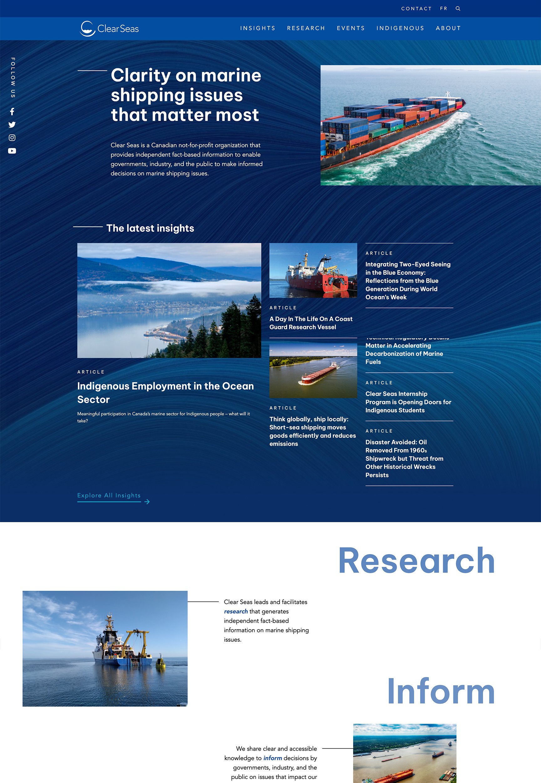
A trusted source for clarity.
Clear Seas is an independent, not-for-profit research centre that supports safe and sustainable marine shipping. They achieve this by funding and publishing fact-based research in collaboration with Indigenous peoples, stakeholders and experts.
We created an elevated user experience and cohesive design across the website to help users navigate and explore Clear Seas’ robust array of resources.
Reach
- The public, policymakers, and indigenous communities across Canada.
Services
- Digital Brand Refresh
- Information Architecture
- UX & UI Design
- Content Optimization
- WordPress Development
- Web Hosting
- WebOps
Year
- 2024
Technology
- WordPress
- Jetpack Search
- WPML Integration
- Text-to-Speech
Site Architecture
Mapping out a direct journey.
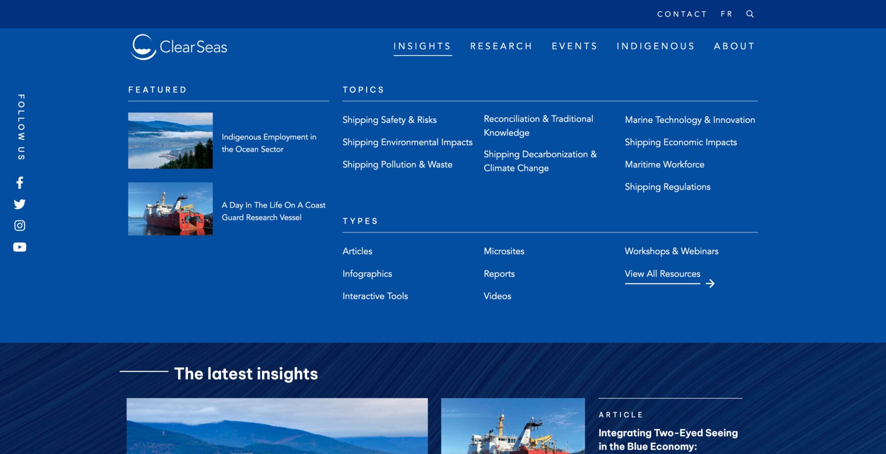
Clear Seas brings clarity and perspective to discussions about sustainable marine shipping. So naturally, we needed to create an ultra-clear navigation and guide users on their journey. We developed a navigation system that is simple and intuitive to help users feel comfortable exploring a broad range of resource topics and types.
The “Insights” mega menu allows users to see the full spectrum of Clear Seas resources so they can quickly navigate to featured links and pre-filtered issues of interest. In the upper navigation, we also have an advanced search feature that prompts users with a friendly message of “What do you want to learn about?” along with a list of popular searches.
UX/UI Design
Elevated editorial with inclusive design.
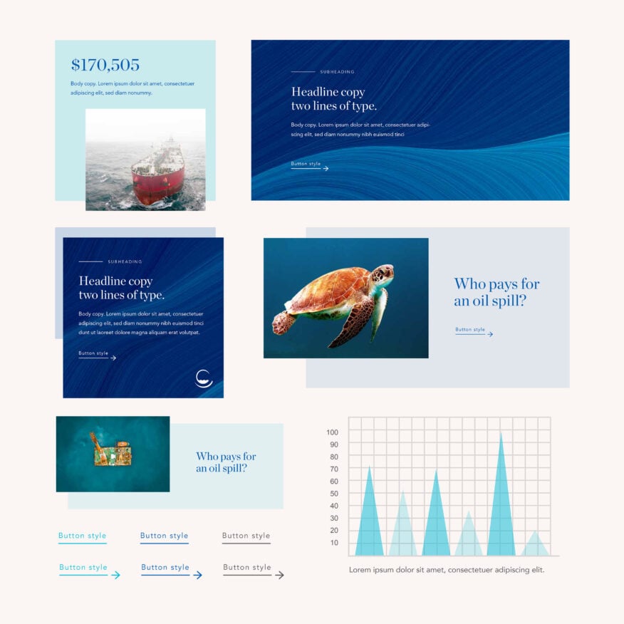
We started the design process with a digital brand refresh. Expanding on Clear Seas’ established brand, we created consistent UI styling across the website’s pages. We developed an updated typographic system, a sophisticated wave-like textural graphic, and a connective design element throughout the site. We also established a cohesive colour hierarchy, iconography, button styles, and more. The new digital aesthetic captures Clear Seas’ knowledgeable, balanced, and trusted brand essence.
We also saw the potential to incorporate the movement of typography and visuals across the site. These thoughtful and modern animations throughout the experience bring content to life and add an energized level of professional polish.
Content
Engaging content on a deeper level.
The platform’s main goals are to keep users on site for longer, help them understand why they should care about marine shipping issues, and encourage them to share interesting resources. To accomplish this, we displayed content in various ways that keep users’ attention.
We optimized the supplied content with an eye on UX writing principles to ensure maximum web-friendliness. Not only does this lead to better engagement, it helps users gain a deeper understanding of the issues. We also added helpful microcopy, navigation breadcrumbs, and strategic calls to action to guide users through the website and keep them exploring.
Accessibility
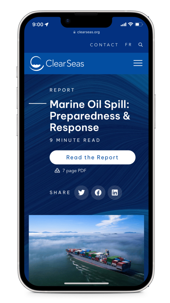
Listen to this.
Podcasts and audiobooks are popular for a reason. Because many people prefer to listen to long-form content rather than read it, we embedded listening tools into Clear Seas’ digital content. This audio option on articles gives users an accessible way to consume content away from their screens. They can multi-task while easily integrating content into their everyday tasks.
Development
A central hub to explore.
The website’s Insights hub is by far the most complex and robust part of the site. It organizes a huge variety of resources in a user-directed way. The previous site had the same content, but finding specific resources wasn’t easy. We knew advanced search features and smart filtering would make a major difference in clarifying the experience.
To keep users on a relevant path of resources, we developed a “Recommended for you” feature. The feature suggests posts based on related topics of the most recent post visited by the user. Strategically placed newsletter opt-in forms are placed throughout the site and its resources, encouraging users to stay current.
Final Thoughts
Balancing credibility with creativity.
For government-funded organizations like Clear Seas, it’s vital to have a digital presence that conveys trust. But that doesn’t mean the experience needs to be stoic or static. Creating an engaging experience that connects with people and policymakers across Canada requires an inspired approach. Take, for example, Clear Seas’ new About page, which tells the organization’s story in a visually driven and dynamic way. Whatever the subject matter, there’s always an opportunity for websites like this to serve up content to users in creative ways.