Rejuvenating the skincare experience.

Revive Skincare
From clinical to aspirational.
Revive Skincare is a thriving medical skincare practice that offers clients a variety of treatments to achieve their ideal aesthetic outcomes. Revive’s holistic approach and partnership with the Kelowna Skin Cancer Clinic give it a unique advantage.
Revive’s former brand and website didn’t convey the clinic’s modern, thoughtful approach to skincare. We developed a refreshed brand and digital presence that is beautiful, feminine, and knowledgeable.
Reach
- The Okanagan’s premier skin care clinic.
Services
- Information Architecture
- UX & UI Design
- Copywriting
- Development
- Web Hosting
Year
- 2022
Technology
- WordPress
- Pantheon
Marketing Strategy
What Revive’s all about.
Revive offers clients the opportunity to reach their ideal aesthetic outcomes through a variety of treatments. While the medical aesthetic industry can be overwhelming, Revive is committed to making the process approachable. Their holistic approach and partnership with the Kelowna Skin Cancer Clinic gives them a unique advantage that comes from a place of genuine passion.
Digital Brand Refresh
Rethinking what Revive wanted to show the world.
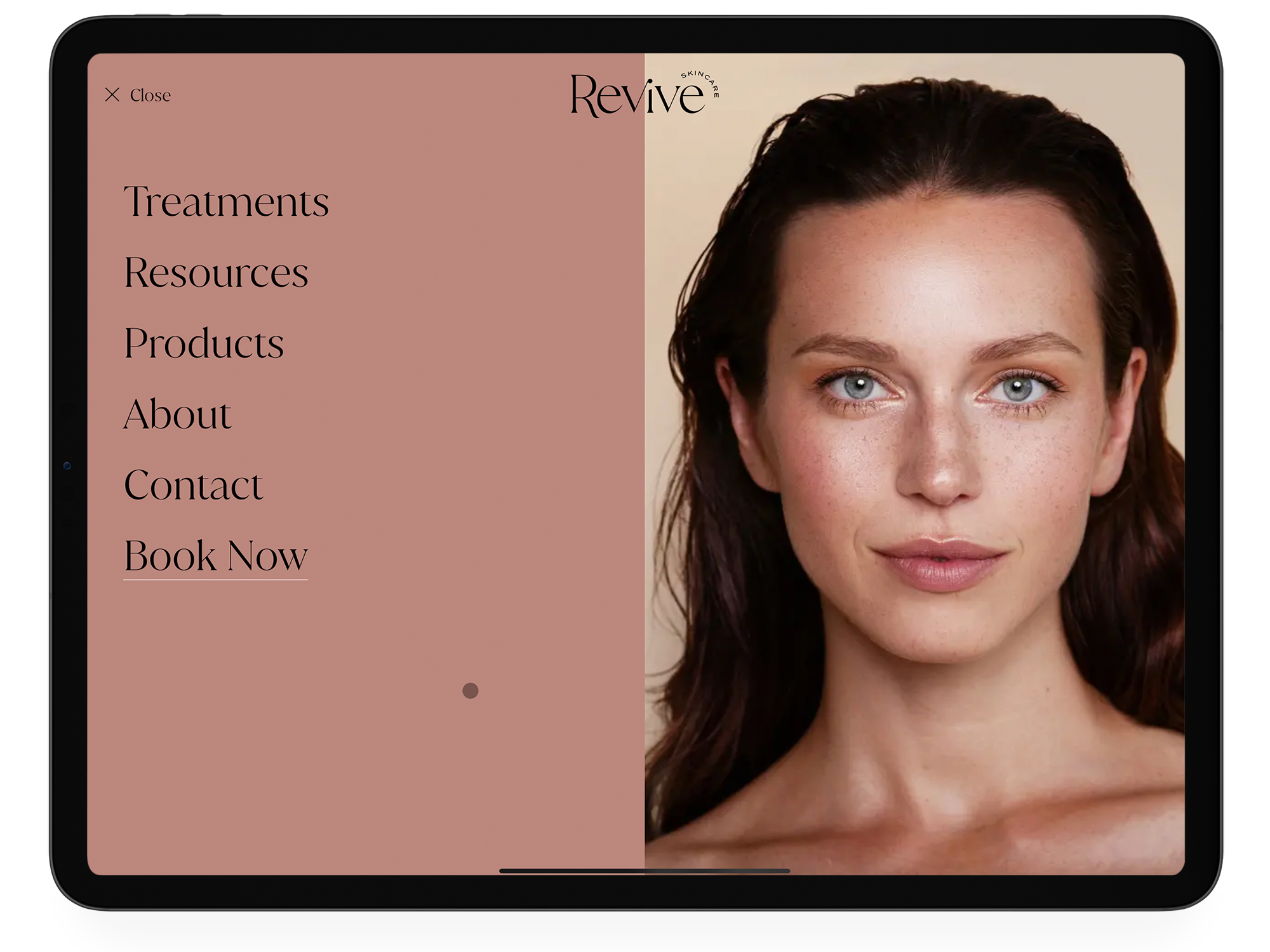
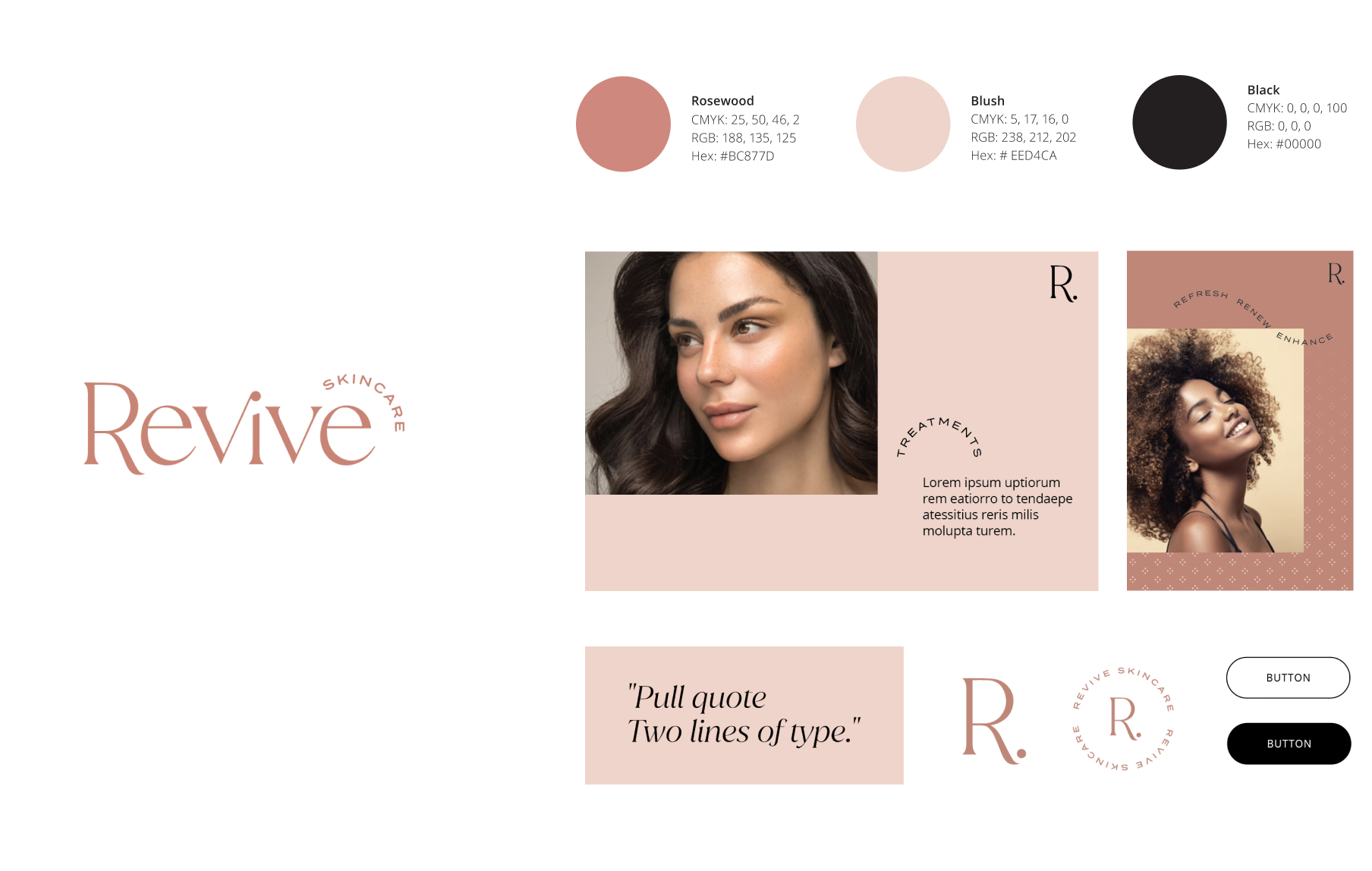
The Revive brand was entirely reinvented for this website redesign. At their core, Revive knew who they were, but the clinic’s digital identity didn’t reflect their sense of self. The design didn’t appeal to Revive’s mostly female audience. Similarly, the overall aesthetic didn’t give any indication that the clinic was an advocate for skin care as an ally for self-confidence.
The brand’s identity needed a complete makeover for their digital presence to thrive. This required serious changes to the design, content, and user experience to appeal to the right audience.
Content Strategy
Creativity has its place in skincare.
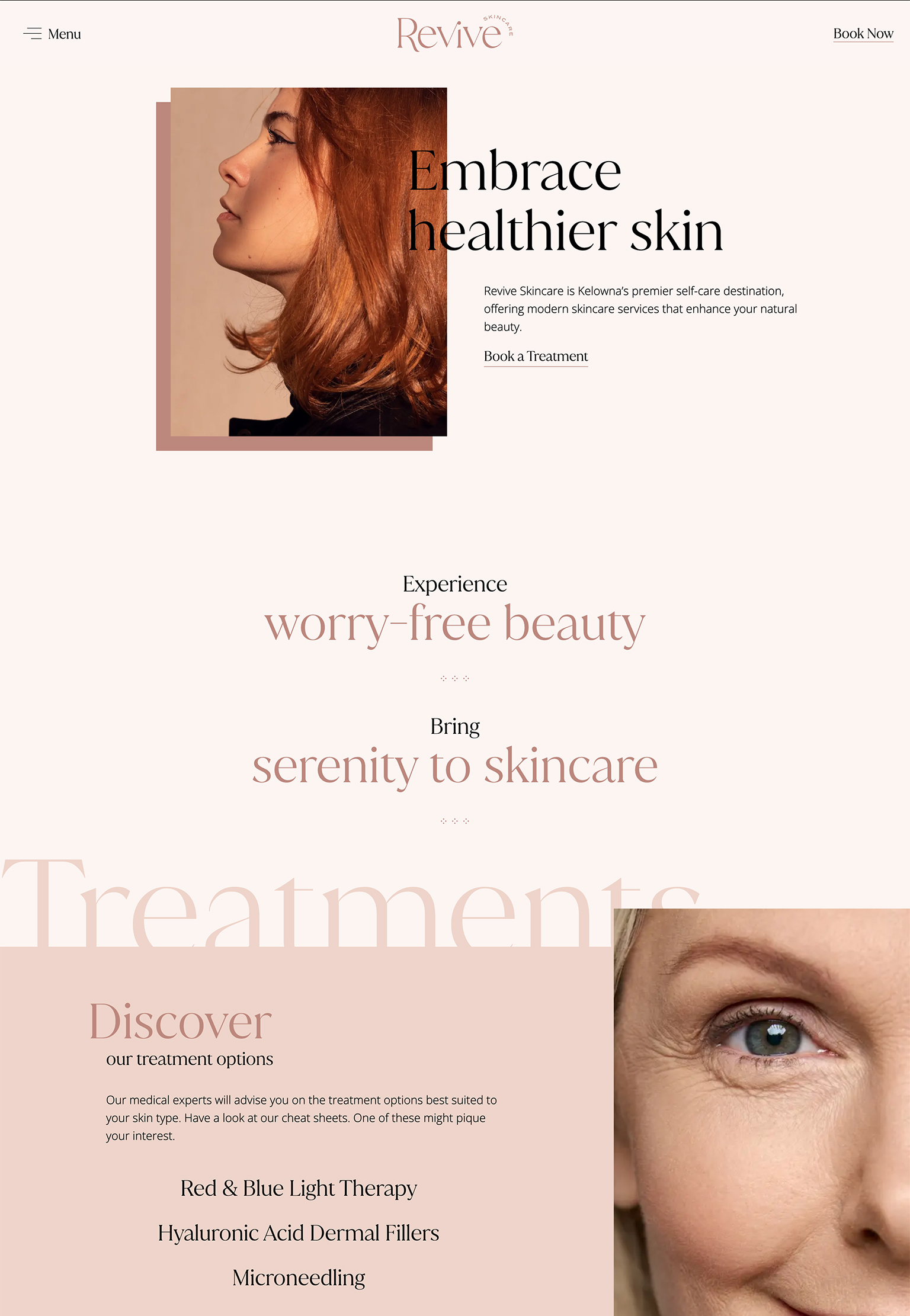
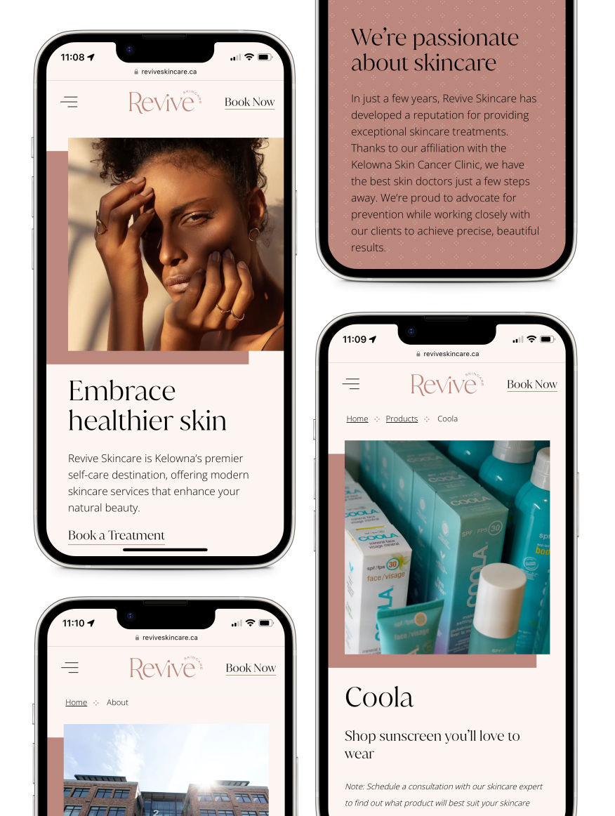
Revive’s new website takes a visual approach to content. Medical content can sometimes be uninteresting to look through. Yet, it’s important to feature. We sought to make people want to read more.
In addition to small pockets of information, the medical language is often broken up by inspirational phrases such as “Experience worry-free beauty.” Headlines are carefully worded to make users feel safe and excited about their skin treatments. Given their affiliation with the Kelowna Skin Cancer Clinic, the content also captures the clinic’s focus on prevention by highlighting the products they sell. Overall, the tone conveys Revive’s genuine passion for skincare through short, beautiful, and informative content.
Website Design
Beautiful, feminine and professional.
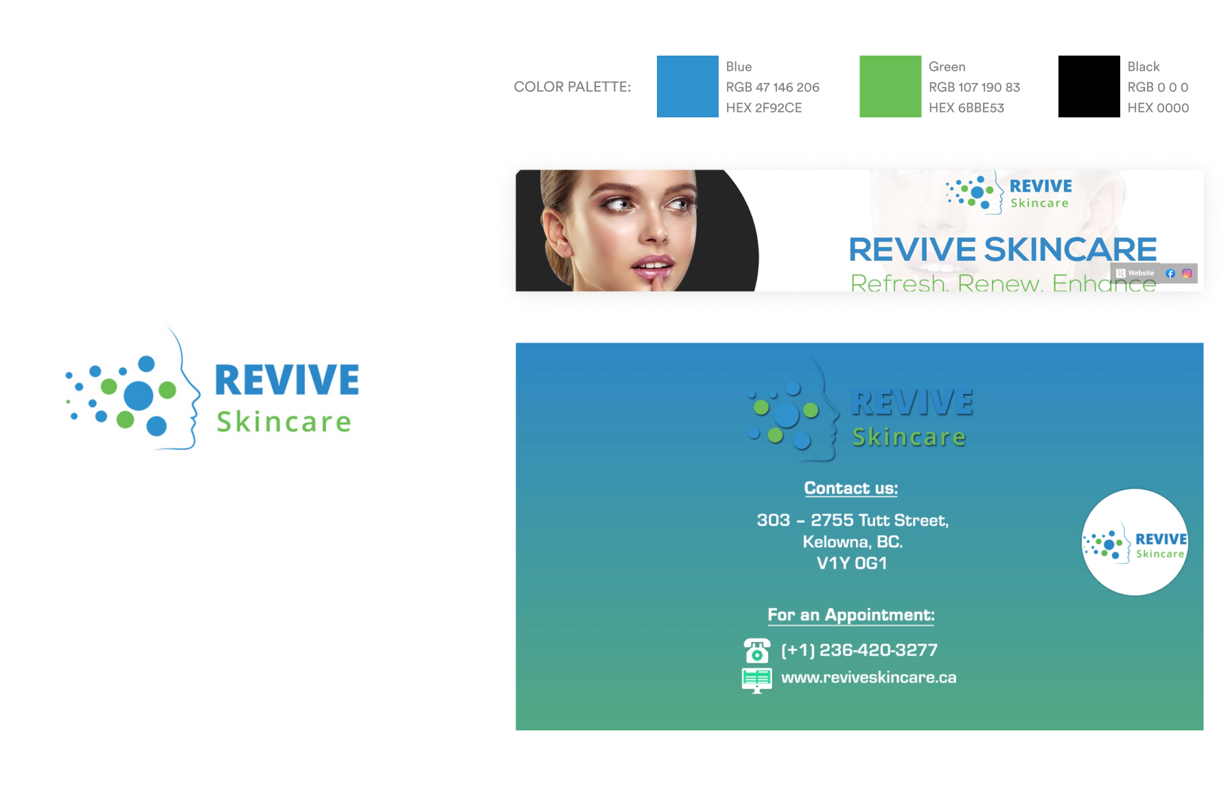
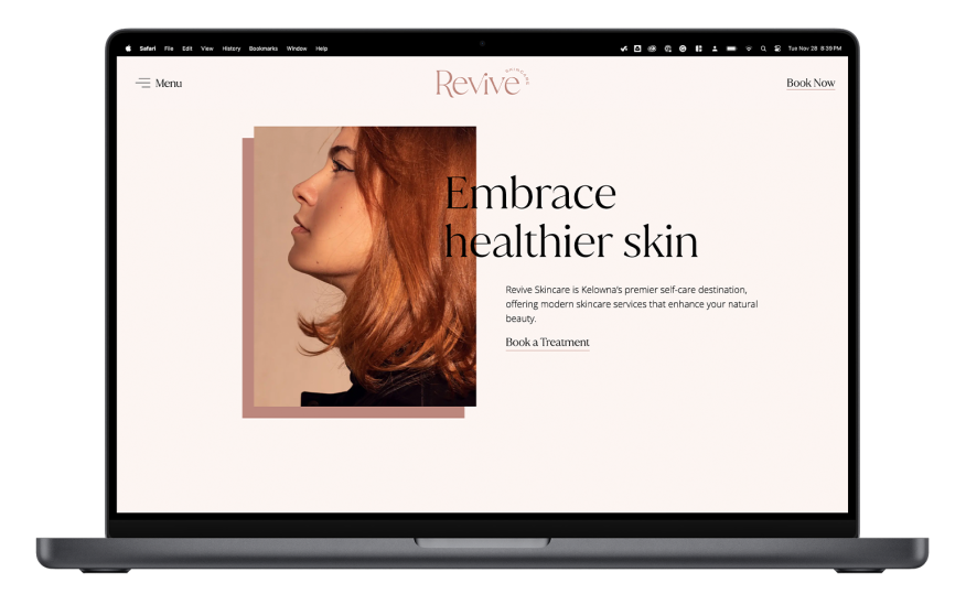
Clients want their medical experience to feel spa-like. They also crave a skincare experience that’s inviting and free of judgment. Through stunning images, a new colour palette, animated UI, and thoughtful typography, we created a user-friendly and aspirational that resonates with women and honours the brand’s femininity.
Instead of focusing on the negative and preying on insecurities, the new design alludes to what treatments can do for their clients’ self-confidence. Medical jargon isn’t necessary to instill trust in clients. Trust signals throughout the experience, along with a welcoming, approachable aesthetic, accomplish the goal.
Development & User Experience
A comprehensive journey for clients.
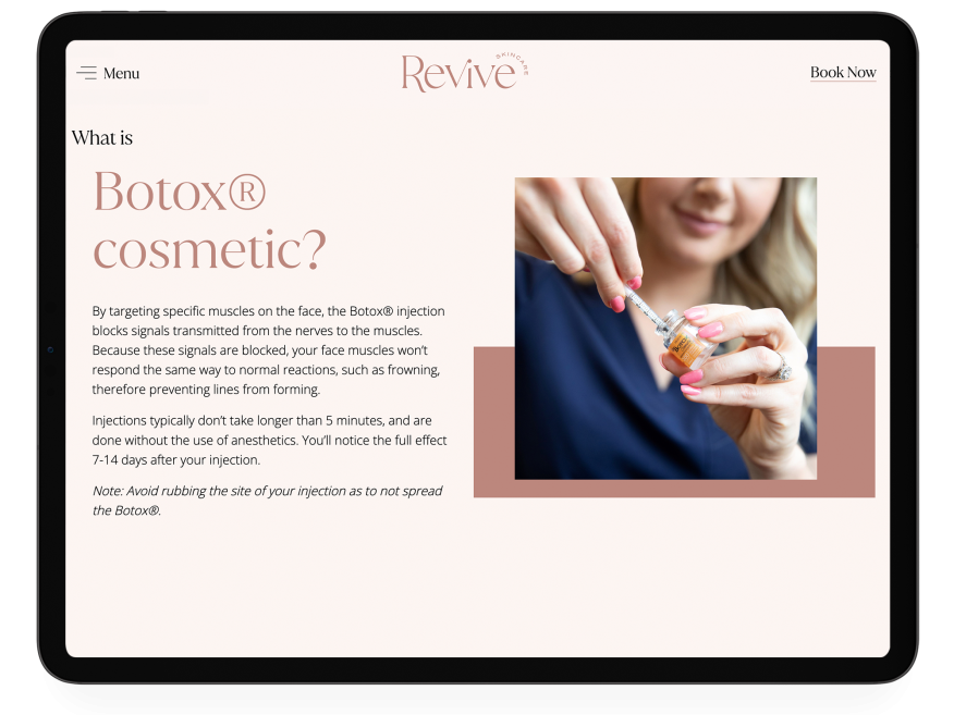
We focused development on creating an uncomplicated user-driven experience with movement throughout for a contemporary feel. The homepage features scroll animations in various areas, along with interactive UI elements that allow users to find the information most relevant to them.
The homepage’s interactive cheat sheets are a great example of providing the user with at-a-glance information and putting the control in their hands to learn more.
I have nothing but positive things to say about our experience working with Twirling Umbrellas. The entire team has been a dream to work with, guiding us towards something that would be aesthetically pleasing and timeless. It was clear that they understood us and the direction we wanted to take from the get-go. Our final product is better than we could have imagined. Thank you for making this such an easy process!
Montana Brown, Revive Skincare
Final Thoughts
Reinventing the digital world of skincare.
For any website project, we start by considering the audience, positioning, and industry. In this case, Revive’s brand needed to be reinvigorated before their new site could thrive. The new website fully embodies Revive’s spirit. It attracts the right audience and clients who may have previously been intimidated by skincare treatments. Most importantly, the new digital presence allows the clinic to focus on what it does best.
