About pages are more important than you might think.
Your association’s About page is usually the first place potential members will go to learn more about your organization, so capturing the essence of what makes your association unique and something that people want to be a part of is important.
It’s time to break free from the mold. By crafting a compelling About page, you can not only attract new members but also deepen the engagement you already have with existing ones. It can even give you a boost in search engine rankings and help you stand out for future members that may not even know you exist.
So, if you want to level up your organization’s game, take the time to create an awesome About page that truly represents your mission and ethos. Trust us. It’s worth the effort and can seriously help your online presence and engagement with your intended audience.
Did you know 52% of visitors landing on your site want to view your About page right away?
KoMarketing
Why many miss the mark.
Many About pages are fairly unremarkable and not very memorable. Some are too short, some are too long and wordy, and some are trying to cram in too much information. Or maybe the information isn’t very well laid out. Or, it’s outdated. The list goes on. Many companies set up their About page, slap up some headshots and bios, and then forget about it until the next site refresh. We believe this is a huge missed opportunity because your About page can be where your organization really shines.
Adding a little extra spice.
For a long time, About pages were pretty dry (and for some associations, they still might be) and pretty forgettable. A few paragraphs were written about the organization’s history and then the page was just left to its own devices.
As the above statistic confirms, people want to learn more about your association, your brand’s origin story, your culture… really anything that allows them to connect with your brand on a personal level. This is the perfect space to create content that offers that little bit extra to your audience.
No mo’ FOMO!
Never fear, there’s always a chance to better your About page and strengthen your brand and conversions. Here are a few tried and tested tips and tricks that we’ve found create more engagement with your brand.
Make sure your mission’s clear.
What do you stand for? This is important information for your members. More and more, people want to be connected to and work with brands that stand for the same values they believe in. Make sure your mission is clear, concise, and something that you’ll actually back.
Include your origin story, but leave some mystery.
Everyone likes to see or read the birth of an association or brand. Knowing where you came from gives your audience a look into who you are and adds a layer of authenticity and humanity to your organization. BUT, less is more. Keep it succinct with a couple paragraphs. Or find a visual way to show it via an infographic timeline or something more interactive.
Show off your people.
Who are the people behind your brand? This is another way to humanize your products and show off your employees and their talent! But make sure it’s more than just a headshot and a name. Here’s a great place where you can have a little more fun!
Content that convinces.
This is the place for you to add some extra content that may not have fit onto the homepage. Think data visuals, links out to your blog content, videos that didn’t make the cut for your homepage, key partnerships, social or environmental impacts, or community involvements.
Bombproof blueprints.
Instead of just “Headline – paragraph – headline – paragraph”, why not try out something different. This is a great opportunity for visual storytelling, to share a little more design personality.
Your needs versus your user’s needs.
There’s a difference between what you’re hoping will go onto your About page vs what users are actually looking for when it comes to information about your organization. Don’t overload them with info but make sure you give them something to chew on.
No cul-de-sacs here.
Don’t let your About page be a deadend spot where visitors end up with nowhere to go. While telling your story, bring attention to other pages on the site and link out to them. Call to actions are your friend here.
Best About page glow-ups.
Our clients have trusted us to create informative and engaging About pages for them. Here are a few examples of our favourites.
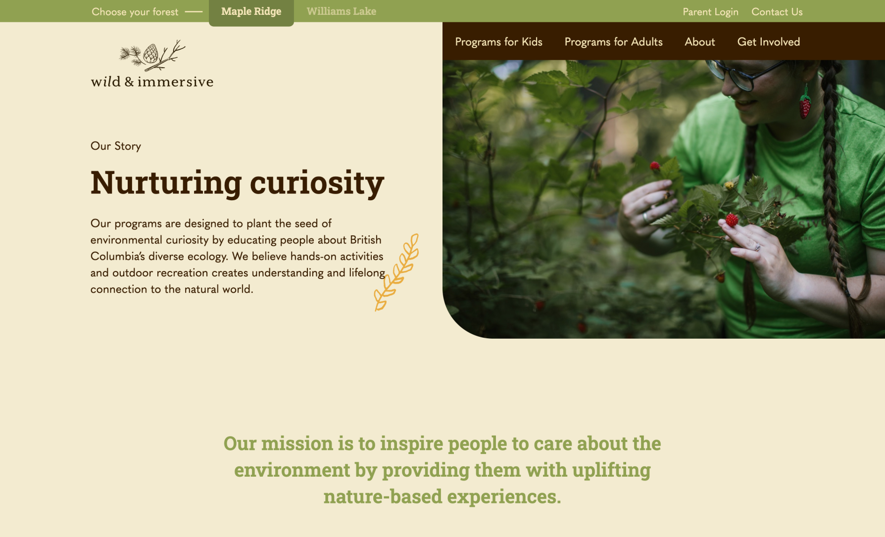
Wild & Immersive

Before we came on the scene, the Wild & Immersive page was pretty standard. It had info but not enough, and the imagery and design left something to be desired. Now, the page features plenty of passion and personality thanks to design hits and interactive movement. Their mission is clearly stated in a fun and engaging way, and there are plenty of avenues to go down – from the team to the forest and more.
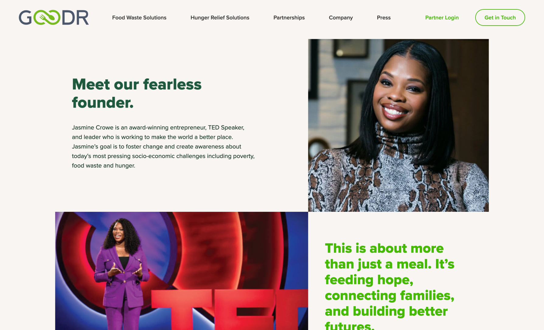
Goodr

For the Goodr About page, there was a lot of information to share. Keeping things succinct was a challenge that we happily took on. This page also showcases their founder in an approachable and human way, putting a face to this company. And, as you scroll, there’s subtle animations and great CTAs to get you engaged in an active way so you know what the next steps are.
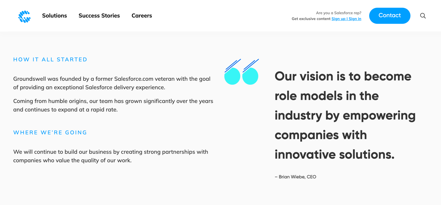
Groundswell

Just because you’re an enterprise business doesn’t mean that you can’t also have an engaging About page. For Groundswell, we kept the design simple and clean, adding in movement only when necessary. Copy about their vision, their approach and their people was also kept to a minimum while still being impactful.
Don’t miss the opportunity.
A captivating About page is more than just a formality or an item to check off of your site’s to-do list. It’s a powerful tool for building trust, attracting new members, and fostering a strong sense of community within your association. By investing time and effort into crafting a compelling and informative About page, you’ll not only differentiate your organization from competitors but you’re also creating a lasting impression on future members and other visitors.
