
What accessibility means, how WCAG and Canadian requirements apply, and how to build, test, and maintain a website that works for more people.
A website can look polished and still put important information or services out of reach. Someone may be navigating without a mouse, enlarging the page to read it, listening through a screen reader, or trying to understand a complicated form under pressure. Accessibility is about whether the website works in those real conditions.
For an association, regulator, charity, or public-facing organization, that has practical consequences. People may depend on your website to renew a membership, understand professional requirements, register for a program, or apply for support. A barrier in that process can prevent them from participating, even when the information is technically available online.
This guide explains the main barriers, what the standards are trying to achieve, and what to expect from the people designing, building, and maintaining your website.
What website accessibility means
People often associate accessibility with blindness or difficulty using a mouse. Those are important considerations, but the range of needs is much broader. Accessibility also involves hearing, mobility, speech, learning, memory, and concentration. Some disabilities are visible. Many are not.
These needs are part of the audience most organizations already serve. In the 2022 Canadian Survey on Disability, 27% of Canadians aged 15 and older reported one or more disabilities that limited their daily activities. That figure does not tell you how any particular person uses a website, but it challenges the idea that accessibility concerns a small, separate group of visitors.1
It can be as familiar as an older adult increasing the text size on their phone. They may never describe themselves as having a disability. They simply need the words to be larger. If the website clips those words or hides the button they need, the design has created a barrier. Age-related changes in vision, dexterity, and cognition often overlap with the needs addressed by web accessibility.2
People also use different tools to get things done, including screen readers, voice commands, and switch controls. Someone recovering from an injury may temporarily rely on a keyboard. The website needs to accommodate that variety without assuming everyone sees, hears, or interacts in the same way.
Access means being able to complete the task.
A useful way to think about accessibility is to follow the person’s task. Finding an application page is only the beginning. They still need to understand the requirements, gather documents, complete the form, correct any errors, and know that the application was received.
When one of those steps fails, the person may have to ask for help or abandon the task. They may also need to disclose personal information to someone assisting them. Independent access matters because it gives people more control over how and when they use a service.
Another way to get help is valuable, but should not excuse leaving the online service difficult to use. GOV.UK’s service standard offers a wider perspective: consider the online and offline parts of the service, and the support people need to move between them.3
Accessibility, usability, and compliance
Accessibility concerns barriers that prevent people with disabilities from using a website. Usability concerns how effectively and comfortably people can use it. Compliance concerns the obligations that apply to an organization. They overlap, but a positive result in one area does not settle the others.
A form can satisfy technical requirements and still be exhausting to complete. A site can feel straightforward to its project team while excluding people who use different technology. The strongest approach combines a clear standard with attention to the experience of the people using the service.
Where WCAG fits
The Web Content Accessibility Guidelines, usually shortened to WCAG, give organizations a shared technical reference for accessibility. Developed through the World Wide Web Consortium, or W3C, they turn broad intentions into requirements that can be evaluated.4
That shared reference is useful when a project moves between teams. “Make the text readable” can mean different things to different people. An agreed contrast requirement gives the designer, developer, and evaluator a common basis for a decision. The standard supports the conversation; it does not replace understanding the reader’s needs.
WCAG is organized around four principles: people must be able to perceive the information, operate the interface, understand the content and interactions, and use the site with different browsers and assistive technologies. Captions, keyboard access, clear instructions, and properly identified controls are everyday expressions of those principles.
What an organization needs to specify
A project should name a WCAG version and level. WCAG 2.2 Level AA is a sensible target for a new website, alongside confirmation of the legal and contractual requirements that apply. Some laws still refer to WCAG 2.0 or 2.1, so a project target and a legal requirement are not always the same thing.
The levels are cumulative: AA includes A requirements, and AAA adds more. A higher level is not a simple quality rating for an entire website. W3C does not recommend requiring full AAA conformance as a general policy for whole sites because some content cannot meet every AAA criterion.5
The numbered references below identify selected requirements, known as success criteria. You do not need to memorize them. Your project team should be able to explain how they apply to your content and services.
Designing content people can see and adapt
Colour contrast: assess combinations, not colours.
A brand colour is not inherently accessible or inaccessible. What matters is how it is used. A pale colour may work well as a background and be difficult to read as small text. A stronger colour might work for a heading but need a darker variation for a navigation label.
This distinction is important during a redesign. Discovering a contrast problem does not automatically mean abandoning the brand. Often the answer is to agree on suitable combinations and roles: which colours are for text, which are backgrounds, and which should be reserved for decoration.
Contrast describes how clearly something stands out against what is behind it. WCAG’s Contrast (Minimum), criterion 1.4.3, requires at least 4.5:1 for most text and 3:1 for text meeting its definition of large text. That gives the team a more reliable benchmark than how a pairing looks on one person’s monitor.6
Buttons, form fields, and meaningful icons need attention too. If a faint outline is the only thing identifying where to enter an address, a reader needs to be able to see it. WCAG also addresses the contrast of visual information needed to identify controls and meaningful graphics, generally using a 3:1 threshold against adjacent colours. Decorative borders do not all serve that purpose.7
A useful digital brand guide records approved pairings for specific uses. It should include what happens when a button is selected, a link receives keyboard focus, or a form displays an error. Editors then have practical choices they can trust, rather than a palette they have to reinterpret whenever they create a page.
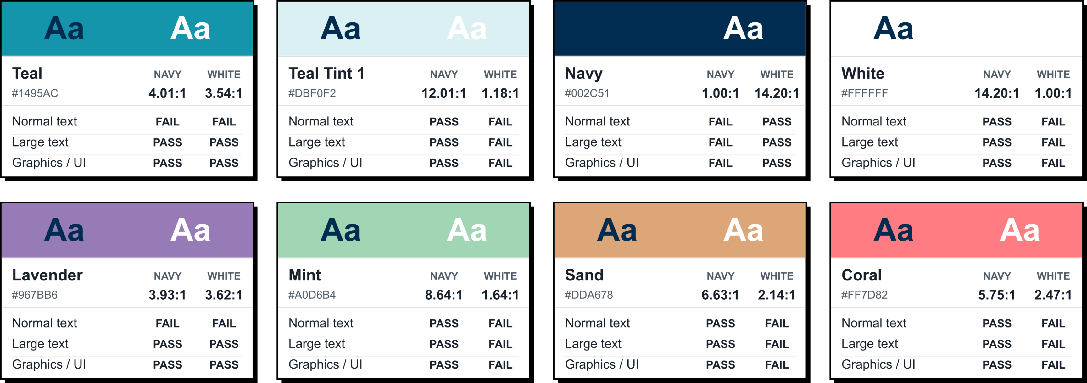
RHRA’s website serves retirement-home residents, their families, and the people who operate their homes. Its digital style guide defines where text and brand colours can be used to help keep important information readable for a broad audience, including older adults. This comparison shows why those choices matter: the same brand colour can support one use and fall short in another. The chart compares WCAG AA contrast thresholds; RHRA’s usage rules may be stricter.
The surrounding design matters as well. Text over a photograph can be clear in one crop and disappear into a lighter area on a phone. Small, thin text can remain uncomfortable even when its colours meet a minimum. The U.S. Web Design System’s guidance on colour makes this wider point: readability also depends on typography, spacing, line length, and the content itself.8
When reviewing a design, look beyond the largest headings. Check the small instructions, dates, captions, navigation, and form labels. These quieter details often contain information people need to act on.
Colour cannot carry the whole message.
Contrast and colour dependence are different issues. One concerns how clearly something stands out. The other concerns needing to recognise a particular colour to understand what it means.
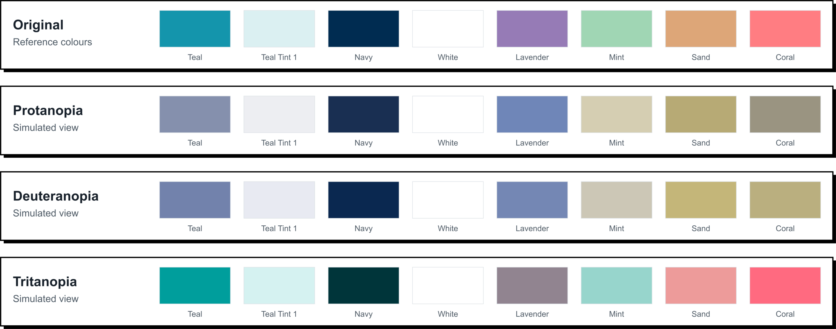
A chart can have strong contrast and still be difficult to interpret if its categories are identified only as red, green, and blue. A form can display an obvious red outline without explaining which detail needs correcting. In each case, making the colours stronger would leave the underlying problem unresolved.
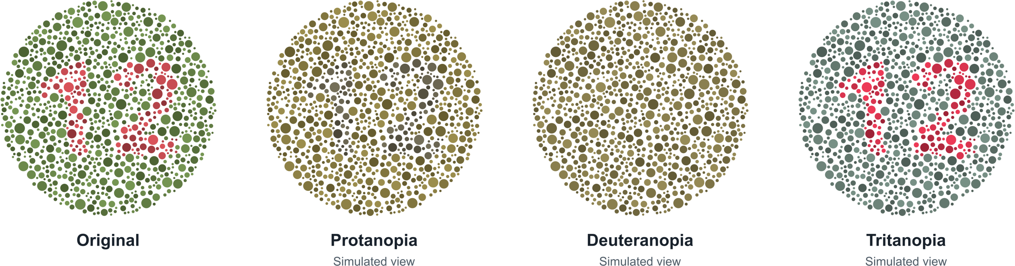
The practical answer is to give the information another clear form. A status can say “Approved” or “Action required”. A chart can label its series directly or use patterns alongside colour. An error can explain what needs attention beside the affected field. These approaches support people who perceive colour differently and reduce the amount of interpretation expected of everyone else.9
WCAG’s Use of Color requirement, criterion 1.4.1, captures this principle. Colour can reinforce meaning, but it should not carry that meaning alone. The same applies to instructions: “Select ‘Continue’” is clearer than “Select the green button”.
Larger text and layouts that adapt
A responsive website needs to accommodate more than a smaller screen. People change text size, enlarge pages, and adjust how they read. A layout that looks good on a phone at its default settings may stop working when someone increases the text.

Imagine the same service page on two phones, one with ordinary text and one with enlarged text. The second should show fewer words at once, with content moving down the page. It should still provide the same instructions and actions. Keeping everything in its original position matters less than keeping the service usable.
The problems are often small but consequential: a heading overlaps the next paragraph, an eligibility condition disappears inside a fixed-height box, or the final button moves out of reach. A screenshot at the default size will not reveal these problems. An enlarged view of a real page will.
WCAG includes requirements for resizing text to 200% without losing content or functionality, and for ordinary content to reflow into a narrow reading area. These are separate but related checks, covered by criteria 1.4.4 and 1.4.10. The purpose is to let someone read larger content without continually scrolling back and forth across each line.10
People may also change spacing or use a device in an orientation that suits them. Someone whose tablet is mounted to a wheelchair may be unable to turn it sideways. These preferences should be part of the design discussion, rather than treated as unusual settings that the site does not support.11
Headings and links that help people find their way
Most people do not read a long web page from beginning to end. They look for a heading, a familiar term, or a link that appears to answer their question. Clear structure helps them decide where to spend their attention.
Someone reviewing an application process might want to find eligibility, fees, deadlines, and required documents. Those topics make useful headings because they reflect the reader’s questions. A series of sections labelled “More information” requires much more exploration.
The structure also needs to exist beneath the visual design. Screen readers can use headings to move through a page, provided those headings are properly identified. Simply making text bigger and bolder does not provide the same navigation. A well-built publishing system should make the right structure straightforward for editors to use.12
Links are another form of signposting. “Download the membership application” tells a reader more than “Click here”. Harvard’s guidance on link wording explains why this matters when a screen-reader user moves from link to link and hears the labels without all the surrounding text.13
Consider this before a content migration. Moving hundreds of pages successfully does not necessarily make them easier to navigate. The page hierarchy and labels need their own attention.
Images need a purpose and an alternative.
Images can explain something quickly, provide context, or make an article more engaging. The accessibility question is what a reader would miss if they could not see the image.
Alternative text, often called alt text, gives assistive technology a way to present that meaning. It should reflect the image’s purpose on the page, rather than list keywords or describe every object in view.
A photograph of a building might introduce a news story. On a visitor information page, the same photograph might show which entrance has a ramp. The useful description changes with the purpose. Harvard’s alt text guidance includes examples of this contextual approach.14
Some images are purely decorative or repeat information already provided nearby. These usually need an empty alternative so assistive technology can skip them. A linked image needs to communicate its destination or action. W3C’s alt text decision tree helps editors distinguish these uses.15
Charts and diagrams need more care. “Funding chart” tells someone that a chart exists, but not what it shows. Explain the important conclusion in the page text and make the underlying information available in a suitable format, such as an accessible table. That explanation also helps readers who can see the graphic but find it difficult to interpret.16
Making navigation and interactions work
People need more than one way to navigate.
A mouse is only one way to use a website. People may navigate with a keyboard, voice commands, touch, or an alternative input device. Some combine methods. A service should not require a precise movement or a particular device when the task itself does not depend on it.
Keyboard access is a useful example. Someone needs to be able to open the menu, choose a search filter, enter information, and continue to the next step without reaching for a mouse. Links that work are a start, but an unusable date picker can still bring the whole task to a halt.
They also need to know where they are. Keyboard focus is the current location for interaction, often shown by an outline around a link, button, or field. If that indicator disappears, the person can be left guessing what will happen next. If a dialogue opens, they need a clear way to close it and continue.17
WCAG’s Keyboard requirement, criterion 2.1.1, establishes the expectation of keyboard operation, with limited exceptions. For a project review, a demonstration is often more revealing than a statement in a checklist. Ask to see someone complete an important task without a mouse, including any menus, pop-ups, and third-party steps.
What a screen reader needs from a website
A screen reader does more than read a page aloud from top to bottom. People can move between headings, review links, locate form controls, and skip to the part of the page they need. Apple’s VoiceOver documentation illustrates several of these navigation methods.18
This changes how a website needs to communicate. A sighted visitor might recognise a menu because of its position and appearance. A screen-reader user needs the control to identify itself and communicate whether it is open. A checkbox needs to convey its checked state. Information that seems obvious visually still needs an equivalent that the software can understand.19
These details are mainly implementation responsibilities, but their purpose is easy to understand. The person should be able to tell where they are, what options are available, and what happened after an action. A control that looks finished can still be missing that information.
A short recording can make this more tangible. Listen for how the person finds a heading, identifies a link, and moves through a form. The speech comes from the screen reader; keyboard navigation itself is silent. One demonstration shows a particular setup and approach, rather than the experience of every screen-reader user.
Touch targets, dragging, and voice control
Small, crowded controls ask a lot of the person using them. A row of tiny icons might look tidy, but selecting the right one can be difficult for someone with a tremor or limited dexterity. A larger area that responds to a tap gives them more room to act accurately.
This is especially important when the consequences of a mistake are frustrating: removing an item instead of editing it, closing a form instead of continuing, or selecting the wrong appointment time. Visual neatness should not depend on everyone having the same precision.
WCAG’s Target Size (Minimum), criterion 2.5.8, provides a benchmark for size and spacing. But meeting a minimum should not prevent a team from making frequently used controls more comfortable.20
Dragging is another easily missed barrier. A booking interface may expect someone to hold and move an item into place. Offering buttons or another non-dragging pointer action can make the same task available without that sustained movement.21
Voice control depends on clear, consistent names. Someone saying “Click Apply now” expects the visible “Apply now” button to respond. The name supplied to assistive technology needs to match the visible wording closely enough to support that expectation. Testing with speech recognition can reveal gaps that mouse-based reviews miss.22
Forms should help people succeed.
Forms are where an organization’s instructions become a person’s work. Every field asks them to interpret a question, locate information, and decide what to enter. Accessibility improves when those expectations are clear before anything goes wrong.
A persistent label tells someone what belongs in a field. A short example can explain an unfamiliar format. Required information should be identified early, especially when it means finding a document or asking someone else for a detail. Instructions that disappear as soon as typing begins are much less useful.23
When an error occurs, the message should help the person recover. “Enter a postal code in the format A1A 1A1” gives them something to do. “Invalid input” leaves them to guess. GOV.UK’s guidance on error messages emphasizes explaining the problem and how to correct it, using clear language.24
WCAG’s Error Identification requirement, criterion 3.3.1, calls for errors to be identified and described in text. The recovery experience matters too: messages should be easy to find and connected to the relevant field, including for assistive technology.25
Keep the valid information the person has already entered wherever possible. A small mistake should not mean starting a long application again. For consequential actions, a clear review or confirmation step can help someone catch an incorrect amount or an unintended choice before submitting.26
Finally, make success clear. A visual confirmation that appears without moving to a new page needs to be communicated to assistive technology as well. “Your application has been received” answers an important question that a green tick alone may leave unresolved.27
Logins should not become an unexpected barrier.
Organizations sometimes put considerable care into their public website and much less scrutiny into the account system behind it. Yet a member who cannot sign in still cannot renew, register, or access the information they need.
Review the whole account journey, including security checks and account recovery. Can someone use their password manager? Can they paste a code? What happens if they cannot complete the challenge they are given? These questions are particularly relevant when authentication depends on remembering or transcribing information.
Accessible Authentication (Minimum), criterion 3.3.8, addresses cognitive barriers in authentication and the alternatives or assistance that can resolve them. It does not prohibit passwords or multi-factor authentication. It asks teams to consider how people can complete those security steps.28
Asking for the same address again adds effort and another opportunity for error. Where appropriate, let people reuse information they have already provided. WCAG addresses redundant entry, with exceptions including security and information that is no longer valid.29
Give people control over motion and time.
A rotating banner can change before someone finishes reading it. A large animation triggered by scrolling can make someone feel unwell. A time limit can expire while someone is still working through the instructions. These experiences are easy to miss when a team reviews a page quickly and already knows what it says.
The first question is what the movement or deadline contributes. A decorative effect may be enjoyable for some visitors and a barrier for others. Content should remain understandable when unnecessary motion is reduced, and people need appropriate ways to pause moving or updating information. WCAG includes requirements for certain automatically moving content and limits on flashing.30
Respecting a person’s reduced-motion preference gives them control without requiring a separate setting on every website. Some motion-related recommendations go beyond Level AA, but can still be appropriate for the audience.31
Time limits deserve similar consideration. Security may require a session to end, but the warning, opportunity to extend it, and treatment of unsaved work all affect the person using the service. Someone who needs longer to read or enter information should not repeatedly lose their progress. WCAG’s Timing Adjustable requirement provides a framework for many of these situations, with defined exceptions.32
Making information easier to understand and access
Plain language is part of accessibility.
Clear writing reduces the work a reader has to do before they can act. It helps someone distinguish an eligibility rule from a recommendation, understand what a deadline applies to, and know which documents to prepare.
Plain language does not mean removing useful detail or talking down to the audience. It means explaining that detail in a form the intended reader can use. The Canada.ca Content Style Guide makes this distinction and connects clarity with the ability to find, understand, and act on information.33
For example, “Upload proof of your address, such as a utility bill dated within the last three months” is more useful than “Submit supporting documentation”. Both ask for evidence. One explains what that evidence could be.
Predictability matters too. A complicated process becomes harder when instructions change location, the same action has several names, or a later question assumes the reader remembers an earlier detail. Canada’s Digital Accessibility Toolkit recommends manageable amounts of information, clear language, and support for people who find recall or time pressure difficult.34
These considerations extend beyond what a technical checklist captures. A page may contain properly coded headings and still be confusing. Content review and conversations with the people using the service can reveal where an explanation needs to be clearer.
Audio and video need equivalent ways to understand them.
A video can be an effective way to explain a process or tell a story, but people need access to the information it carries. Someone who cannot hear the soundtrack needs the relevant speech and sounds in another form. Someone who cannot see the picture needs important visual information explained.
Captions, transcripts, and audio description address different parts of that problem. Captions appear with the video. A transcript provides a separate text version. Audio description communicates visual information that the existing soundtrack leaves out. One does not automatically replace the others.35
Caption quality matters as much as availability. Incorrect names, missing words, or poor timing can make an explanation difficult to follow. Automatically generated captions should be reviewed before publication. The Described and Captioned Media Program’s Captioning Key covers quality considerations such as speaker identification and meaningful sounds.36
WCAG’s Captions (Prerecorded), criterion 1.2.2, establishes a requirement behind this work. Include accessible versions in the video brief and budget so they are planned before the final edit.37
Planning also helps with visual information. If a presenter explains what an on-screen chart shows, more of the meaning is already in the soundtrack. If they simply say “As you can see here”, someone who cannot see the chart is left without the explanation.38
A standalone audio clip should have an equivalent text alternative, and the player itself needs usable controls. For a screen-reader recording, a nearby transcript can capture the speech and describe the actions needed to understand it. The example should offer the same consideration for its audience that it is illustrating.39
Documents and third-party services are part of the website experience.
A website’s most important information is sometimes in a download: an application form, a policy, an annual report, or a schedule. If that document is difficult to use, an accessible page linking to it does not resolve the problem.
A PDF with selectable text is not necessarily accessible. Reading order, headings, image descriptions, tables, and form fields can all need attention. A scanned document needs more than text recognition to become a well-structured, usable document. The U.S. government’s accessible PDF resources provide practical guidance for production and evaluation.40
It is worth asking whether a download is the right format in the first place. Information intended mainly for reading online may work better as a web page that adapts to different screens and reading preferences. Keep the download where it serves a purpose, but avoid making it an unnecessary obstacle to essential information.
Tables and charts deserve particular care in reports. A reader navigating a table one cell at a time needs to know which heading a value belongs to. Preserving those relationships matters when moving information from a spreadsheet into a document or web page.41
Third-party services need the same attention. An event registration tool, payment form, or member portal can determine whether the overall experience is accessible. Harvard’s procurement guidance recommends evidence such as demonstrations, accessibility reports, and assessment of the actual product. A general statement about a supplier’s commitment is not enough to establish how your chosen service will work.42
How to evaluate accessibility meaningfully
Accessibility testing should help an organization understand where people encounter barriers and what needs to change. A score on its own gives a much narrower picture.
Automated tools are useful for finding repeatable problems, including some missing labels and contrast failures. They cannot judge everything. An image may have alt text that is inaccurate. A heading can be correctly identified and still tell a reader very little. A form might pass several checks while leaving someone unsure how to correct an error.43
Combine automated checks with manual evaluation and assistive-technology testing. GOV.UK’s accessibility testing guidance describes this approach. Each method reveals different problems; one tool leaves gaps.44
Include real tasks and different states of the website. An expanded menu, a failed submission, an empty search, and a logged-in page can behave differently from the default view. A homepage review alone cannot tell you whether someone can complete an application or payment.
Involving people with disabilities adds another kind of evidence. They may identify difficulties that are not obvious to the project team. Their feedback complements a standards-based review; a small group cannot represent every access need or establish conformance on its own.45
What to expect in a website proposal
“The website will be accessible” is too vague to evaluate. A proposal should identify the target standard, what is included, how it will be tested, and who will resolve the findings. You should be able to understand the promised outcome without interpreting a page of technical terminology.
Useful questions include:
- Does the work include existing content, documents, forms, and third-party services?
- How will important tasks be tested, including use without a mouse?
- What evidence will show which barriers were found and corrected?
- Who is responsible for unresolved issues, and when will they be addressed?
- What will the publishing team need to know to maintain accessibility?
Harvard’s accessibility questions for vendors offer a useful reference for these conversations, including documentation, demonstrations, and plans for improvement.46
Where an independent specialist assessment is appropriate, name it explicitly in the scope and budget. Routine development checks and a formal conformance evaluation are different deliverables. A useful report should explain the scope, findings, and limitations, rather than offer a broad assurance without supporting detail.47
Be cautious with claims such as “98% accessible” unless the measure is explained. A scanner score is not a percentage of WCAG conformance. A blocked final step can prevent a task from being completed even when many earlier checks passed.
Where WordPress fits
WordPress provides useful publishing tools for headings, image alternatives, captions, and reusable layouts. A carefully configured editor can help a communications team make consistent choices without needing to understand the code behind them.
The WordPress project targets WCAG 2.2 AA in its accessibility standards, while acknowledging known issues. An “accessibility-ready” theme has passed a defined theme review; it is not a certification of the completed website. Themes, plugins, custom features, and content decisions all affect the result.48
The publishing team’s access matters too. Staff should be able to use the tools that maintain the website, so include editorial tasks when selecting and configuring a platform.
Our guide to WordPress for mission-driven organizations explores that broader publishing context. The accessibility principle is the same on any platform: assess the website and workflows people will actually use.
Canadian accessibility requirements
There is no single website rule that applies identically to every Canadian organization. Jurisdiction, sector, organizational size, content, and timing can affect the requirements. A project may also have contractual obligations beyond the legislation’s minimum.
The following is a high-level orientation, not an exhaustive legal review or legal advice. Confirm the requirements that apply to your organization, including obligations outside website-specific regulations. Legal information last reviewed: September 2026.
Federal requirements
Amendments to the Accessible Canada Regulations introduce digital accessibility requirements for federal public-sector organizations and federally regulated private-sector organizations with at least 100 employees. They reference CAN/ASC–EN 301 549, a broader information and communication technology standard, rather than a simple requirement that every Canadian website meet WCAG 2.2.
Requirements for new or updated web pages begin on December 5, 2027 for covered federal public-sector organizations and December 5, 2028 for covered private-sector organizations. Other provisions address training, documents, mobile applications, procurement, and accessibility statements, with scope and dates that vary. Check the federal summary and the regulations for the relevant organization and deliverable.49
Ontario
Ontario’s website requirements under the Accessibility for Ontarians with Disabilities Act generally cover designated public-sector organizations and businesses and non-profits with 50 or more employees. Covered public websites and web content published after January 1, 2012 must meet WCAG 2.0 Level AA, with exceptions including live captions and prerecorded audio description. Separate provisions apply to the Ontario government and Legislative Assembly. Scope, control of content, and practicability provisions need to be considered.50
Manitoba
Manitoba’s Accessible Information and Communication Standard Regulation uses WCAG 2.1 Level AA. Its web-content requirement covers content published after the regulation applies to an organization and content needed to access its goods and services. Web applications have related requirements for publication and significant updates. The regulation sets out the covered organizations, phase-in dates, and exceptions, including provisions concerning technical feasibility, control, and undue hardship.51
Quebec
Quebec’s SGQRI 008 3.0 standard applies to specified public bodies. It draws on WCAG 2.1 A and AA with stated exceptions, adds selected AAA criteria, and includes selected WCAG 2.2 requirements. It also contains requirements for accessibility information and assistance. Describing it simply as “WCAG 2.1 AA” misses important details, and it should not be presented as a blanket rule for every Quebec business.52
British Columbia and other jurisdictions
The Accessible B.C. Act and its regulation require covered public-sector organizations to establish accessibility committees, plans, and public feedback mechanisms. Those requirements should not be confused with a province-wide WCAG mandate for every business website.53
Other provinces and territories have their own legal and policy contexts. Review current requirements when planning a project and revisit them as standards develop. The absence of a particular website regulation is not a useful reason to leave a known barrier unresolved.
Why overlays are not a substitute for accessibility.
Accessibility overlays are often presented as a quick way to make an existing website accessible. Typically, they add a toolbar, change parts of the page as it loads, or combine the two. The appeal is understandable: an organization wants to improve access without starting a large project. The problem is treating the installation as if that work has been completed.

An automated tool may correct some technical issues, but it cannot reliably decide whether an image description communicates the right meaning, instructions make sense, or a complicated application process works for the person using it. A missing label is one problem; choosing a useful label is another. The Overlay Fact Sheet, a community statement supported by accessibility practitioners and people with disabilities, explains these limits and recommends correcting problems at their source.54
There is also the experience of the person arriving at the website. They may already have their screen reader, browser, and device configured to suit them. Another layer of controls can duplicate those settings or interfere with how they navigate. Perkins School for the Blind’s explanation of overlays describes these concerns. The European Disability Forum and the International Association of Accessibility Professionals make a similar distinction in their joint statement on overlay limitations: personalization features can help some users, but they do not establish that a website is accessible.55
Claims of automatic compliance deserve particular scrutiny. In April 2025, the U.S. Federal Trade Commission finalized an order requiring accessiBe to pay million to settle allegations involving unsubstantiated claims about its product’s ability to make websites WCAG-compliant. The FTC case record provides a concrete example of why buyers should ask for evidence. It concerns a particular vendor’s claims under American consumer-protection law, rather than a ruling about Canadian accessibility obligations.56
We do not recommend overlays as a substitute for fixing and testing the website. Useful personalization features, publishing checks, and automated testing tools can support accessibility. They still need a clear purpose and an evaluated result. If a supplier proposes an overlay, ask which barriers it will address, which will remain, and how people using assistive technology have been involved in testing. The measure of success is whether people can use the service, not whether an accessibility icon appears in the corner.
Keeping accessibility part of everyday website work
Accessibility changes as a website changes. A new form, a different colour pairing, a document upload, or an embedded service can introduce a barrier after launch. Maintaining access depends on ordinary publishing and development habits.
Agree on responsibilities for design, development, content, and third-party services. Editors need practical publishing guidance, and technical changes need someone responsible for testing their effect on accessibility.
Shared patterns make this work more manageable. A well-tested form or page layout reduces the number of choices an editor has to make. Training should use the organization’s own content and common tasks, with a clear route for questions that need specialist help.
Keep a record of known issues and their effect on people. Prioritize barriers that prevent essential tasks, assign responsibility, and check the correction. If a temporary workaround is needed, make it clear how someone can use it and what the plan is for resolving the underlying problem.
An accessibility statement can explain the standard being pursued, what has been evaluated, known limitations, and how to request help or report a barrier. It should describe the site honestly and stay current. W3C’s accessibility statement guidance is a useful starting point.57
Begin with an important task. Can someone find and understand the instructions, use the controls, recover from a mistake, and know they have succeeded? Combine that practical view with a standards-based assessment. The goal is a service people can use with confidence, maintained as their needs and your website evolve.
- Statistics Canada, The disability rate in Canada increased in 2022 (2022 Canadian Survey on Disability). ↩︎
- W3C WAI, Older Users and Web Accessibility. ↩︎
- GOV.UK Service Manual, Make sure everyone can use the service. ↩︎
- W3C WAI, WCAG 2 Overview. ↩︎
- W3C, WCAG 2.2: Conformance Requirements. ↩︎
- W3C, Understanding 1.4.3: Contrast (Minimum). ↩︎
- W3C, Understanding 1.4.11: Non-text Contrast. ↩︎
- U.S. Web Design System, Using color: Color, contrast, and readability. ↩︎
- W3C, Understanding 1.4.1: Use of Color. ↩︎
- W3C, Understanding 1.4.4: Resize Text; W3C, Understanding 1.4.10: Reflow. ↩︎
- W3C, Understanding 1.4.12: Text Spacing; W3C, Understanding 1.3.4: Orientation. ↩︎
- W3C, Understanding 1.3.1: Info and Relationships. ↩︎
- Harvard University Digital Accessibility Services, Writing link text. ↩︎
- Harvard University Digital Accessibility Services, Write helpful Alt Text to describe images. ↩︎
- W3C, Understanding 1.1.1: Non-text Content; W3C WAI, An alt Decision Tree. ↩︎
- W3C WAI, Complex Images. ↩︎
- W3C, Understanding 2.1.1: Keyboard; W3C, Understanding 2.1.2: No Keyboard Trap; W3C, Understanding 2.4.7: Focus Visible. ↩︎
- Apple Support, Intro to advanced navigation with VoiceOver on Mac. ↩︎
- W3C, Understanding 4.1.2: Name, Role, Value. ↩︎
- W3C, Understanding 2.5.8: Target Size (Minimum). ↩︎
- W3C, Understanding 2.5.7: Dragging Movements. ↩︎
- GOV.UK Service Manual, Testing with assistive technologies; W3C, Understanding 2.5.3: Label in Name. ↩︎
- W3C, Understanding 3.3.2: Labels or Instructions. ↩︎
- GOV.UK Design System, Error message: Writing error messages. ↩︎
- W3C, Understanding 3.3.1: Error Identification; W3C, Understanding 3.3.3: Error Suggestion. ↩︎
- W3C, Understanding 3.3.4: Error Prevention (Legal, Financial, Data). ↩︎
- W3C, Understanding 4.1.3: Status Messages. ↩︎
- W3C, Understanding 3.3.8: Accessible Authentication (Minimum). ↩︎
- W3C, Understanding 3.3.7: Redundant Entry. ↩︎
- W3C, Understanding 2.2.2: Pause, Stop, Hide; W3C, Understanding 2.3.1: Three Flashes or Below Threshold. ↩︎
- W3C, Understanding 2.3.3: Animation from Interactions. ↩︎
- W3C, Understanding 2.2.1: Timing Adjustable. ↩︎
- Government of Canada, Canada.ca Content Style Guide: Communicate clearly with plain language. ↩︎
- Government of Canada, Digital Accessibility Toolkit: Designing for users with cognitive disabilities; W3C WAI, Cognitive Accessibility at W3C. ↩︎
- W3C WAI, Making Audio and Video Media Accessible. ↩︎
- Described and Captioned Media Program, Captioning Key. ↩︎
- W3C, Understanding 1.2.2: Captions (Prerecorded). ↩︎
- W3C, Understanding 1.2.5: Audio Description (Prerecorded). ↩︎
- W3C, Understanding 1.2.1: Audio-only and Video-only (Prerecorded). ↩︎
- Section508.gov, Create Accessible PDFs (production and testing guidance). ↩︎
- W3C WAI, Tables Tutorial. ↩︎
- Harvard University Digital Accessibility Services, Accessible Technology Procurement. ↩︎
- W3C WAI, Evaluating Web Accessibility Overview. ↩︎
- GOV.UK Service Manual, Testing for accessibility. ↩︎
- W3C WAI, Involving Users in Evaluating Web Accessibility. ↩︎
- Harvard University Digital Accessibility Services, Accessibility questions for vendors. ↩︎
- W3C WAI, Conformance Evaluation and Reports. ↩︎
- WordPress.org, Accessibility. ↩︎
- Government of Canada, Summary of amendments to the Accessible Canada Regulations: Digital accessibility. ↩︎
- Government of Ontario, How to make websites accessible; Government of Ontario, A Guide to the Integrated Accessibility Standards Regulation (PDF), section 14. ↩︎
- Government of Manitoba, Accessible Information and Communication Standard Regulation, sections 2, 7, and 8. ↩︎
- Gouvernement du Québec, Standard sur l’accessibilité des sites Web (SGQRI 008 3.0), in French. ↩︎
- Government of British Columbia, Accessible B.C. Act and regulation. ↩︎
- Overlay Fact Sheet, limitations of automated repair and community statement. ↩︎
- Perkins School for the Blind, Do accessibility overlays work?; European Disability Forum and IAAP, joint statement on accessibility overlays, 2023. ↩︎
- U.S. Federal Trade Commission, accessiBe Inc., case record and final order, 2025. ↩︎
- W3C WAI, Developing an Accessibility Statement. ↩︎