
Advancing an ambitious insurance brand.

Acera Insurance
Coverage built for Canadians.
Acera Insurance is the amalgamation of 15 award-winning insurance companies across Canada. With expertise in a range of insurance products, including personal, commercial and group benefits, Acera has become one of Canada’s largest independent brokerages.
We developed an enterprise platform to establish their new brand online and consolidate all of their legacy websites under the Acera umbrella. The new website provides a central source for driving leads with a personable approach that helps to change the way people feel about insurance.
Reach
- 60+ locations across Canada and growing.
Services
- Information Architecture
- Digital Style Guide
- UX & UI Design
- Content Optimization
- WordPress Development
- Web Hosting
- WebOps
Year
- 2023 — Present
Technology
- WordPress
- Jetpack
- Pantheon
- Salesforce Integration
- Google JavaScript Maps
- Google GeoCoding API
Digital Strategy
Making insurance more personal.
We wanted to help Acera change the perception that insurance is intimidating and impersonal. Inspired by their new tagline, “Be certain,” our shared goal was to sagely guide customers through relevant insurance products and services in a way that’s easy to understand, providing them with utmost confidence.
To bring an MVP to market that could drive online leads to a single source, we took an iterative approach to the website build. The MVP included homepages for the three pillars of their business: personal, commercial, and benefits. We also built out their 60+ location pages with an interactive directory and established their key support pages. From there, it was about crafting all their product and service pages to start phasing out and redirecting their legacy websites.

Information Architecture
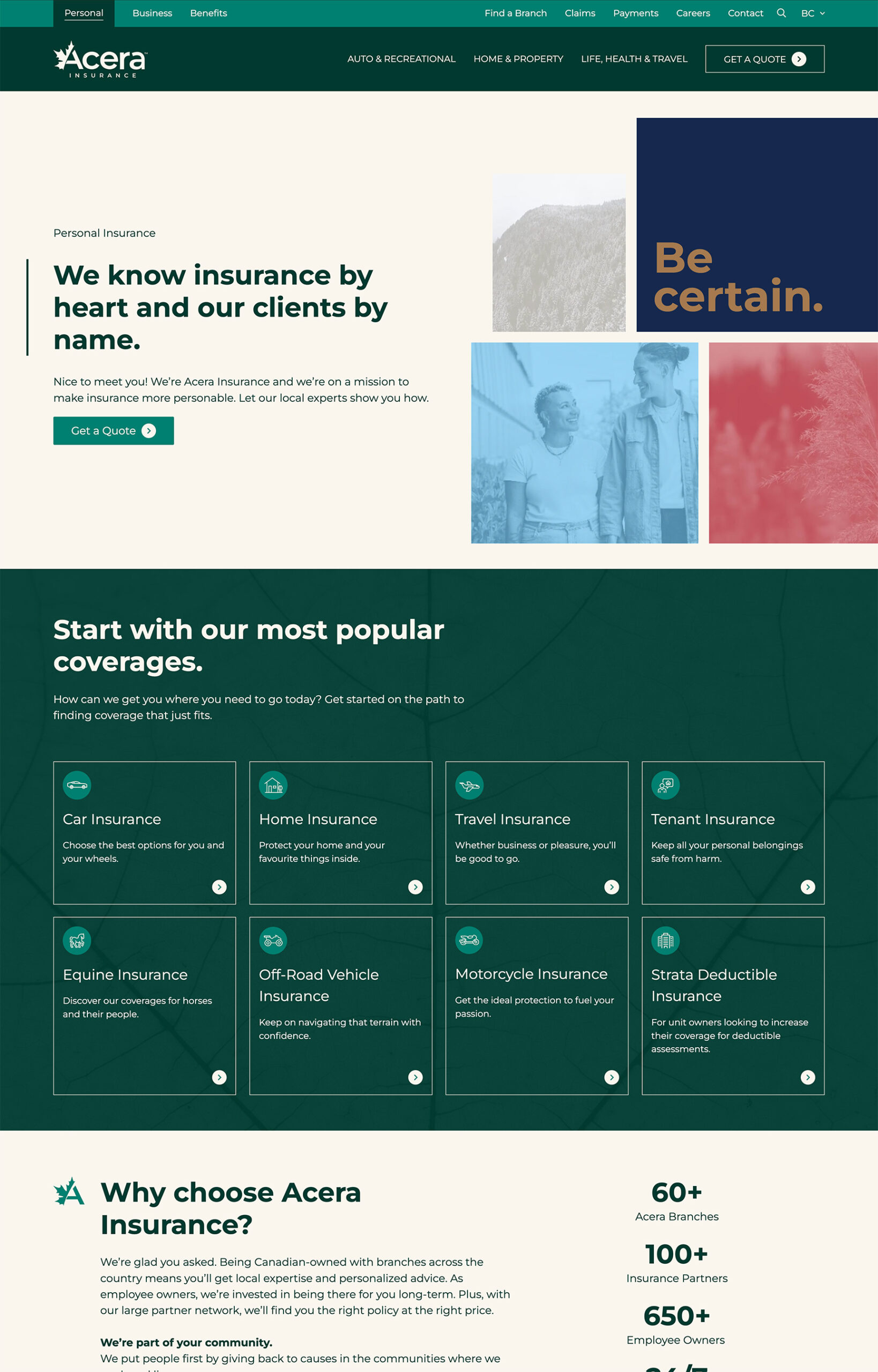
Supremely streamlined navigation.
Many insurance websites feature menus with an intense amount of options, creating an overwhelming experience for users. We knew it was critical to streamline the menu options for the new Acera site. Reorganizing and re-prioritizing hundreds of pages from multiple websites was no small feat. The architecture had to accommodate a range of user types – from individuals and businesses simply looking to get a quick quote (transactional), to larger organizations looking for a trusted partner (relational).
The site’s architecture makes it easy for new and existing customers to find their way quickly. Featuring an intuitive site-switcher that differentiates Acera’s products and services, users can drive their journey based on their needs. Whether someone is looking to renew their car insurance online, reduce the risk for their business, or provide their employees with a benefits package, the navigation directs traffic efficiently to create a streamlined path to conversion.

UX/UI Design
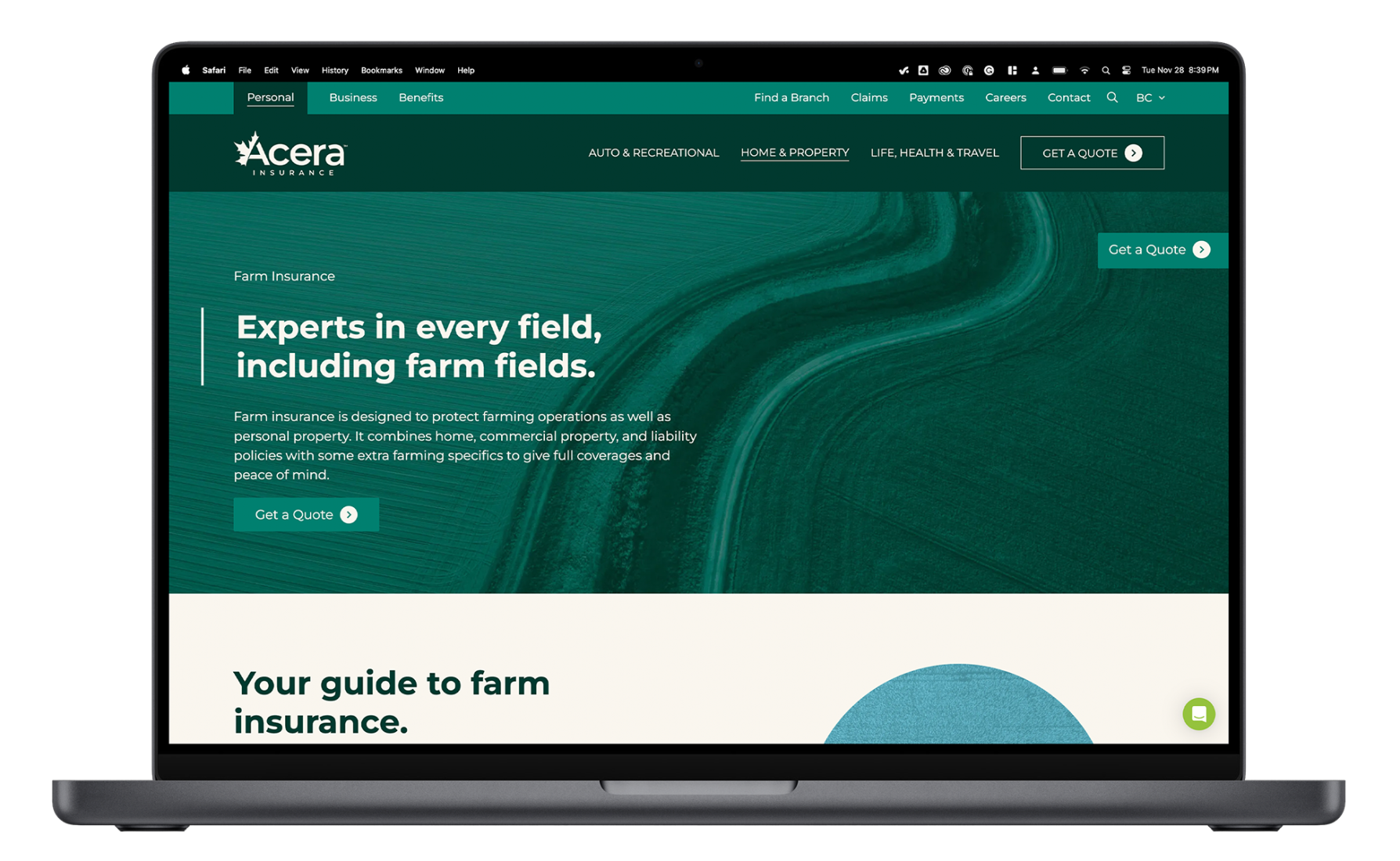
Naturally designed to be approachable.
After reviewing the competitive landscape, we found that many insurance companies did little to distinguish their brand online. If their logo was removed, it would be difficult to tell them apart. We knew Acera’s new website needed to provide a brand-forward experience to help them stand out.
With a fresh new brand in hand, Acera had a repertoire of cohesive brand assets to get the ball rolling. And with an extensive library of Canadian landscape imagery, they had a unique look that needed to be brought to life online. We sought to strike the ideal balance of form and function to ensure the site was engaging and practical to appeal to a wide range of Canadians.
Content Optimization
Writing that’s not too insurance-y.
For many consumers, the world of insurance is often confusing. Industry jargon and complex coverage details can be intimidating, and for many, insurance is seen as a “necessary evil.” We aimed to upend this pattern by crafting straightforward and personable copy. It’s professional yet friendly, conversational, and easy to understand.
Working closely with Acera’s content team and their subject matter experts, we wrote and optimized over 200 pages of insurance content for the new website. We developed a structure sitewide that is digestible and not overwhelming. Across product and service pages, we found the balance of comprehensive SEO-friendly information and concise, digestible copy. Insightful words of wisdom from Acera advisors throughout the experience add a human touch.
Development
Live on location.
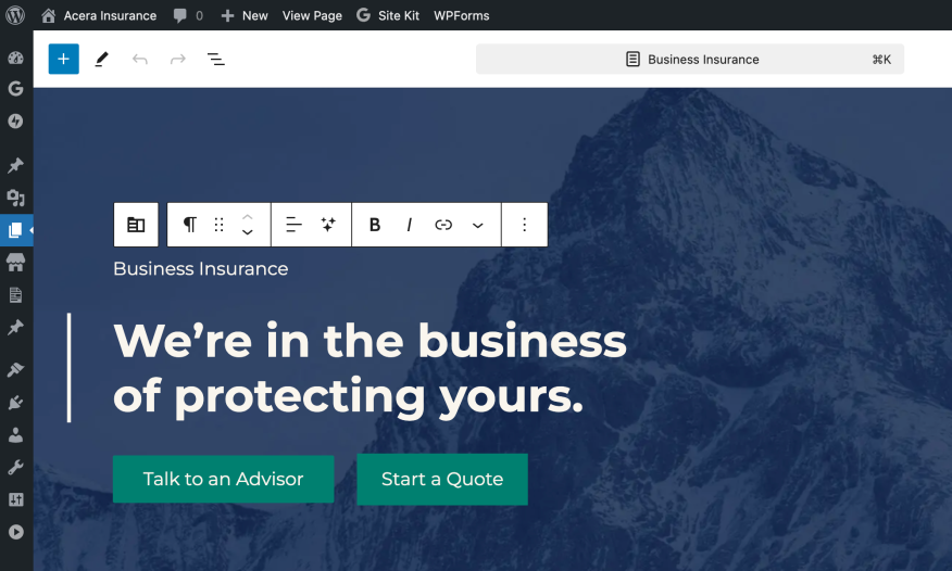
The site has several special features and functionality, including advanced custom fields and a custom quote tool that gives users a quick and easy 3-step process to start a quote. We also helped seamlessly integrate form submissions with Salesforce.
Equally crucial to the front-end user experience is creating a backend that’s intuitive for Acera’s team to make updates and add new pages. Using WordPress’ built-in block editor, Gutenberg, we developed custom page templates and blocks that put their team in control of updating the site when it matters most.

Final Thoughts
Strategize and optimize.
With our ongoing WebOps relationship, we’re continuing to add new content and features, while working to improve the website’s user experience and performance. As Acera’s go-to digital experts, we’re there for everything from quick fixes to big picture ideas. Acera has ambitious goals and we’re committed to helping propel their growth as Canada’s largest independent insurance brokerage.