Raising the bar for boarders.
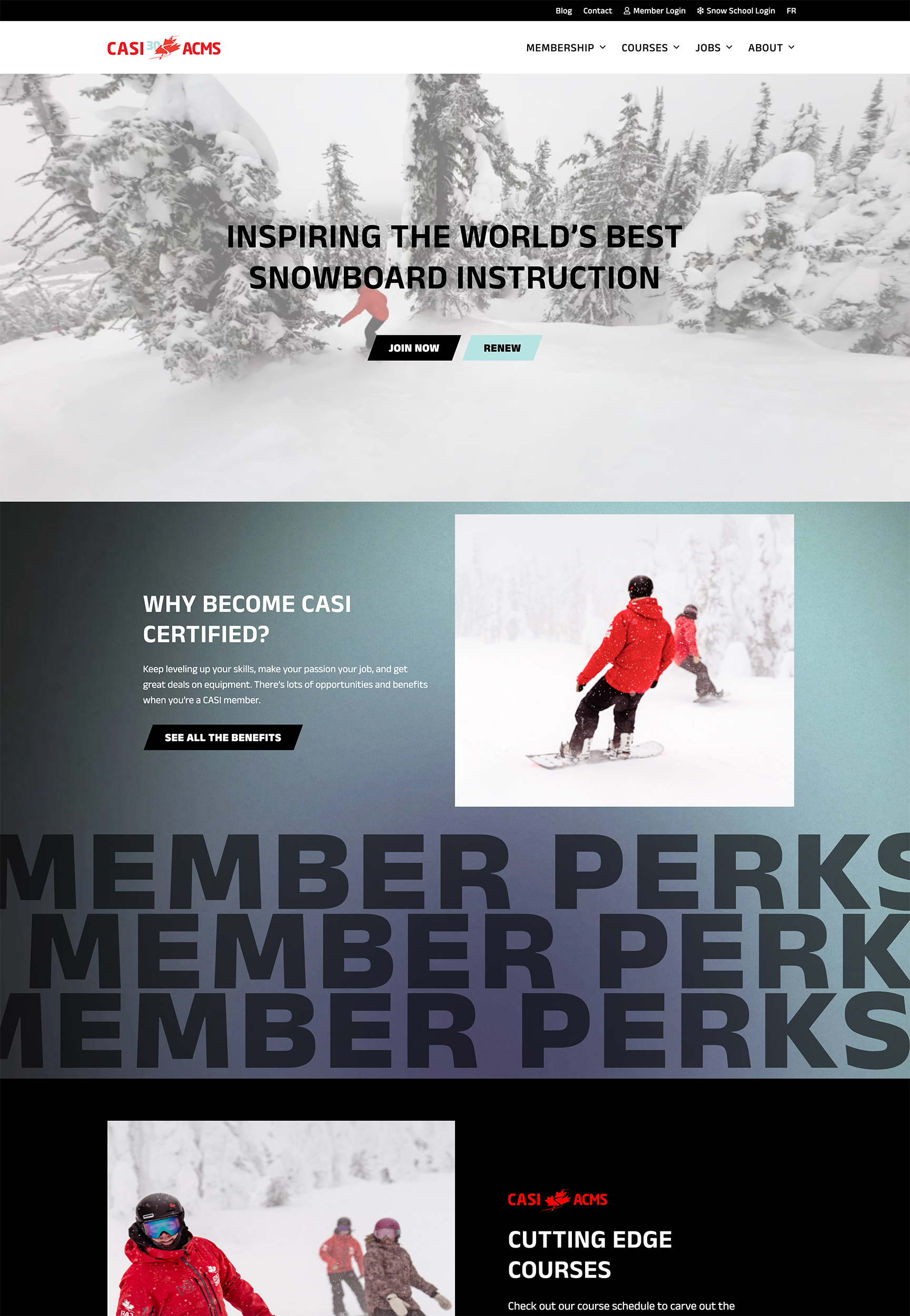

Canadian association of snowboard instructors
Teaching the next generation of snowboard instructors.
The Canadian Association of Snowboard Instructors (CASI) is a non-profit organization with members based all across Canada. As a membership-driven association, its main role is to train and certify snowboard instructors and help connect instructors with job opportunities at resorts and snow schools across the country.
CASI needed a new website to better serve current members and attract new ones, reflecting its reputation for providing world-class instruction.
Reach
- Membership of 8,000+ snowboard instructors across Canada and the globe.
Services
- Information Architecture
- Brand Refresh
- UX / UI Consulting
- Copywriting
- Search Optimization
- WordPress Development
- Web Hosting
Year
- 2024
Technology
- WordPress
- WooCommerce
- Pantheon
- WPML Multilingual
- Google Cloud Platform
Digital Strategy
Carving out a new member path.
We wanted to create a bigger and bolder site that would stand out and better reflect CASI’s personality while showcasing its educational and community-driven qualities. We also had to showcase CASI’s member value at the forefront of the experience.
To achieve those objectives, we streamlined the site’s pages. We grouped them accordingly into a cleaner and more minimal site architecture, making it easier for users to navigate and find the necessary information.
UX/UI Design
Finding fresh tracks.
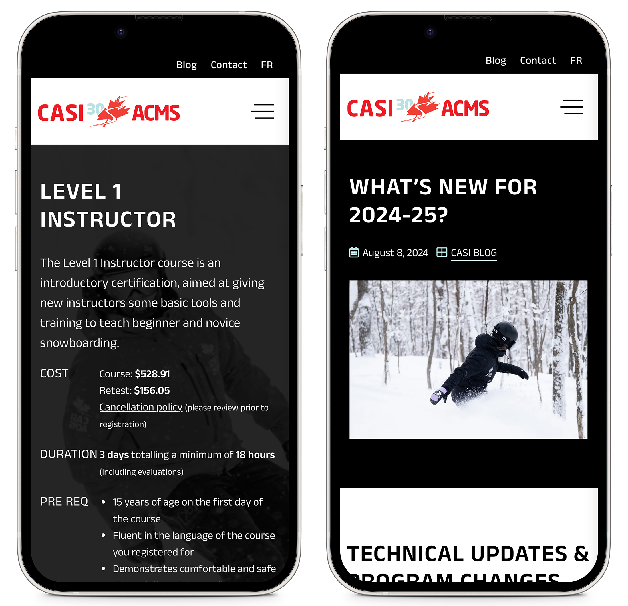
CASI’s previous site felt more corporate and lacked a clear connection to snowboard culture. So, for the updated design, we took some outdoorsy inspiration to create a clean yet energized look and feel that appeals to new and current members.
We kept CASI’s classic black and white colourway but added more of the secondary colour palette with contemporary gradients and textures. For the typography, we updated fonts and added bold, repeated phrases to heroes and headers for a more modern aesthetic. We also featured CASI’s high-quality imagery and video to bring authenticity to the entire experience.
Content Optimization
Focused on the trees, not the forest.
For content, we ensured members could easily access information, such as the courses they needed to sign up for and why being a part of CASI was a benefit. We created a tone of voice that is inclusive and encouraging while avoiding cliche snowboarding slang. Now, the content throughout the site showcases CASI’s appreciation for snowboarding and its passion for helping others develop their skills in instruction and snowboarding.
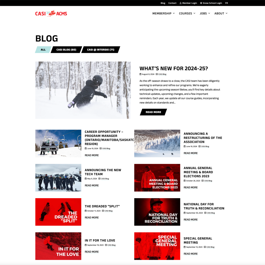
Analytics revealed that courses were CASI’s most viewed category (41% of the total page views), so we directed focus to the course pages. Each page was reimagined by prioritizing key bite-sized course information at the top and offering users more to explore as they scrolled down.
Development
Upgraded gear for a better experience.
Switching from their previous CMS (Joomla) to WordPress has given the new CASI website a much-improved user experience and solved major usability issues. We also dramatically upgraded the course schedule and instructor job board with filters and advanced search capabilities.
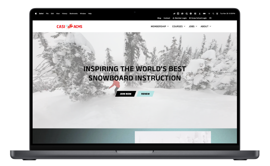
CASI has made an array of quality video content over the years, but this wasn’t effectively featured on their previous website. We seamlessly embedded rich media throughout the experience, paired with dynamic motion and animations to create a more immersive experience. Blogs from the previous CASI blog space and the Interski microsite were amalgamated into one spot. Finally, to ensure the site is inclusive for all Canadians, we utilized WPML to generate a French translation of the website.
Final Thoughts
Bringing members along for the ride.
Updating and upgrading the CASI website to WordPress sets CASI’s team up to easily make future updates and additions. On the user side, the new site architecture is now organized more intuitively so new and returning users are able to easily navigate and find what they’re looking for right away. By modernizing the content and creating a visually-driven experience, the site is also now more reflective of CASI’s passion for snowboarding and instruction.
