A digital foundation built for planners.

Canadian Institute of Planners
Powering Canada’s planning community.
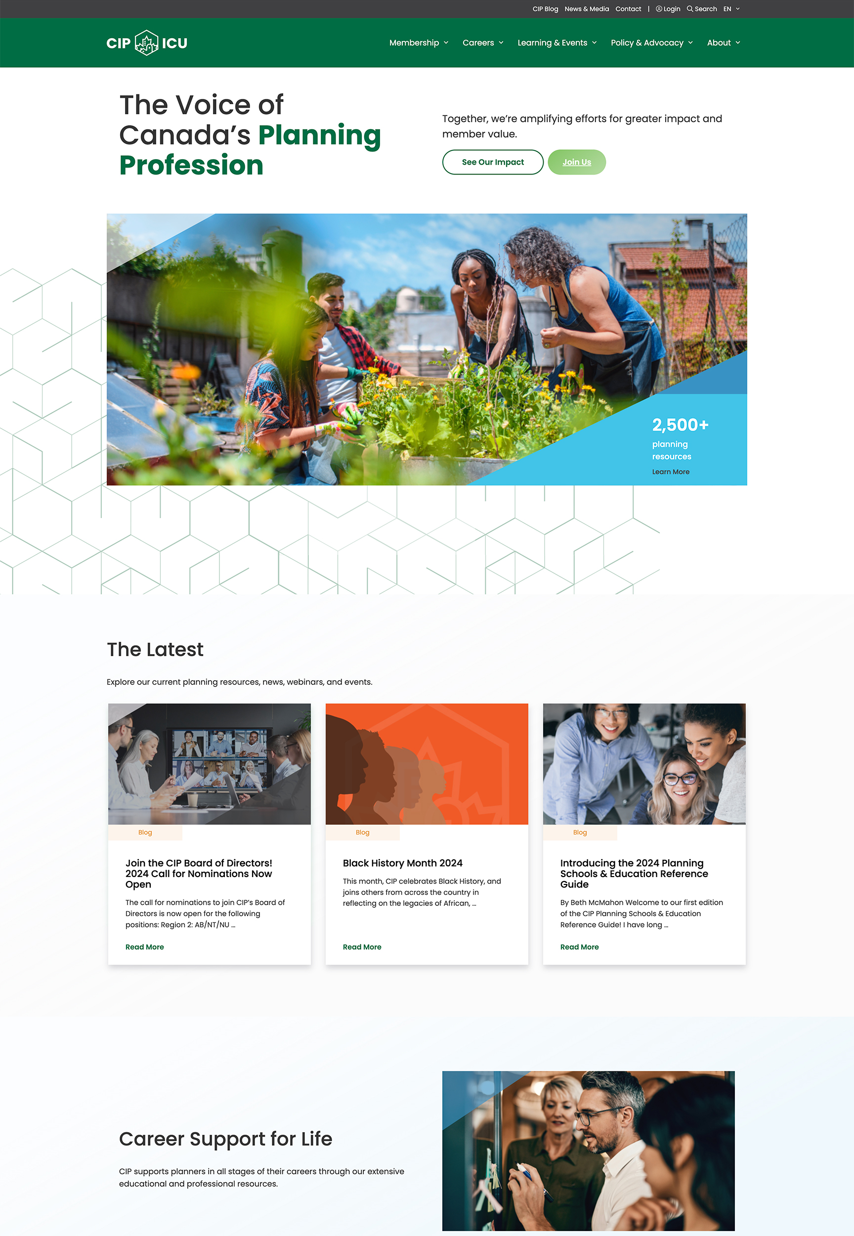
The Canadian Institute of Planners (CIP) works on behalf of over 8,000 diverse planning professionals across Canada. Their organization provides planners with critical career support, valuable resources, and impactful advocacy work.
We worked with the team at CIP to create an accessible and inclusive platform that highlights their value to new and current members—the new site positions CIP as the go-to resource for Canadian planners.
Reach
- Planning professionals across Canada and internationally
Services
- Information Architecture
- Digital Style Guide
- UX & UI Design
- Content Optimization
- WordPress Development
- Web Hosting
Year
- 2022
Technology
- WordPress
- MPower Integration
- WPML Integration
- Search WP
Digital Strategy
Creating a clear blueprint.
Armed with a new brand and an ambitious new strategic plan, CIP wanted to improve its website’s usability to create a more engaging and inclusive experience. We began by diving into their website’s analytics and reviewing other planning sites in Canada and abroad.
We found that most planning sites fail to prioritize and organize member-centric content in the navigation. With a barrage of menu options and no clear hierarchy, planning association sites often make it difficult for users to navigate the experience. We rethought CIP’s site architecture to guide a diverse group of planners at various stages of their careers and planning journeys.
UX/UI Design
Equally inclusive and progressive.
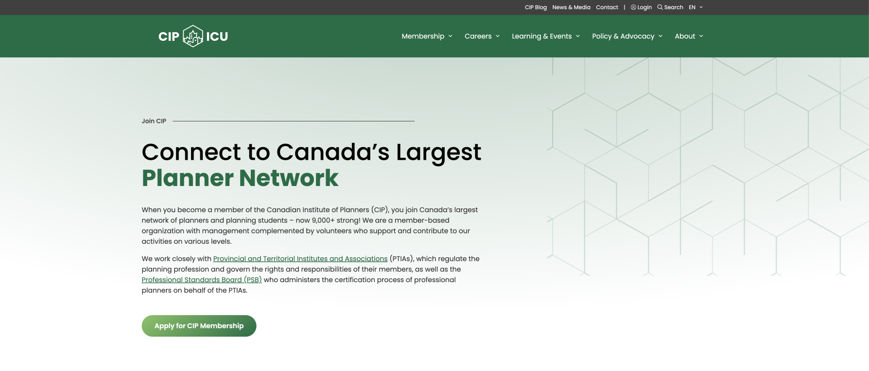
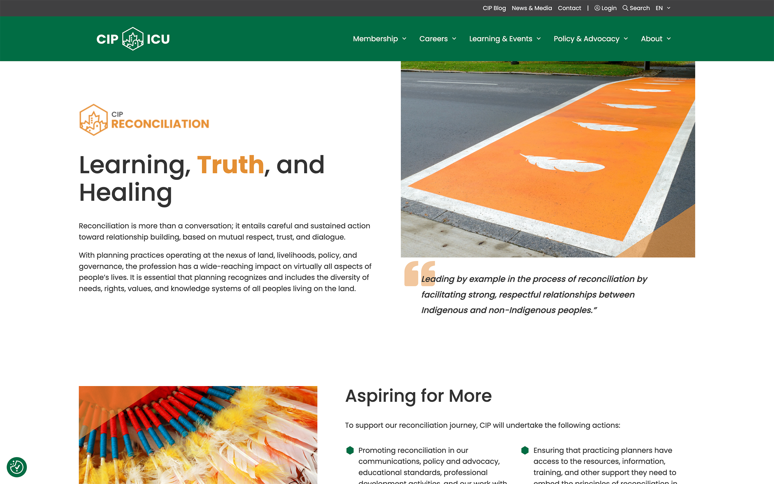
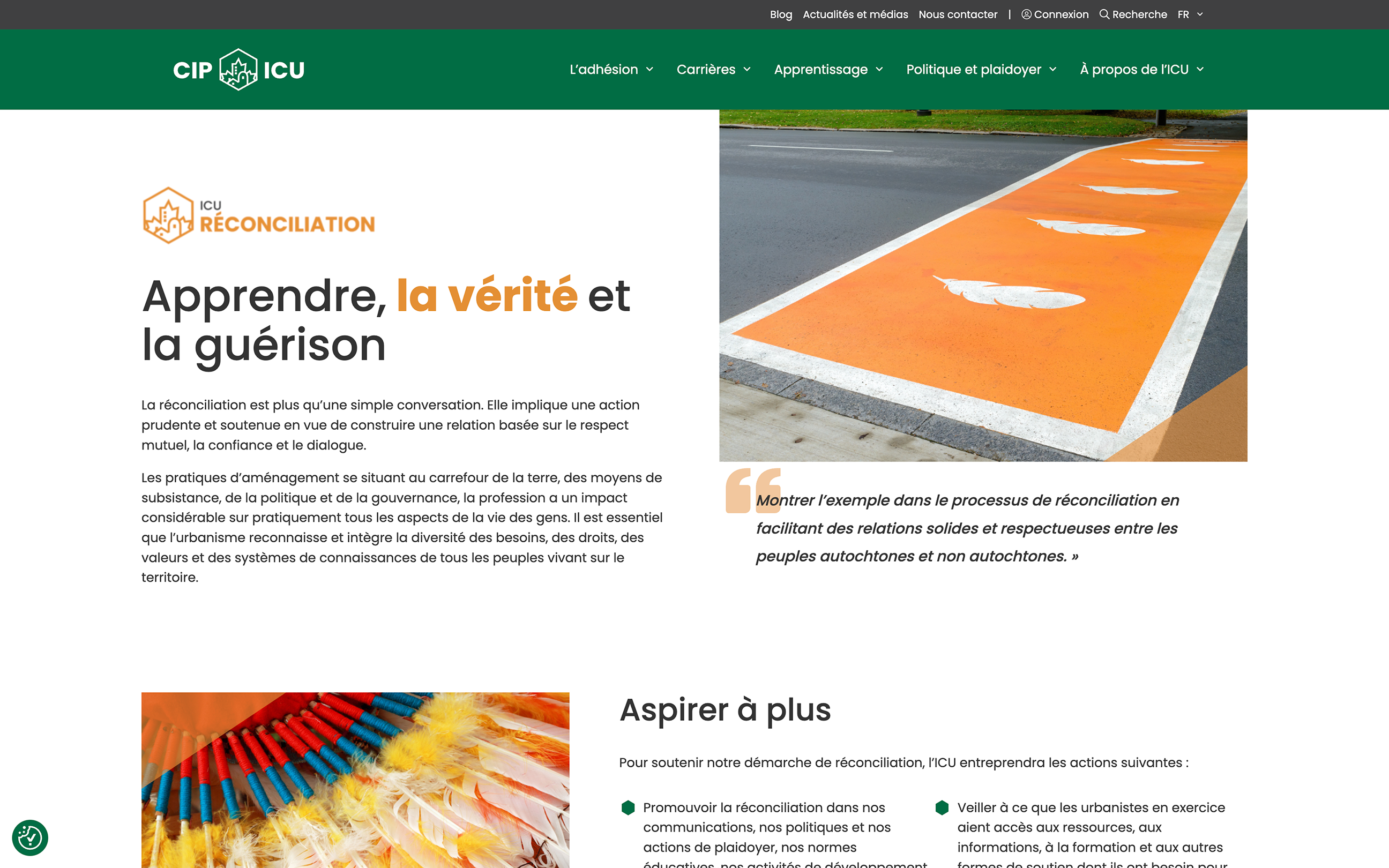
CIP’s new website reflects an aesthetic reminiscent of an architect – clean, polished and professional. When users land on the site, we want them to feel momentum and action. We also saw the potential to incorporate urban design components throughout the experience, such as the geometric pattern that represents the building blocks of community and knowledge.
Accessibility was a key focus in the design process. We distilled CIP’s core values into clear, digestible layouts, incorporating modern and accessible user interface elements. This included carefully planned tab indexes for seamless navigation via screen reader technology. We also prioritized proper contrast and thoughtfully used colour to distinguish their organization’s strategic pillars across the site.

Content Optimization
Guiding and getting to the point.
There’s a tendency among planning sites to include long sections of text with no visual breaks. Organizing content into bite-size sections on the new CIP site went a long way to making content more readable and web-friendly. With a variety of content types and interactive elements, provide users with scannable information and guide them to dive deeper if they choose.
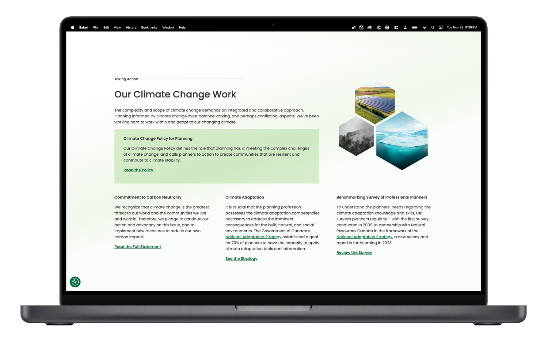
CIP’s tone of voice is concise, familiar, active and forward-looking. To support their members, add value to the planning ecosystem, and advocate on important impact issues, the content is clear and compelling. The advocacy pages, for instance, provide a captivating content structure that communicates CIP’s role in tackling complex issues like climate change.
Development
Advancements across the entire experience.
A key focus for CIP was improving site performance across key metrics such as page speed and mobile friendliness. We also recommended a suite of integrations to improve usability and content management.
This included using WPML to create a French translation of the website’s content and custom post types for their learning resources. It also included incorporating SearchWP to improve search functionality, enabling users to perform advanced searches on CIP’s resources, blogs, and news content.
Final Thoughts
Everything needed to plan for the future.
Analytics data from CIP’s previous site showed that only a small percentage of users were returning to the website after their initial visit. However, these returning users spent twice as long on the website as new users. We saw this as an opportunity to keep users coming back by building a member-first platform with undeniable value. CIP is now set up to keep users engaged by making timely site updates with ease.
