Feeding a brighter future.


Goodr
Tackling food insecurity with technology.
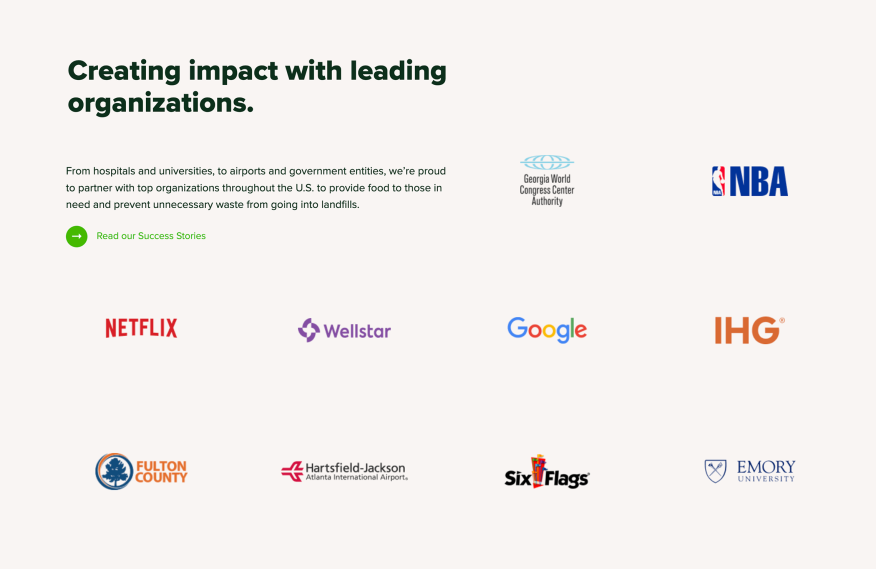
Based in Atlanta, Goodr’s world-changing business model leverages technology and logistics to reduce waste and fight hunger. They partner with major organizations like Google, Netflix, the NBA, Wellstar, and SixFlags. They’ve been featured in well-known media like Forbes, NPR, Fast Company, and CNBC.
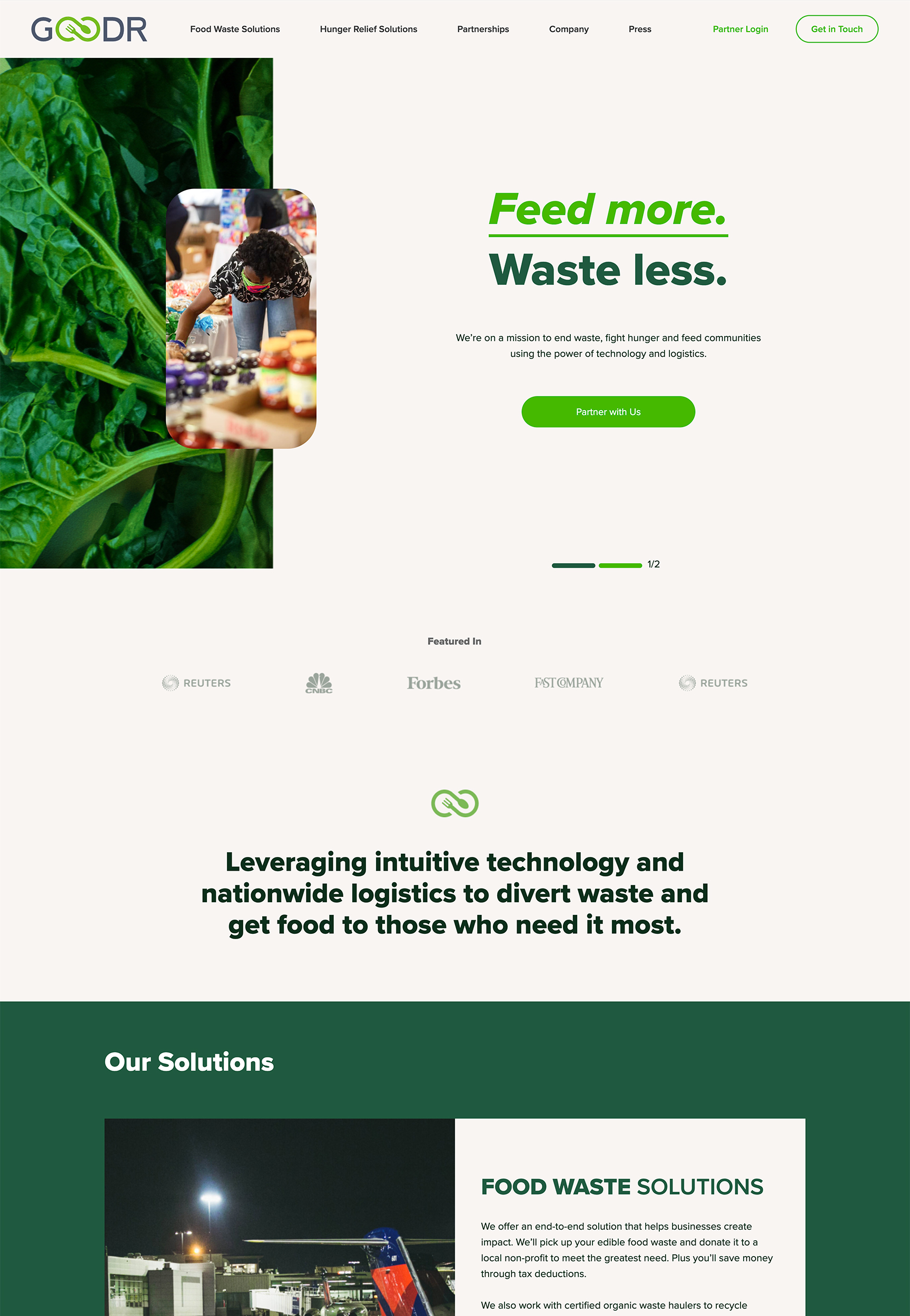
We developed an enterprise-level website to communicate the benefits and impact of their solutions. Ultimately, our goal was to help position them as a nationwide social enterprise powerhouse.
Reach
Services
Year
Technology
Digital Inspiration
Motivated to elevate the experience.
R/GA’s Coalition Venture Studio provided the initial design for the new site. With this solid foundation in place, we highlighted opportunities and ideas to bring the design and content to life. We focused on recommendations that would lead to a modern, dynamic and intuitive user experience. Since Goodr seeks to partner with some of America’s largest organizations, we knew the site needed to be on another level.


Site Architecture
Educate, inspire, empower.
Before we could proceed creatively, we mapped out a game plan for the site’s architecture and navigation experience. Our planning focused on three big-picture objectives:
- Educate — Provide users with well-organized, easily digestible knowledge about the benefits of the Goodr model.
- Inspire — Create dynamic interactions and animations that compel Goodr’s audience to engage with the content.
- Empower — Focus on clear calls-to-action that direct various users to reach out to partner with Goodr.
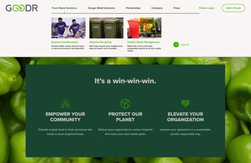
We rethought the sitemap to prioritize core services for their Food Waste Solutions and Hunger Relief Solutions. This led to a beautifully organized menu with meaningful visuals and powerful descriptions for each page.
Designed to drive action.
We developed their site with purposeful, dynamic movement to convey that Goodr is an active, future-minded organization. Whether it’s scroll animations, interactive elements, or seamless video integration, it all adds to a more engaging experience.
Goodr provides advanced technology that allows companies to track pick-ups and impact. We showcase their impressive technology in a meaningful way to create intrigue and show that Goodr is more than just a feel-good story—they have next-level tech to back up their solutions.
With thoughtfully placed calls to action and user feedback elements, the experience directs traffic and encourages users to connect with Goodr. We developed a series of non-intimidating forms to allow various users to choose their path and direct their inquiries to the right person on the Goodr team.
Content
Communicating what makes Goodr great.
With plenty of press coverage, Goodr became known for its Surplus Food Recovery service. This amazing solution allows organizations to donate surplus food that would otherwise end up in landfills to those in need while gaining tax deductions and reducing their carbon footprint.
But Goodr has more than one solution to fight hunger and reduce waste. They also provide recycling, full-scale waste management, and various partnership opportunities to feed communities. We worked closely with the Goodr team to develop content communicating the unique benefits of their seven different services. We also created the platform for Goodr to show real impact through their success stories.
The content had to appeal to various audiences, including large corporations, airports, convention centres, universities, sports teams, non-profits, and potential Goodr employees. We developed simple but powerful messaging that cuts through.

We love the final product and have already seen a 12% decrease in bounce rate, 26% increase in pages per session, and 55% increase in average session duration! The new website changed the face of our brand, increased clarity in our partnerships process, and turned up the confidence of our whole growth team.
Blake Engelhard, Head of Growth, Goodr
Collaboration across borders.
The shift to an even more digital world has made these time zone crossing projects more routine. This project required incredible collaboration between three teams: Goodr in Atlanta, R/GA’s Coalition Venture Studio in New York, and the Twirling Umbrellas team here in Kelowna. With shared digital tools and plenty of virtual meetings, we were able to come together to make the vision a reality.
We’re so proud to have the opportunity to work with Goodr and play a part in highlighting the amazing work they’re doing. If you’re interested in supporting Goodr’s fight to end hunger, you can donate to the Goodr Foundation here.
