Enhanced UI for surging Salesforce experts.

Groundswell
Leading the next wave.
Groundswell needed an elevated digital platform to communicate the depth of its experience to prospective clients. It also needed to showcase its unique culture and highlight career opportunities to attract top talent.
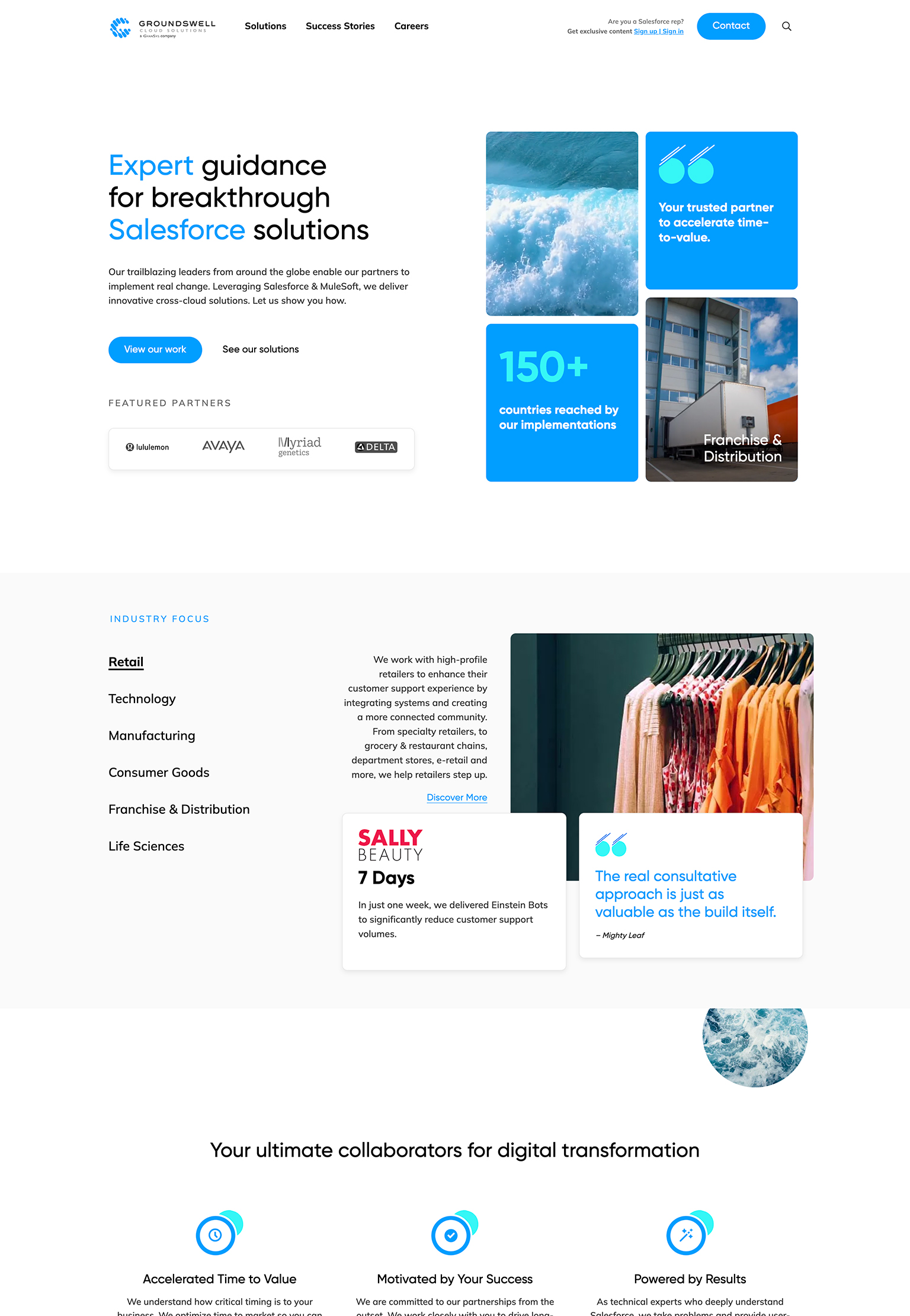
We developed a powerful, custom website that positions them as a trailblazing leader in the Salesforce space. The new site features engaging user interfaces, compelling content for their technical and industry expertise, robust case studies, and an exciting new career area.
Reach
- Implementations in 150+ countries.
Services
- Information Architecture
- UX & UI Design
- Copywriting
- Development
- Web Hosting
Year
- 2022
Technology
- WordPress
- Salesforce Integration
- Lever HR Integration
- Google Cloud Platform
- Pantheon
UX Planning
The digital vision to create impact.
We kicked off the project by taking a deep dive into the consulting environment. We reviewed Groundswell’s strategic docs and audited their current website. Once we got to know Groundswell and its industry better, we defined key objectives and explored the competitive landscape. We compared the user experiences of Groundswell’s various competitors to identify common trends and market gaps.
Reviewing Groundswell’s on-page analytics and HotJar recordings, we determined how users were experiencing the current site and where they were dropping off. We also compiled SEO insights for organic traffic and search. With this research, we outlined the opportunities and inspiration that informed the site’s architecture, design, and content.
Experience Design
Undeniably enterprise-level.
From micro-interactions to major design elements, the redesigned site’s experience needed to reflect the quality of an elite enterprise-level business. With a clean, innovative, and vibrant aesthetic, we aimed to strengthen Groundswell’s reputation, intuitively guide various audiences, and increase quality conversions.
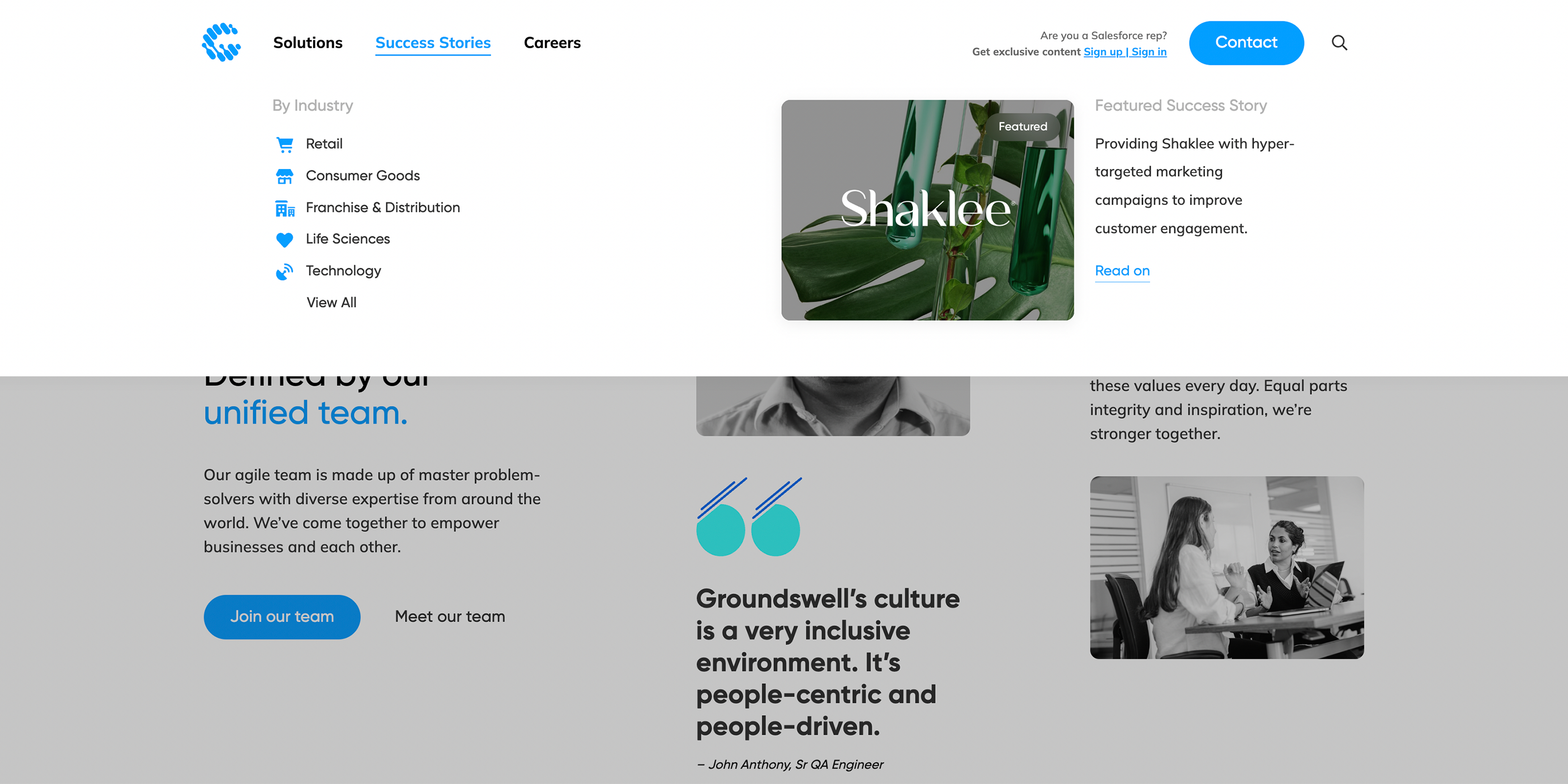
We focused on simplifying the site’s architecture and user flows, improving navigation, filters and search, and wayfinding elements to direct users to the most relevant content faster.
Overall, the new site had to be easy to navigate, with well-organized, visually driven content and dynamic movement. This creates an on-brand experience that amplifies Groundswell’s position as an advanced, agile, trustworthy partner.
User Interface Design
Designed with variety and authority.
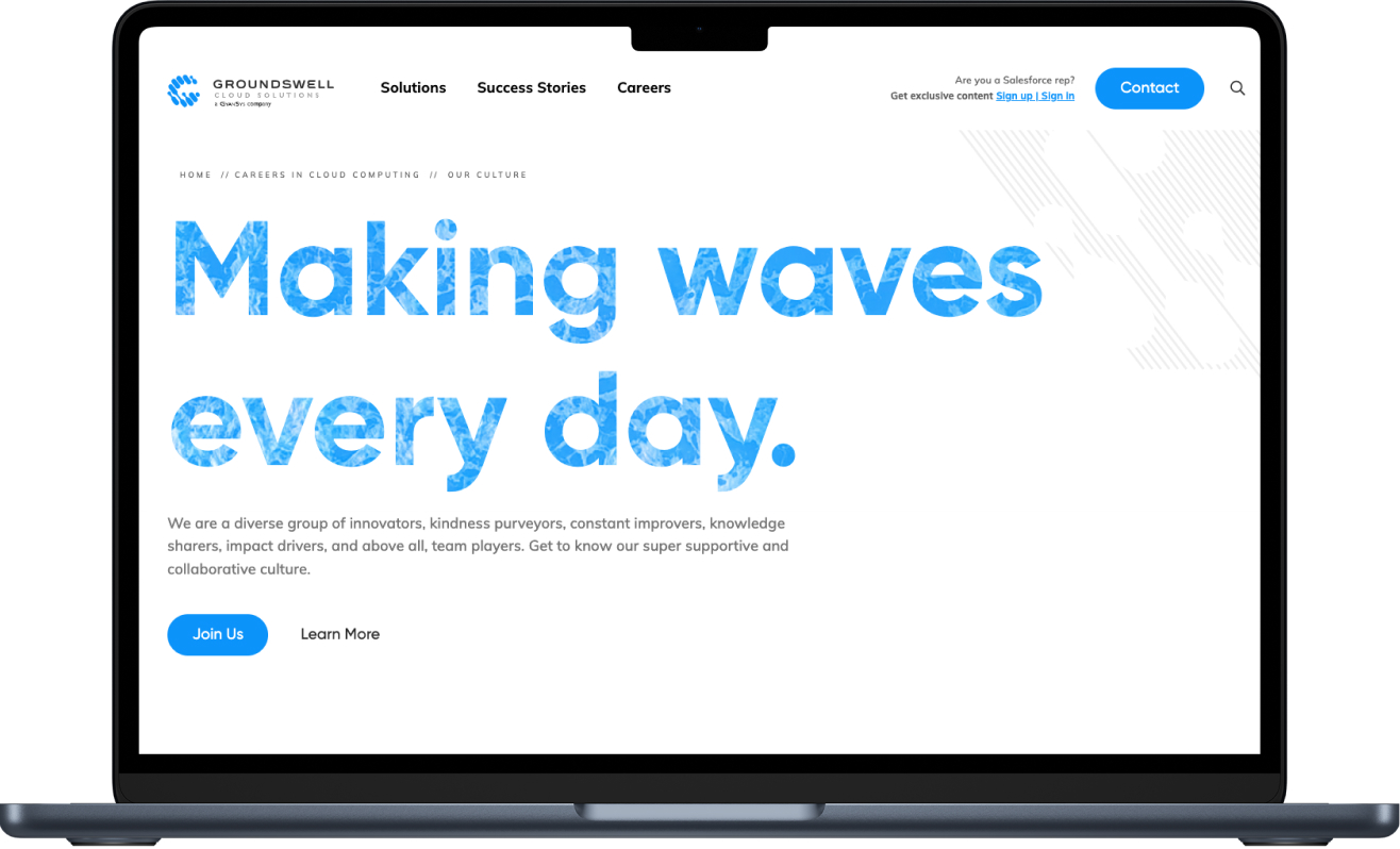
It’s not enough to simply say “innovative”. We had to demonstrate this through contemporary layouts and bold design choices. The progressive design showcases an innovator on the rise. Visual-forward content breaks free from basic formulas while integrating various media types. Waves and ocean imagery throughout the website capture the feeling of momentum that a groundswell carries.
Content Strategy
Brevity and depth in harmony.
We worked closely with Groundswell’s marketing team to establish a concise, confident, approachable, and knowledgeable tone of voice (but not overly technical). To build customer trust, we found the ideal balance between quick wins communicating their team’s proficiency and longer-form content demonstrating leading expertise in greater detail.
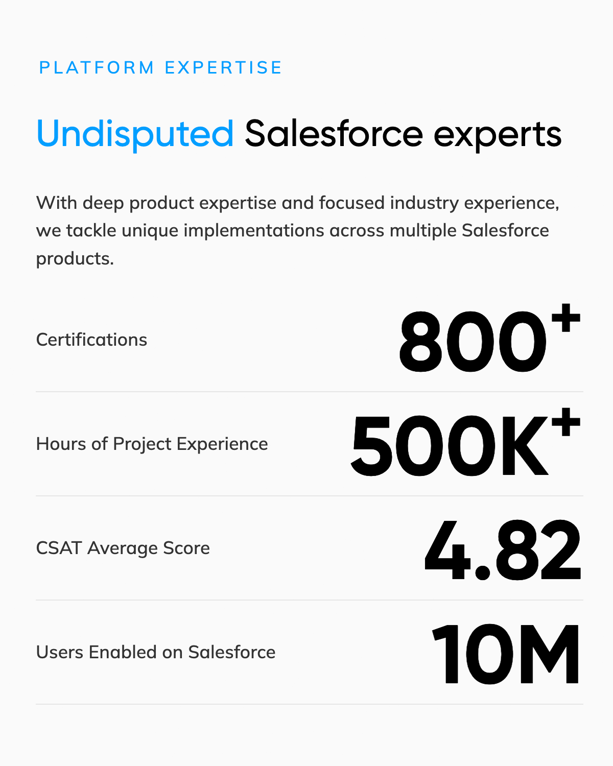
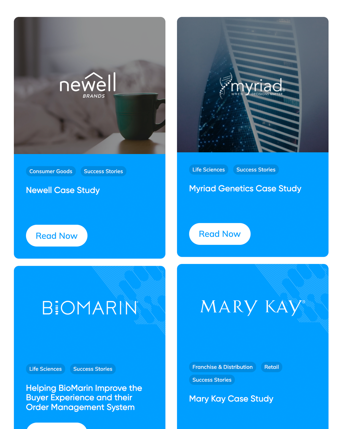
Stats, results, certifications, and testimonials work together to quickly instill confidence. Meanwhile, case studies and expertise pages provide easily scannable yet highly detailed content that proves Groundswell’s knowledge.
Content Creation
Conveying the culture.
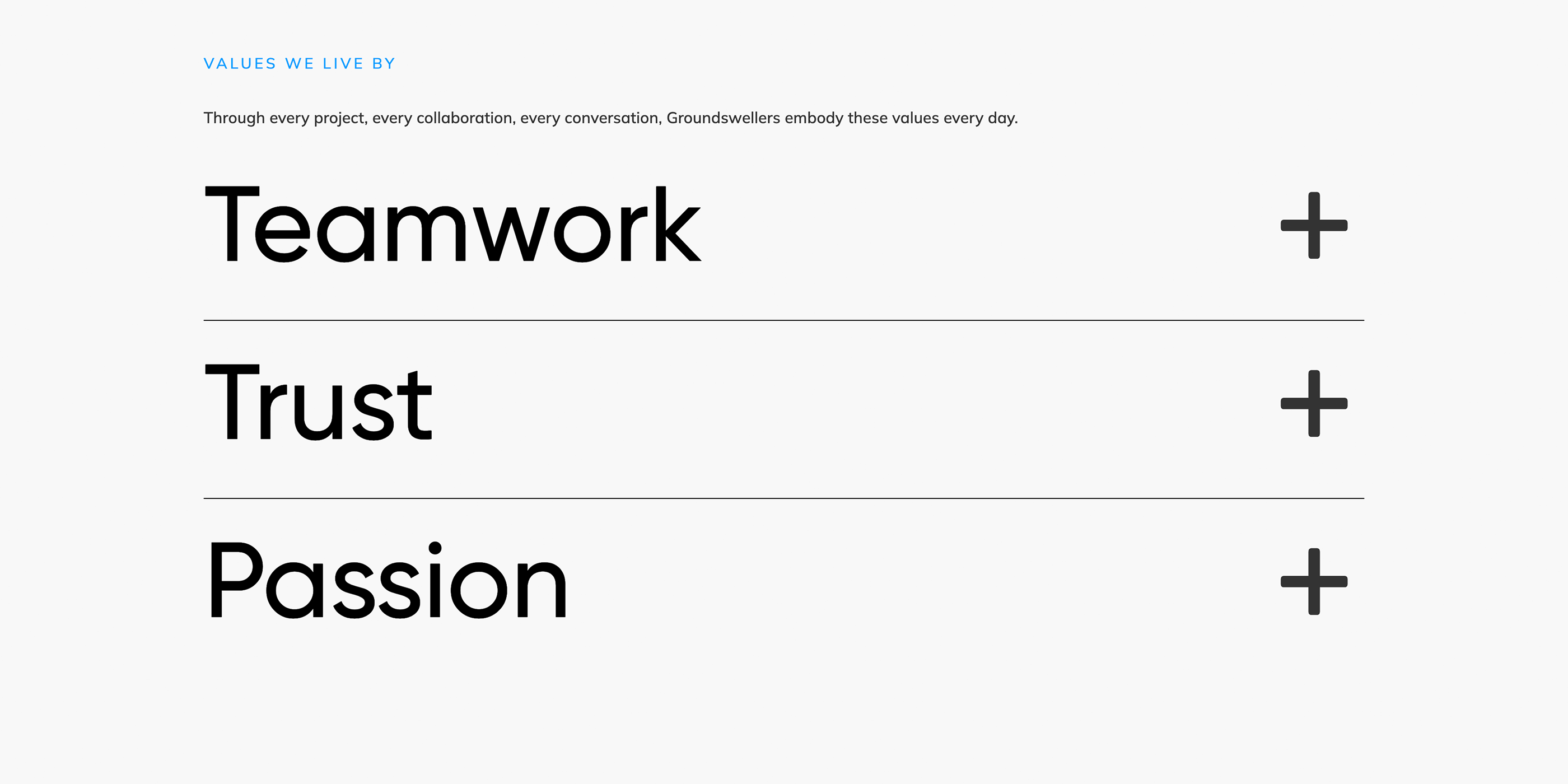
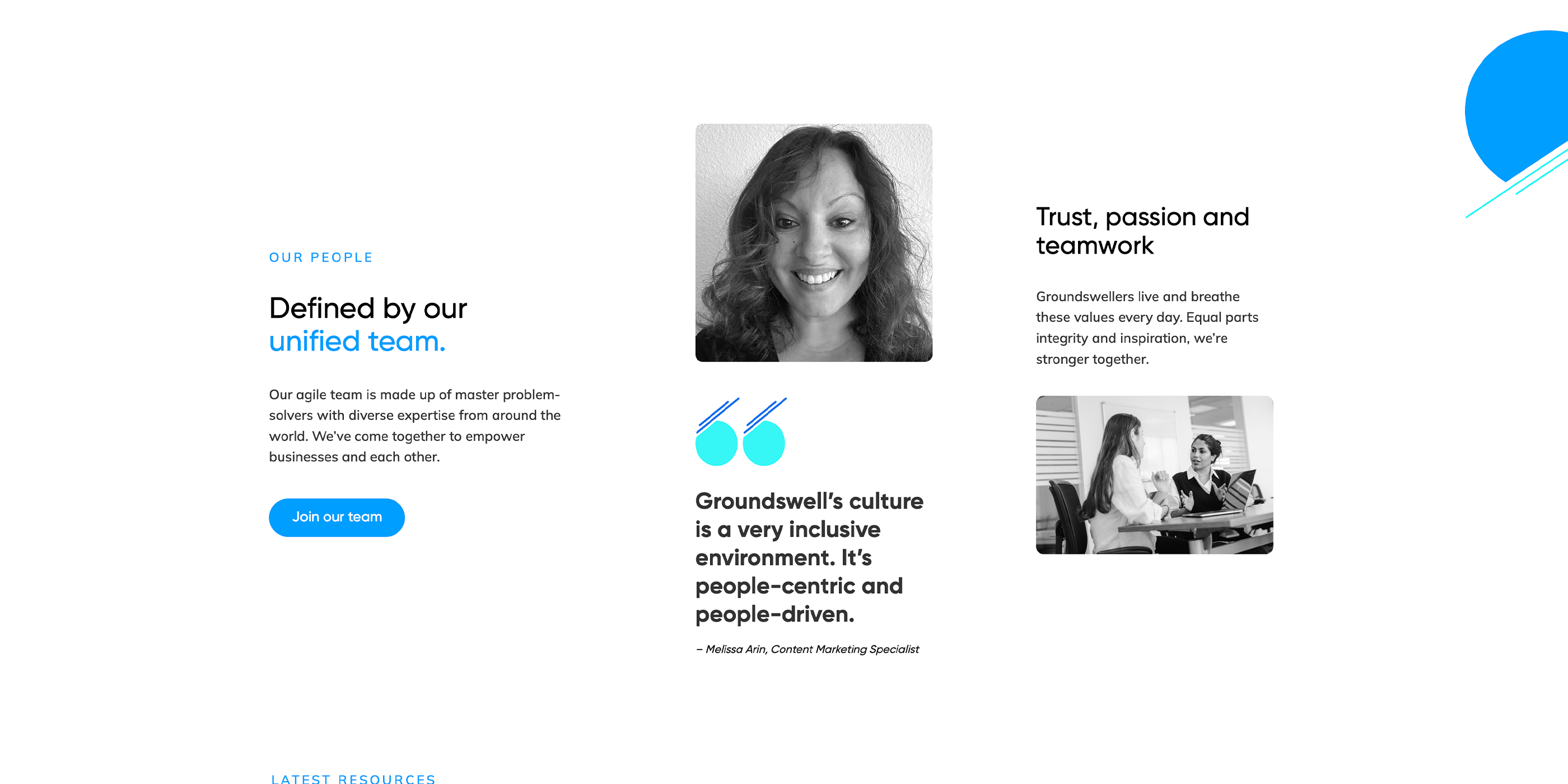
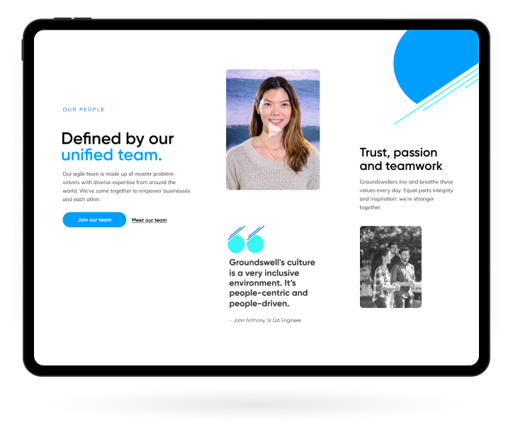
Groundswell is growing fast. They needed a space on their new site to communicate their supportive and collaborative culture. To help them recruit top talent, we created an online Culture Playbook. This robust page provides a glimpse behind the scenes of life at Groundswell by highlighting their people, goals, values, and community impact in a fun and engaging way.
Custom Features
Extras that take it over the edge.
Beyond making a site look awesome, it has to perform at a high level, too. As part of the development process, we focused on key performance metrics to reinforce the high-end experience. We ensured that the site had no drop-off in the quality of experience from desktop to mobile. We also ensured that the site loaded fast and got users to where they needed to go quickly.
Custom Animations
Dynamic interactions, all day.
When website elements react in modern, professional and delightful ways on scroll and hover, it’s beautiful. Smooth, branded animations support the unique variation in design and content. These animations compellingly present content, making the site feel alive and emphasizing always-important CTAs.
With their HQ in Vancouver, the Groundswell team comprises individuals from all over the world. To showcase the diversity of their international team, we developed an interactive map that features places across the globe where Groundswellers have come from.
User Portals
Custom portal for Salesforce reps.
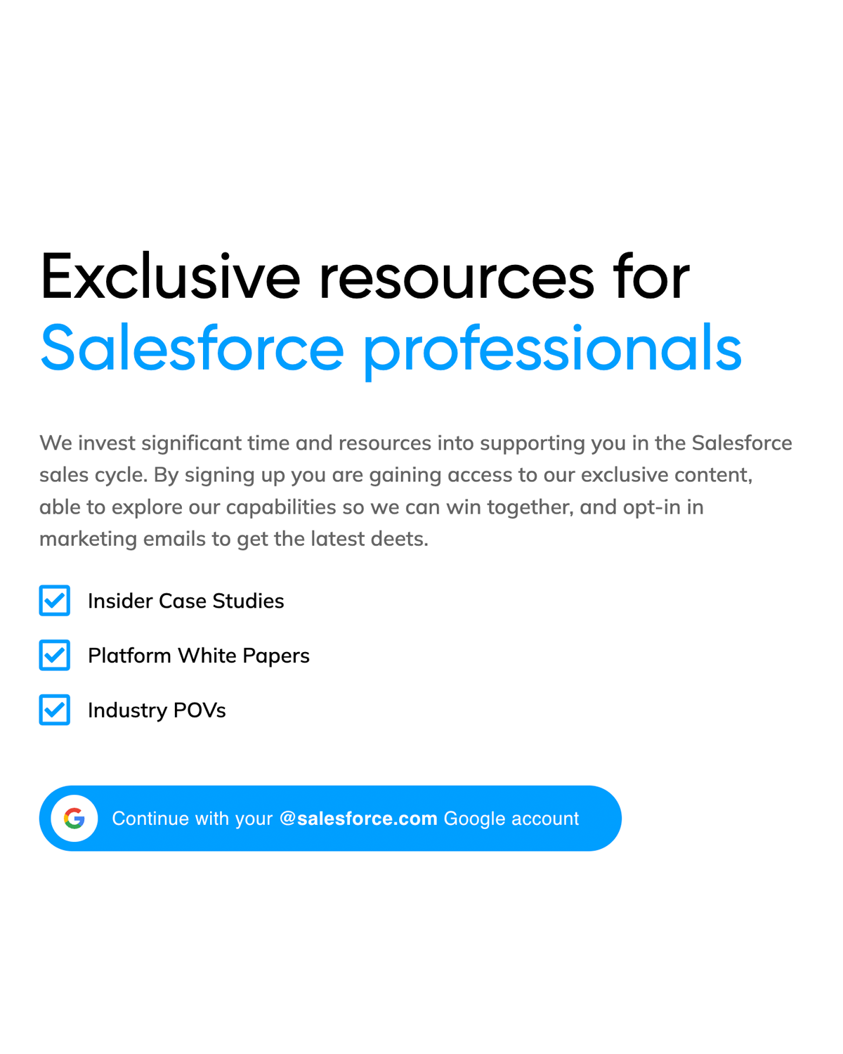
Groundswell works closely with Salesforce reps on new business opportunities. They needed a secure place to house content that only Salesforce employees could access. We developed a landing page and password-protected portal featuring organized resources and exclusive assets. This feature helps to separate Groundswell from the thousands of other consulting partners that Salesforce reps have to choose from.
Final Thoughts
User goals lead the way.
Groundswell’s ultimate goal is to serve as a role model in the industry that top companies and top talent seek to partner with. To dig into this goal, we conducted user interviews with Groundswell’s various user groups, uncovering their pain points and priorities for the site. Focusing on users’ needs gives us a north star to keep coming back to again and again for important UX decisions.

