Refreshing a site with real influence.

Jillian Harris Design Inc.
Say hello to Jilly.
Jillian Harris publishes amazing content that’s highly sought-after by fans and followers. It ranks well in search engines, has a strong brand, and has a clear aesthetic. But in spite of this, the previous website was coming up short in key metrics such as bounce rate, page views and time spent on the site. We worked closely with the incredible Jillian Harris team to improve the user experience of their ultra-high-traffic website while elevating performance and mobile-friendliness.
Reach
- Millions of fans.
Services
- WordPress Development
- Search Optimization
- Web Hosting
- WebOps
Year
- 2021 — Present
Technology
- WordPress
- Pantheon
- Google Cloud Platform
- RewardStyle Integration
- Shopify Integration
User Experience
A mega first impression.
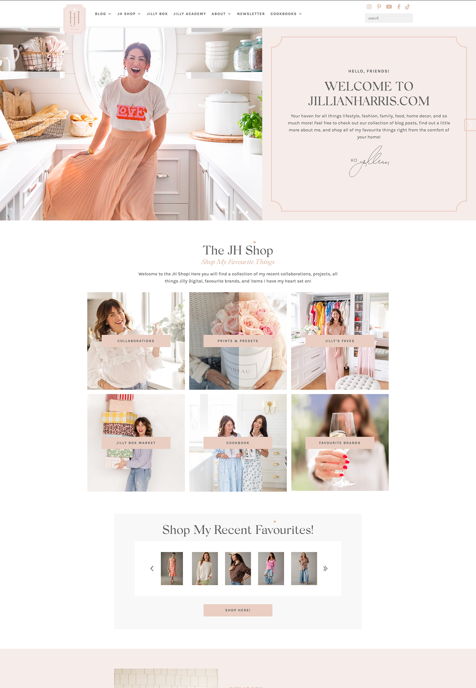
By redeveloping the website as a custom theme on WordPress, we were able to make several major improvements to the user experience. Overall, we streamlined the user’s journey by making it easier for Jilly fans to find what they’re most interested in.
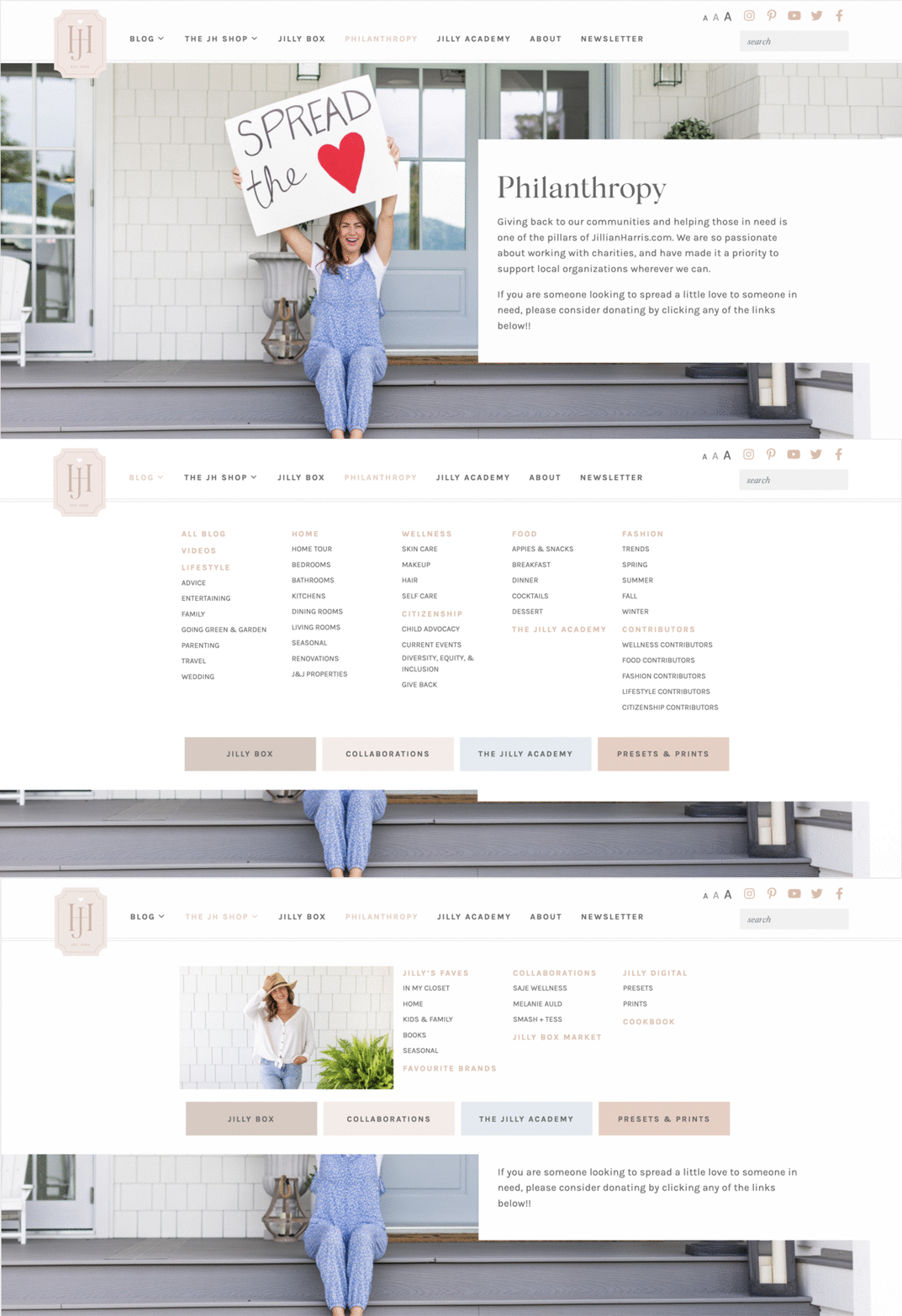
Most noticeable is the reworked navigation, which features a well-organized mega menu that allows users to quickly jump to their favourite content categories and seamlessly navigate throughout the site.
The previous site was call-to-action heavy, with multiple repetitive callouts peppered throughout every page. By contrast, the new site is much more intentional with callouts, so users are directed to meaningful, relevant pages based on their current path.
WEB DESIGN
Blogging that’s even more beautiful.
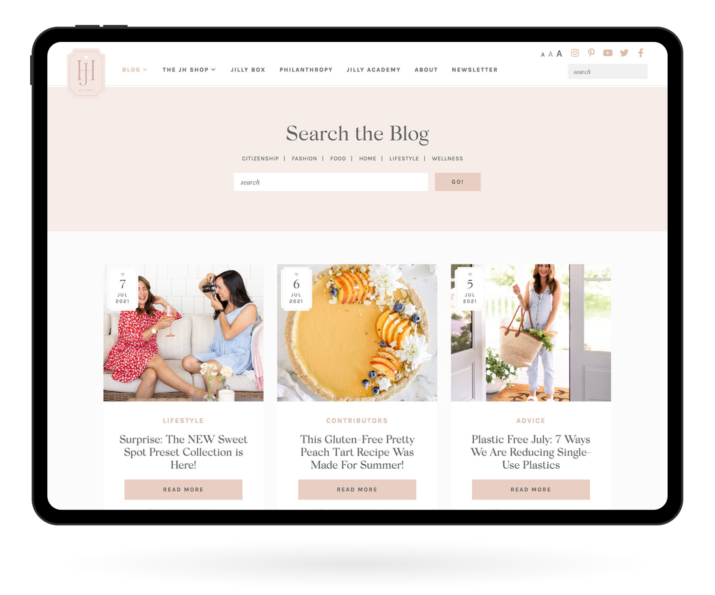
When you have over ten years of blog content to sort through, thoughtful organization is definitely a top priority. To make things more natural to navigate, we revised and narrowed down blog categories. A prominent search feature puts the main blog categories front and center, while category-specific pages like this one add visual interest and allow the user to narrow down their search more quickly.
The main blog has a classic view and yearly and monthly archives, so users can see what’s fresh today and what was fresh a decade ago.
Responsive design
Mobile-first, last and everything in between.
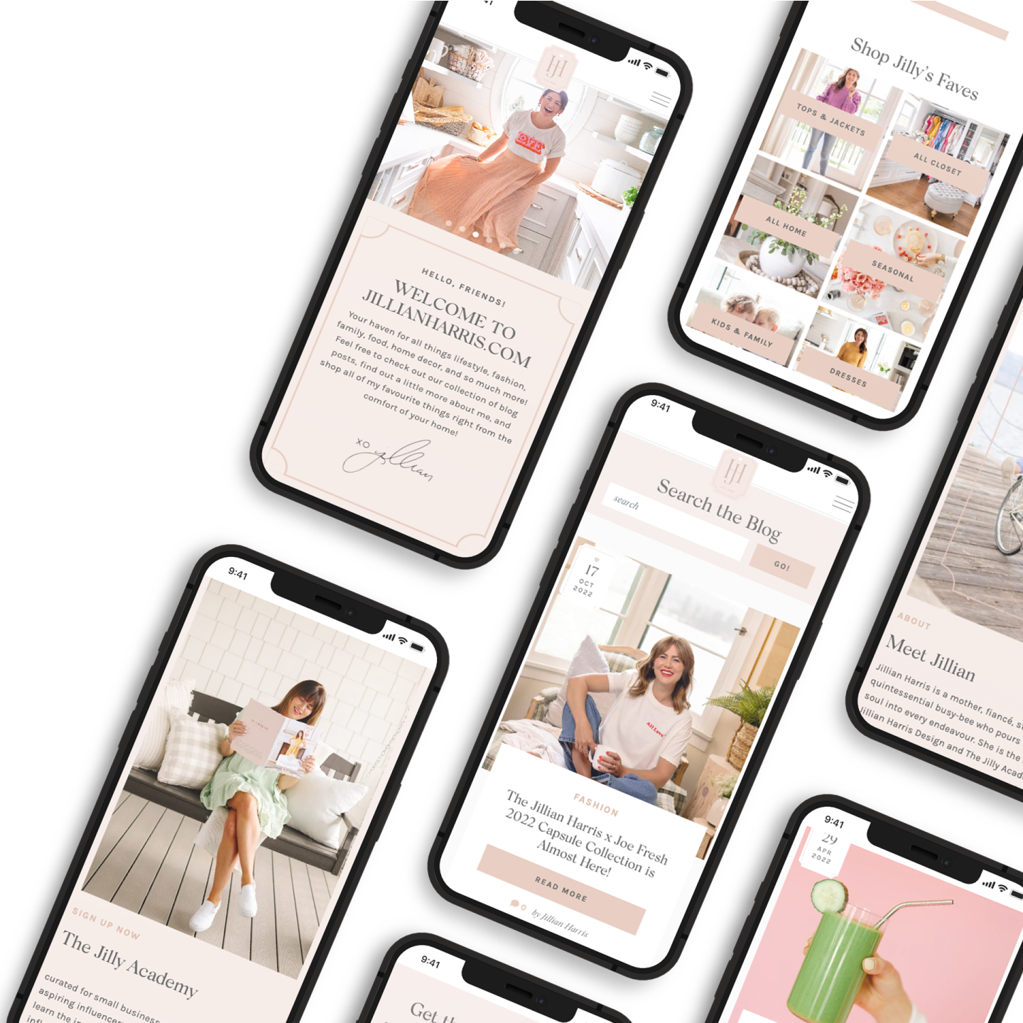
The majority of the original website was designed for a desktop experience, which carried over to the mobile version. With mobile usage representing almost 85% of the site’s users, we knew it was vital to put the mobile experience first. We improved elements like the navigation, sharing links, and articles with larger text, and a more touch-friendly interface. The new site has never looked better on phones!
Website Optimization
High-volume handled with ease.
Needless to say, the Jillian site needed to be configured to handle a large volume at any given time. Redeveloping the website as a custom theme with optimized code, removing unnecessary plugins, and migrating to an advanced serverless hosting infrastructure powered by Google Cloud Platform greatly improved stability, scalability, and responsiveness.
Marketing campaign
12 days of [many] Christmas [visitors].
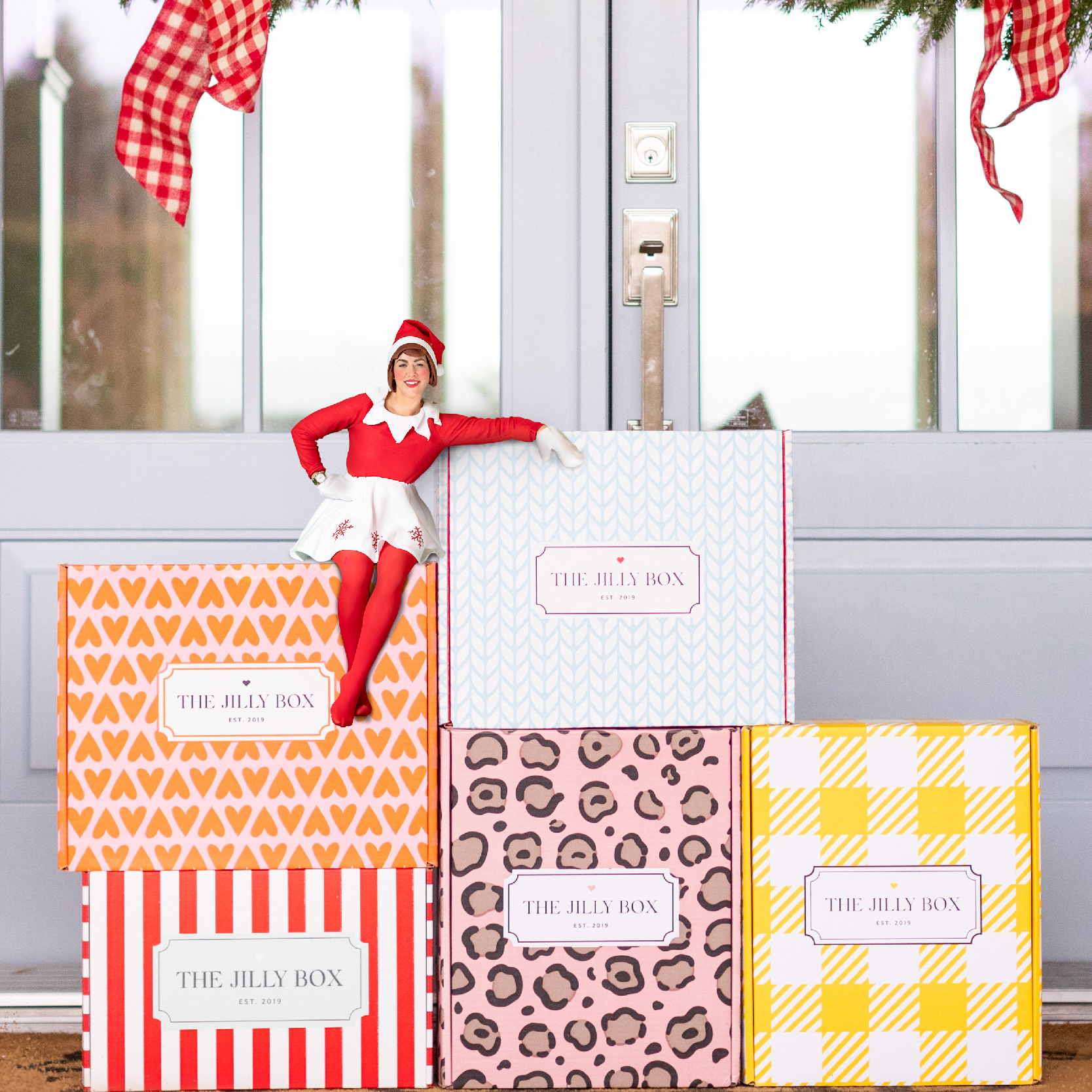
We created an additional custom site for the JH team to publish a giveaway for each of the 12 days of Christmas. We made sure this microsite was seamlessly integrated into the main site. With amazing daily giveaways like a Hawaiian Vacation, a King-sized bed, and diamond earrings, we expected a lot of traffic. But we couldn’t imagine this much!
Social Proof
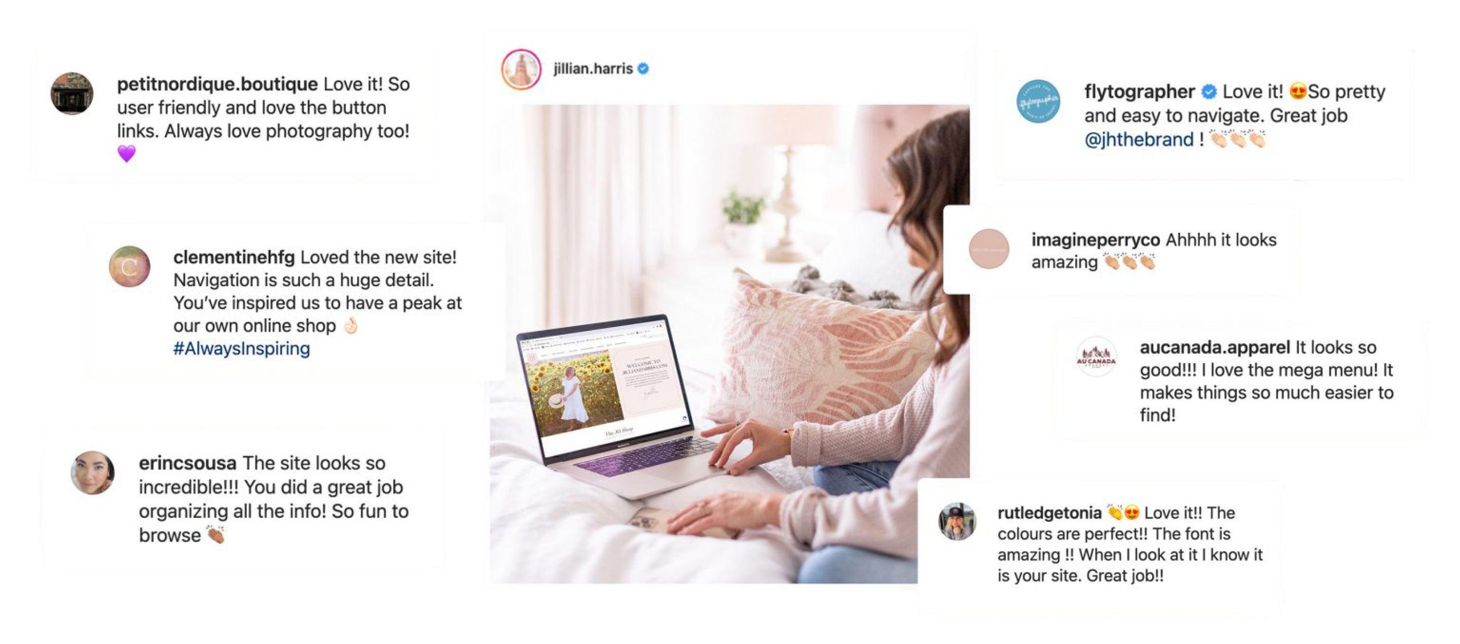
Rave reviews on Jillian’s new website.
Jillian Harris’s website redesign has sparked a wave of accolades. It blends style with seamless functionality that resonates deeply with her audience. The intuitive experience and vibrant design have drawn glowing testimonials and social media praise, establishing the site as a digital masterpiece celebrated by fans and industry insiders.
A shout out here to Twirling Umbrellas […] as this project would not have been possible without all their help and guidance!
Jillian Harris
FINAL THOUGHTS
Natural-born collaborators.
We’re thrilled to collaborate with the Jillian Harris team and provide continued support. With a project of this size, it takes a whole team on both sides to bring it to life. We’re grateful they trusted us to take their site to the next level and create a better experience for their users. Because this is more than just a blog—it’s a lifestyle.


