High-end UX for high-quality mounts.

Kanto Mounts
Finding the perfect mount with ease.
Groundswell needed an elevated digital platform to communicate the depth of their experience to prospective clients. They also needed to showcase their unique culture and highlight career opportunities to attract top talent.
We developed a powerful, custom website that positions them as a trailblazing leader in the Salesforce space. The new site features engaging user interfaces, compelling content for their technical and industry expertise, robust case studies, and an exciting new career area.
Reach
- Sold at 80+ international retailers
Services
- Information Architecture
- UX & UI Design
- Copywriting
- Development
- Web Hosting
Year
- 2022
Technology
- WordPress
- WooCommerce
- Pipedrive integration
- Custom Product Search
- PriceSpider Integration
- Pantheon
Performance
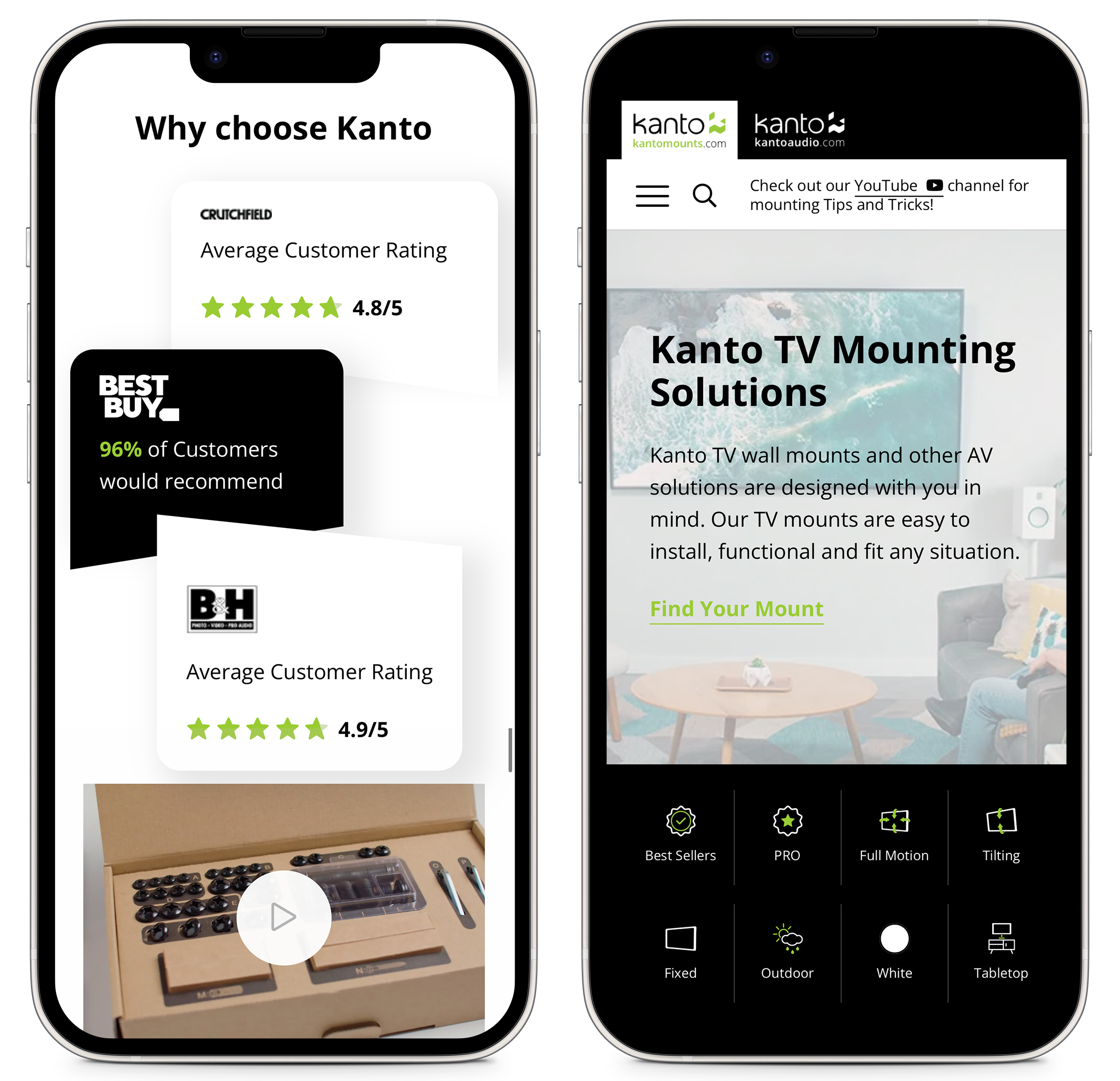
Faster, friendlier, better.
After diving into Kanto’s existing site and its competitors, we identified that the industry wasn’t doing great in key performance metrics like speed and mobile-friendliness. We knew optimizing overall performance would have an impact that gives Kanto an immediate edge.
Arguably, the biggest issue with the previous Kanto website was its mobile user experience. Although the majority of Kanto’s visitors access the site using mobile devices, there were significant issues with the overall display, clickable links, image sizes, and page speed.
It’s easy to measure things like page visits, link clicks, form submissions, and whitepaper downloads. However, this doesn’t provide a clear picture of success. We helped set Kanto up with proper analytics to measure a meaningful funnel path to purchase.
Experience Design
Intuitive from the start.
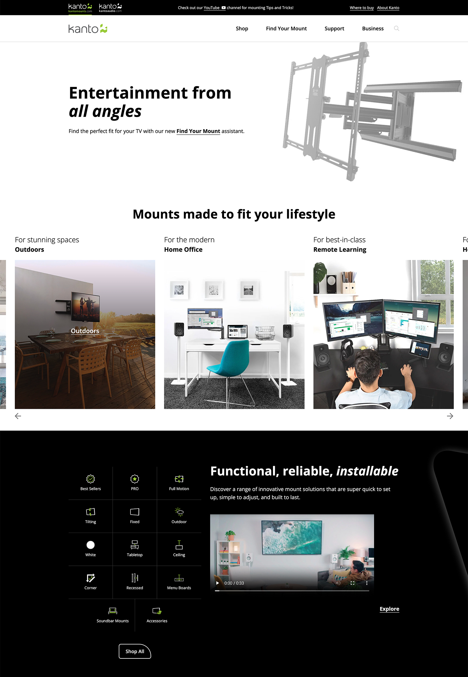
To step up the user experience, we started by streamlining the navigation. Menus of several competitor sites were either oversimplified or overwhelming, with the ideal solution falling somewhere in the middle. We recognized the opportunity for Kanto to have a navigation that is robust, yet clean and non-intimidating.
The new site architecture helps users find what they’re looking for quickly. The mega menu supports Kanto’s breadth of products, use cases, support services and business partners. It provides various user types with scannable content and creates clear paths to guide them through the experience.
Whether it’s a university student looking for a remote learning set-up, a hotel looking to outfit all their rooms with TV mounts, or an existing customer looking for some quick support, the new site gets them where they need to go.
Interaction
Beyond the brochure.
Many e-commerce websites function simply as online catalogues with very few interactive elements or movements to bring them to life. There is often not much interaction on hover, click, or scroll – interactive elements that provide users with feedback and lead to a more modern and enjoyable experience.
By creating a premium-feeling user experience with purposeful interaction throughout, we promote exploration and quick discoveries. Ultimately, this makes Kanto (and its products) appear more reliable and trustworthy.
Design
Balancing form and functionality.
Encouraging users to explore requires an approach that delivers layout variation, prominent feature sections, and distinctly branded UI.
Within this industry, we saw old-school UI patterns, template-y layouts, and inconsistent practices, all leading to a stale experience. We were inspired by leading tech brands outside of the mounts industry to create dynamic, brand-forward designs that are contemporary and sleek.
It was time to organize content better and advance the UI elements to create a smoother, more engaging experience, especially on mobile. The site’s distinctive design reflects a modern brand with high quality and professionalism but an approachable human nature. It’s stylish while keeping the user’s needs top-of-mind.
WooCommerce Products
Up against Amazon.
Kanto competes for attention against the myriad of TV Mount options on Amazon. These repetitive product pages have only a price tag and copy-heavy descriptions to distinguish between them. Most of the product pages on competitor websites follow a similarly basic structure that is visually unappealing. Kanto needed to set its products apart with a unique approach to product pages.
The new product pages are equipped with iconography, succinct copy, lifestyle imagery, at-a-glance features, walkthrough videos, related products, and more. It all adds up to a more compelling shopping experience.
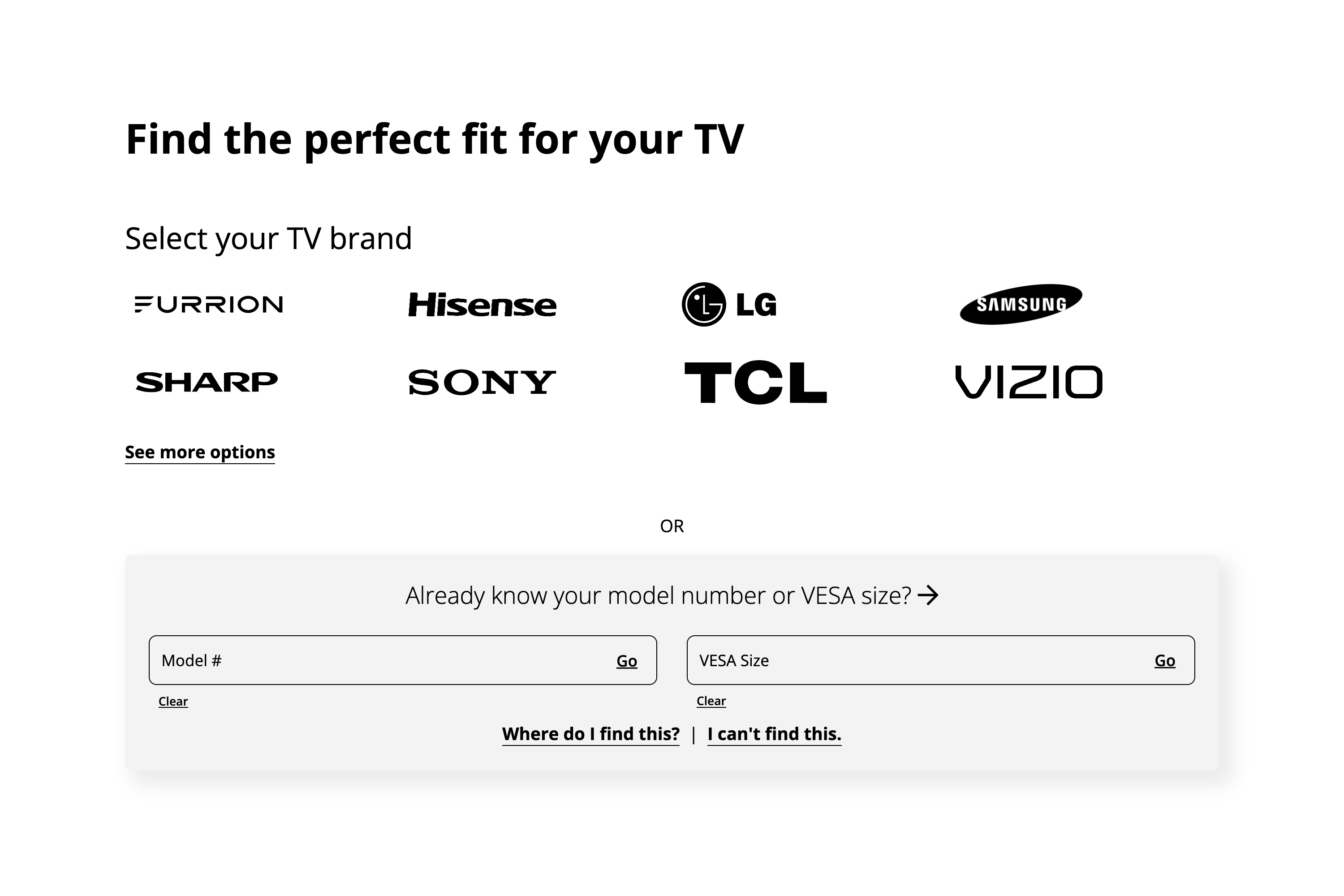
We also developed a custom tool to make it easier for users to compare mounts. Since many of the mount models look the same on the surface, this useful feature allows users to filter based on the model of their television and/or the key features that they’re after.
Content Creation
Clarity plus personality.
Content in this space tends to be utilitarian, with a tone of voice that is interchangeable. There is generally a focus on features and specs as opposed to engaging users with benefit-driven content. We created a confident tone for Kanto, portraying the brand as knowledgeable and helpful. Most importantly, the content connects with consumers and businesses in a human way.
We moved Kanto past the standard “headline, paragraph, bullets” formula to create a content structure that is more bite-size and bold. The new energized content is benefit-driven, with plenty of well-placed CTAs to prompt action.
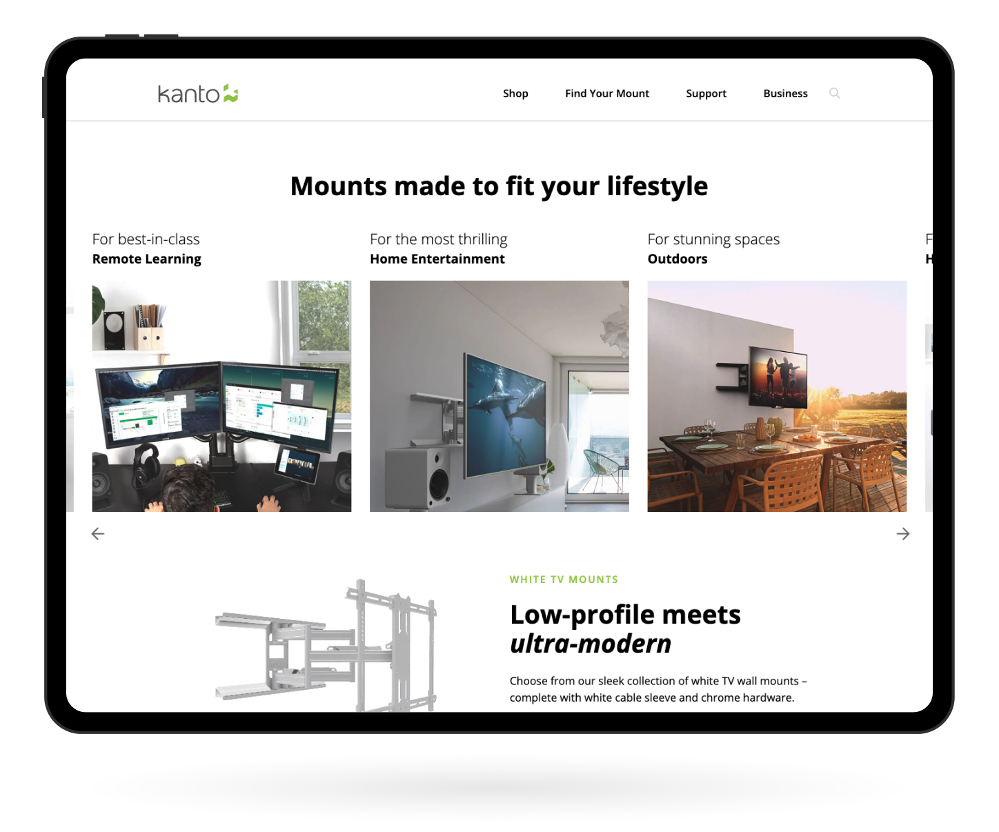
Understanding that users have different use cases that determine what products they’re interested in, we created content for lifestyle pages such as Home Entertainment, Work from Home, and Outdoors. These content-rich pages guide users through popular products and their benefits based on their needs.
Final Thoughts
E-commerce that’s more than just “buy now”.
For an ecommerce experience to be effective in converting looky-loos to add-to-carters, it needs to provide more than the price and product descriptor. It’s about positioning the brand to build trust quickly and providing users with indisputable reasons why this is the right product for them. We have experience working on a range of brand-forward ecommerce sites that compel users to convert. If that’s what you need, then let’s connect.