Building a national digital showroom.

Nufloors Canada
The marketing hub for Canada’s flooring store.
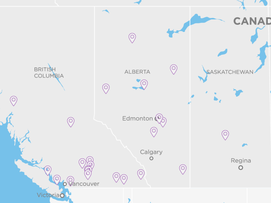
Nufloors has 24 flooring stores and counting across Canada. Each location is independently owned and operated by a local community member. Nufloors is renowned for offering the latest designs in name-brand flooring.
We developed a multi-store website for Nufloors that captures the essence of their “beautiful experience.” The new site showcases expertise, exceptional service, credibility, and product inspiration to set Nufloors apart from the competition.
Reach
Services
Year
Technology
Design
Flooring that’s fashionable.
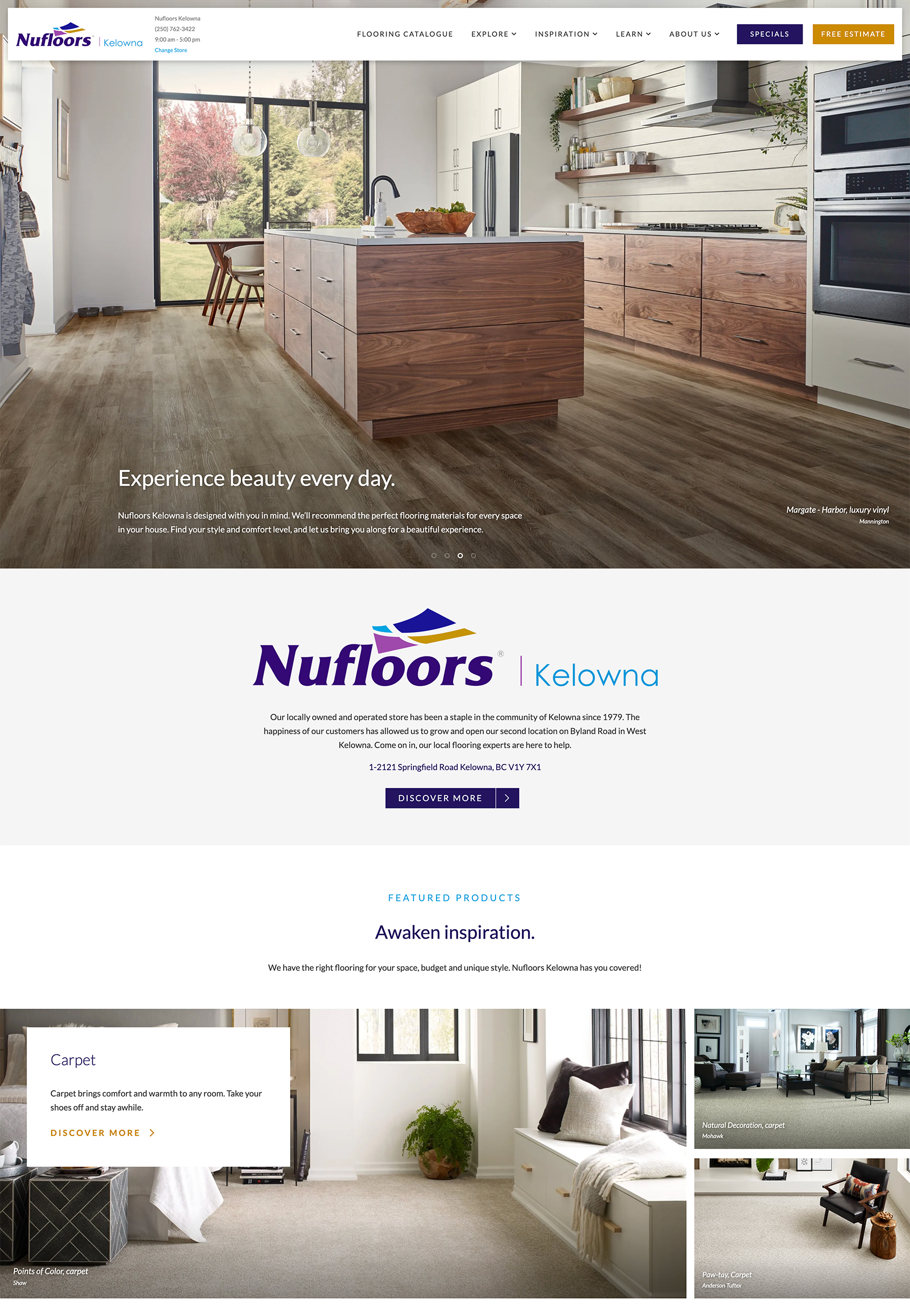
Nufloors believes that flooring should have a fashion-forward mindset. After all, flooring and home decor are a reflection of personal style. With that in mind, the aesthetic of the website is modern, elegant, inspiring and trustworthy, with plenty of breathing space. The design brings in elements of a quality experience and broad appeal.
The bright, airy homepage sets the tone with refined typography, clean organization, and subtle movement. We let the natural beauty of the flooring take the stage. Interior pages follow through with openness and intentional lack of clutter.
Geolocation
Geolocation, location, location.
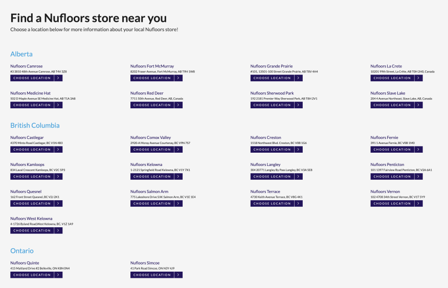
Because each Nufloors location is independently owned, each store has its own products, services, and specializations. This meant that previous website versions had thousands of pages of duplicate content, resulting in a clunky user experience that wasn’t intuitive for those managing the site.
Our solution was a WordPress Multisite Network that seamlessly directs users to their local Nufloors location using geolocation technology. This approach is similar to that taken by most major retailer websites, such as Canadian Tire and Best Buy. And there’s a reason for that—it works! It’s all about minimizing clicks while personalizing the user experience.
This approach also benefits the Nufloors staff, who regularly update the site—more on that in the development section.
Exploration meets inspiration.
Purchasing flooring is a big decision with thousands of dollars on the line, so trust is a big factor when choosing a flooring company. Visitors to the Nufloors site need to feel comfortable, easily find what they’re looking for, and get all of their questions answered quickly.
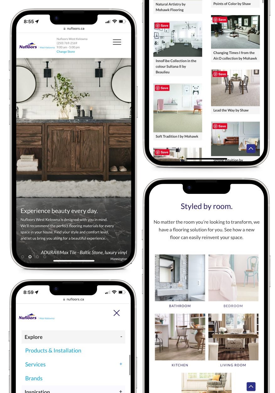
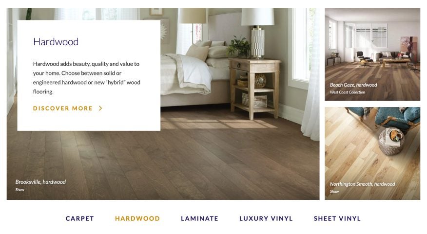
The thoughtful mega-menu acts as central wayfinding and encourages exploration. Complete with well-organized products and services (specific to each store), this menu provides a simple yet robust overview of everything users could be searching for.
The filterable inspiration gallery makes it easy for users to browse through beautiful imagery based on the room and/or flooring type they’re most interested in. Meanwhile, the location-specific About pages showcase the people behind each store and their connection to the local community.
Content
That familiar, friendly professionalism.
The voice for Nufloors’ content is professional, approachable, and relatable. We wanted the language to evoke inspiration without being verbose—succinct copy and clear calls to action help support the fluid user experience and contemporary design.
There are plenty of finer points when purchasing flooring, which can lead to long paragraphs and drawn-out explanations. We made sure to be respectful of the user’s time by providing bite-size flooring information at a glance with the opportunity to dig deeper if they so choose.
Development
Made with the store managers in mind.
The site has 24 different stores that all need regular updates, so having an intuitive back-end organization is vital. During our build, we carefully considered how Nufloors staff would use the site and what information they would (and wouldn’t) need to update.
This is a game-changer for staff who are managing the website. Instead of sorting through a multitude of pages to make simple updates and announcements, they now have clear sections in the backend that can be easily managed. Once a change, like a product update, is made, it is automatically actioned across multiple areas of the sites. This saves the stores tons of time by not having to make the same update in multiple places.
Limiting what each store can access in the backend creates a high level of consistency for the Nufloors brand, keeping the main content (relevant to all stores) intact.
Twirling Umbrellas came through with great advice and ideas that made our website professional, yet customized for each location. The Twirling team is friendly, knowledgeable, professional, and easy to work with.
Debbie Smith, Director of Administration, Canada Nufloors Group Inc.
Laying down the foundation.
Planning is key when it comes to content-heavy sites with specific needs per store. We work closely with our clients to develop game plans and frameworks ahead of design and development. This ensures we’ve mapped out the best possible user experience and the ideal solution for those on the client side managing the website. We help put companies like Nufloors in a position to manage multiple stores online, promote customer interaction, and continue to grow their business for years to come.
