Fortifying the science frontline.

Science Up First
Cutting through misinformation with creativity.
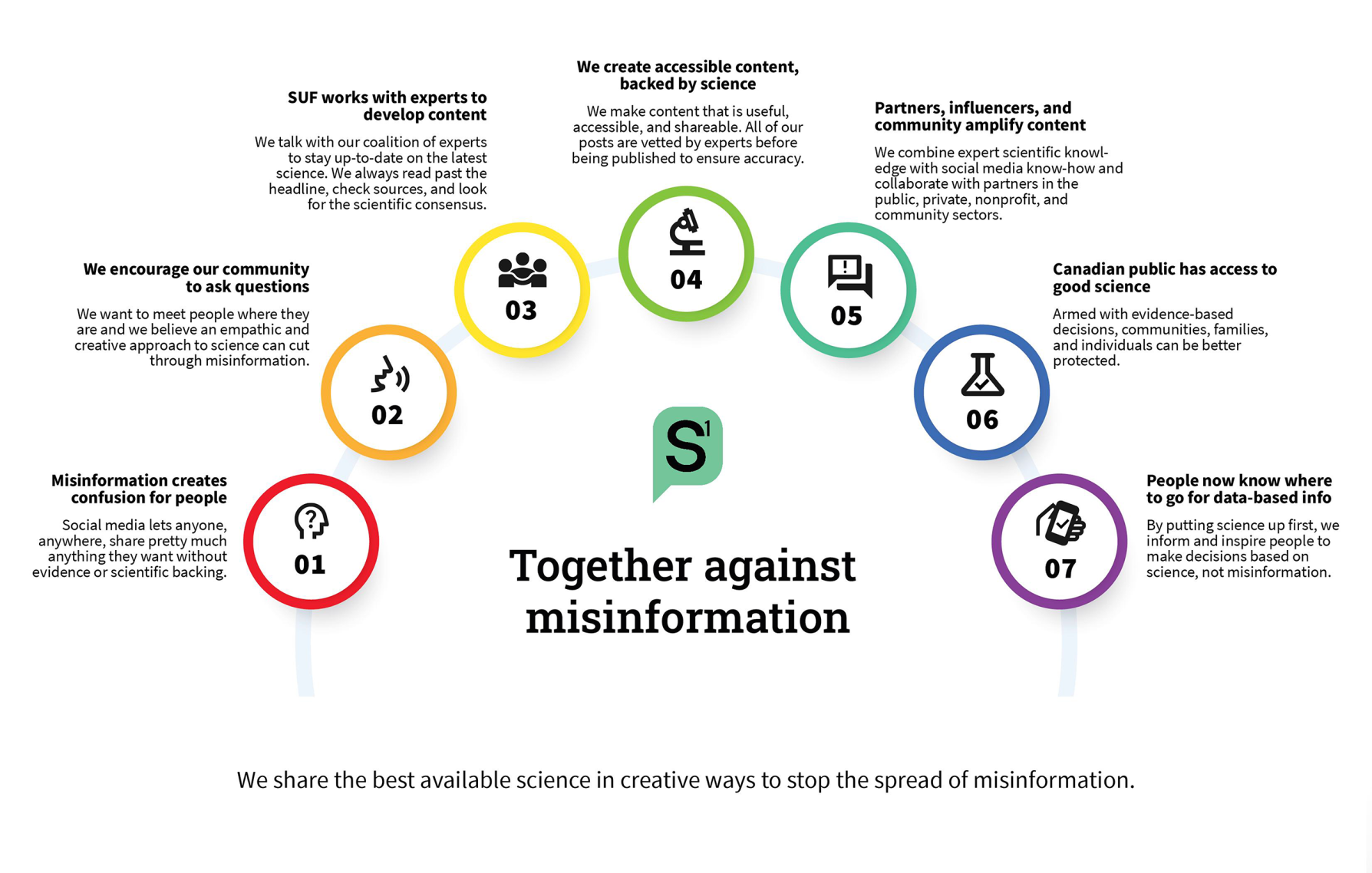
ScienceUpFirst (SUF) was started in 2020 as a national initiative of the Canadian Association of Science Centres (CASC) to debunk COVID-19 misinformation. Their platform features content created by a collective of independent scientists, researchers, healthcare experts, and science communicators.
SUF required a credible, professional and user-friendly website that delivers accessible content across a broader range of science topics such as health and climate change. Their goal: empower Canadians to be champions for good science.
Reach
- 400+ resources and over a million social interactions in multiple languages
Services
- Information Architecture
- Digital Style Guide
- UX & UI Design
- Content Optimization
- WordPress Development
Year
- 2024
Technology
- WordPress
- Jetpack
- WPML

Digital Strategy
Fighting falsehoods with a friendly framework.
The new SUF website needed a facelift to provide a more intuitive user experience, a more trustworthy and credible look and feel, and a better connection that resonated with users and partners. We needed to re-prioritize and consolidate the site’s pages into an intuitive navigation structure to make it easier for users to find what they’re looking for quickly and to make them feel better about SUF as a trustworthy source of information.
UX / UI Design
Redesigned to reassure.
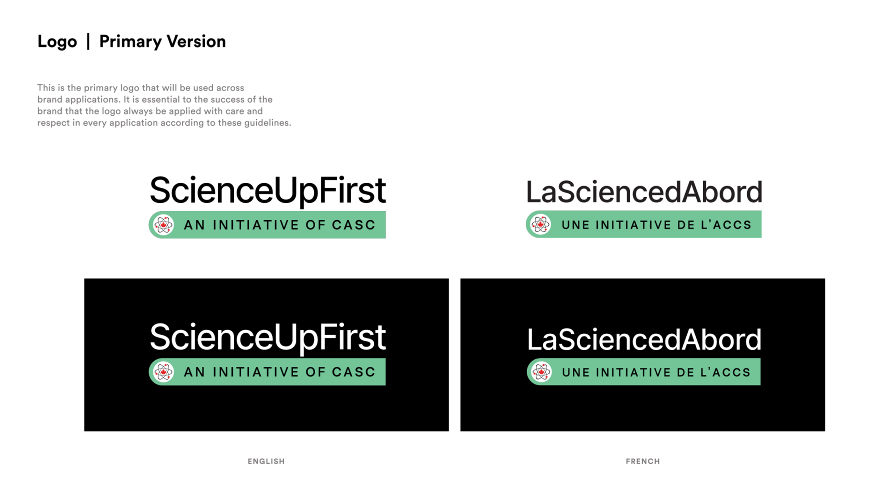
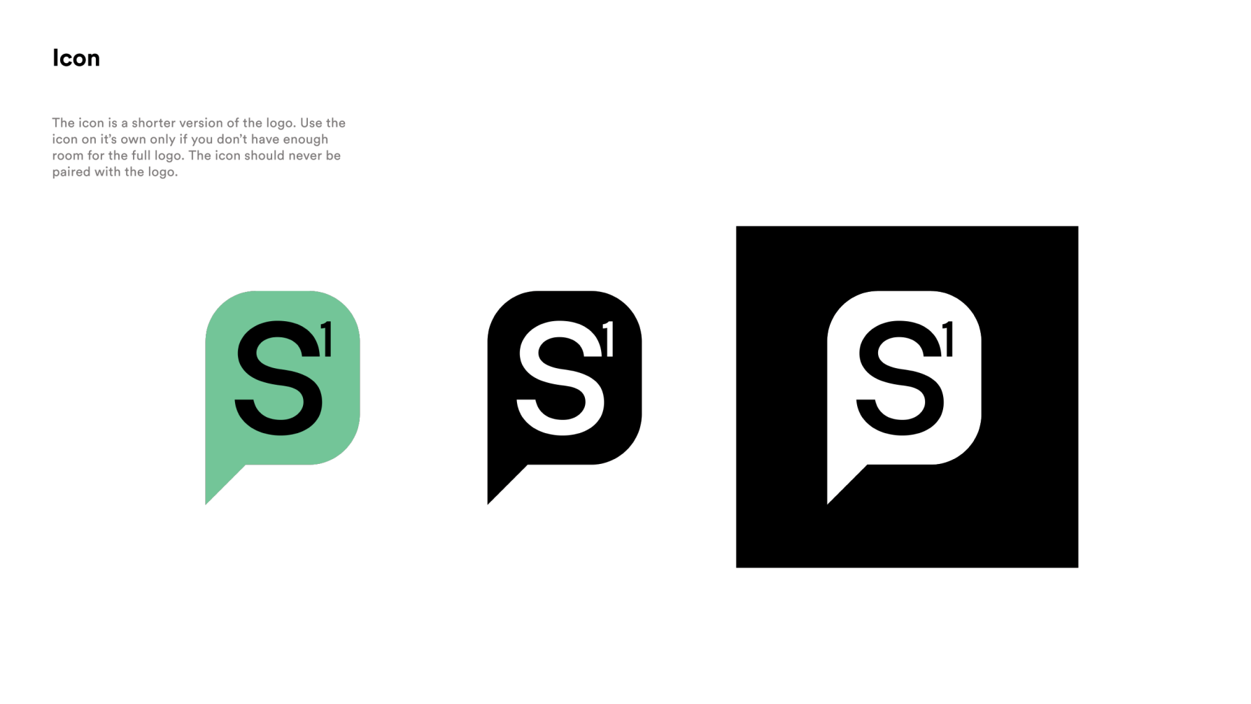
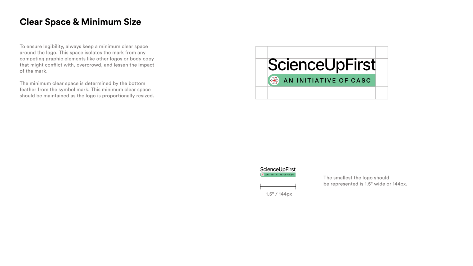
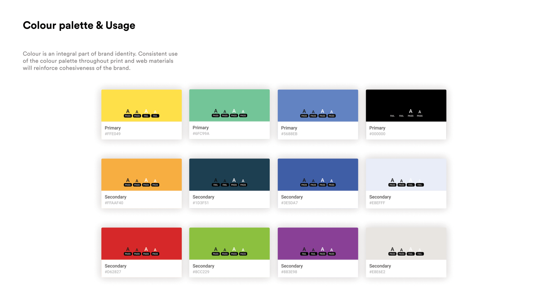
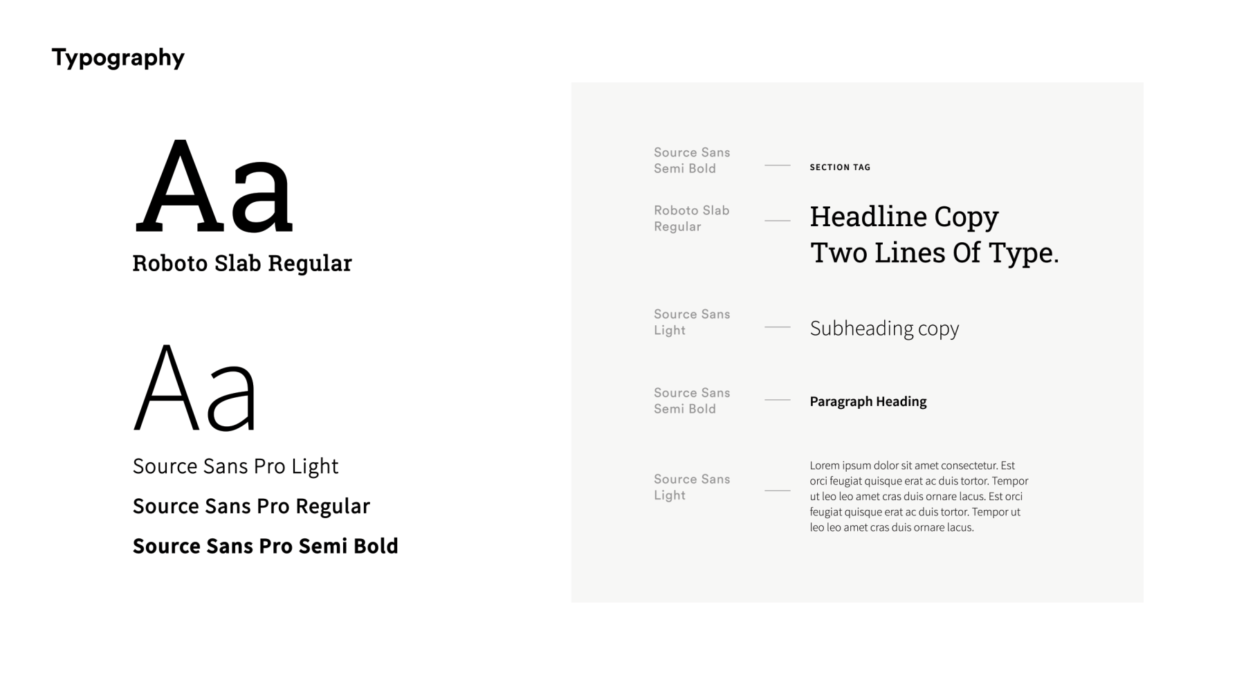
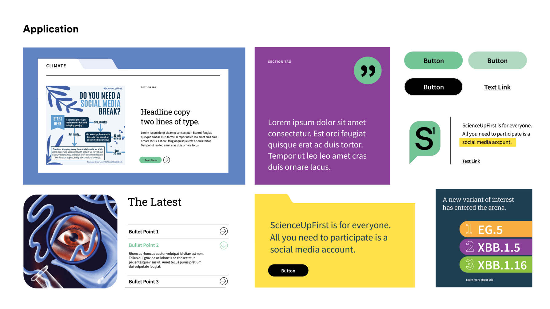
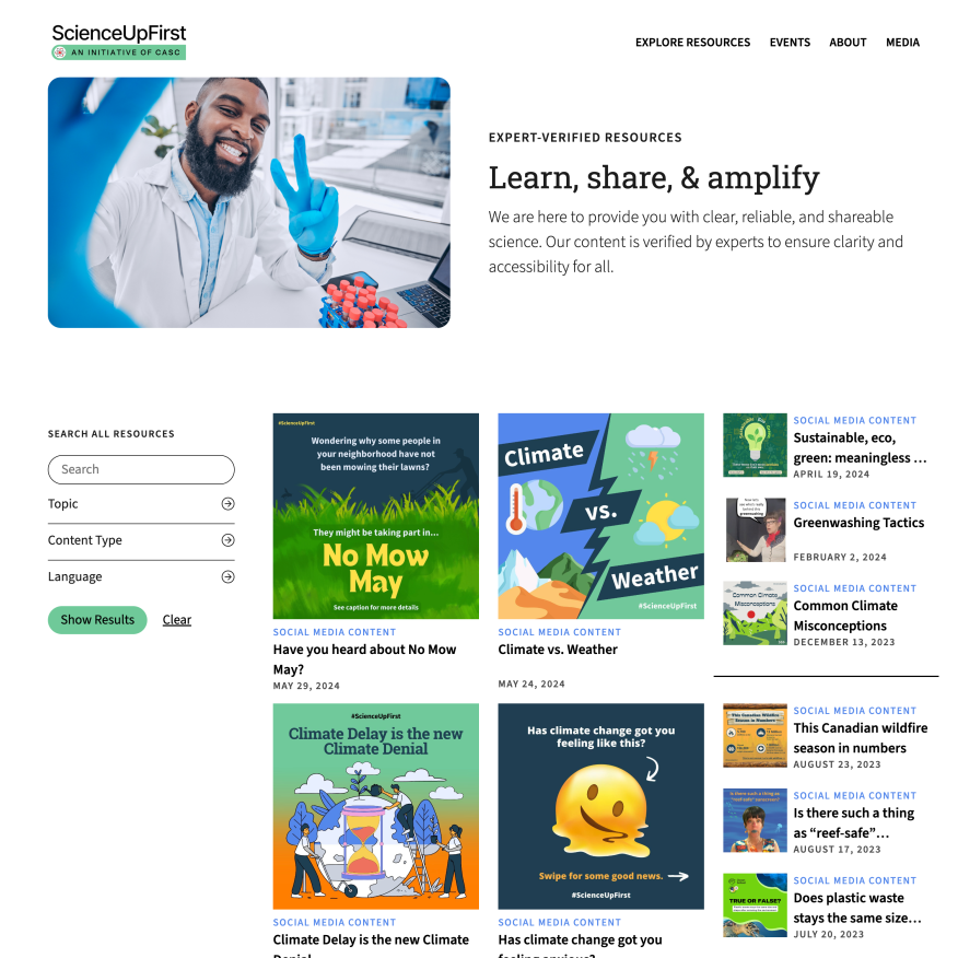
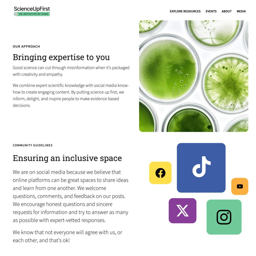
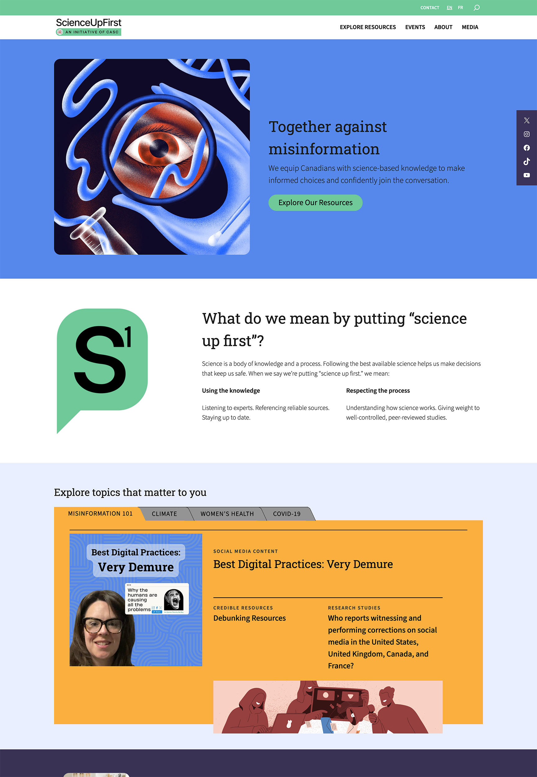
We started with a rebrand to update their look and feel – from their logo to colours, graphics, and typefaces. We wanted to ensure it looked more professional and confident without losing friendliness. The finalized design of ScienceUpFirst’s site is open and inviting so it doesn’t compete with the resources, rather it guides users to find what’s most relevant for them. We featured prominent trust signals throughout the site to reassure users of the content’s authenticity so that they would feel comfortable sharing it with others.
Following key UX principles, we redesigned the site to improve the user’s journey and increase the time they spend on the site. In particular, we focused on the homepage to increase trust and decrease bounce rate. We also ensured the site complied with accessibility standards with alt text, proper hierarchy, colour contrast, and more.
Content Optimization
Unlocking accessibility with clear content.
SUF’s site holds a lot of content with over 400 resources. Much of it is still relevant as the site’s only been in operation for the last few years. We did a copy overhaul of how the content was presented on the site, optimizing it for web and readability. Luckily, much of the content had already been written for a younger, more accessible reading level. Still, we created a cleaner look by adding headlines, streamlining some content, and adding more in other areas to create an engaging user experience.
Development
Building a robust resource hub.
By rebuilding the site on WordPress, we made it easy for users to navigate and more efficient for the SUF team to make timely site updates. By streamlining the site, we also improved its performance, including page speed and mobile friendliness. On the events side, we created a custom post type for each, with fields for the event link, date, time, registration link, and other necessary fields to keep all the content organized.
Regarding the Resource Hub, we wanted to create a new experience that put users in the driver’s seat of their learning and discovery. The new hub has updated categories and tags for more vital organizations. Users can now filter for topic, resource type, and language, allowing them to narrow their focus to explore the most exciting resources and easily share them with friends and family.
We incorporated SearchWP to improve the overall search functionality and enable visitors to create advanced searches of content such as resources and news. We also used WPML to create a French translation of the website. All the resources are now available in English and French, and some in South Asian languages such as Farsi and Punjabi.
We now have two websites with significant increases in engagement, a successful brand renewal that has been very well received, and a team of science communicators and new comms staff who have been busy creating content and eager to see these websites grow! All in all, we could not be happier with the final product, and we truly enjoyed the experience collaborating and engaging with [Twirling Umbrellas].
Bensun Fong, Canadian Association of Science Centres
Final Thoughts
Safeguarding the future of truth and information.
By creating a more streamlined and focused website, we’ve set ScienceUpFirst to be able to do what they do best – working to stop the spread of misinformation on many different fronts, such as vaccinations, mental health, environmental issues, and more. Their new site offers a credible and trustworthy presence, a fresh updated design, and an easy-to-explore structure so that users can find and share science-backed resources quickly and easily.
