An immersive platform for outdoor learning.

UBC Wild & Immersive
A natural solution for a new era.
In partnership with UBC’s Faculty of Forestry, Wild & Immersive provides nature-based learning opportunities for kids and adults alike. They offer forest school programs, kids camps, special events and corporate retreats at Maple Ridge and Williams Lake research forests.
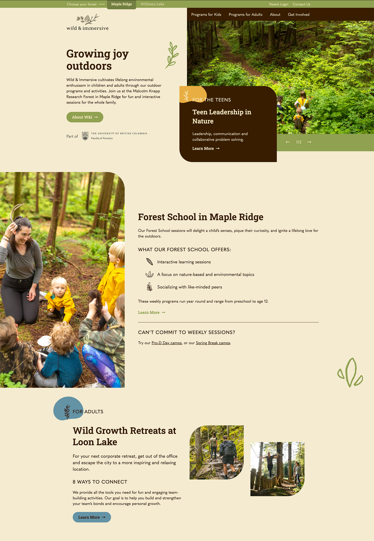
Working with the Wild & Immersive team, we developed a refreshed website that engages users with inspiring content and a natural aesthetic. This helps create a sense of curiosity and adventure—the ideal qualities for getting more people outdoors.
Reach
- Thousands of kids across multiple regions in BC
Services
- Information Architecture
- UX & UI Design
- Copywriting
- Brand Refresh
- Content Strategy
- Development
- Web Hosting
- Search Optimization
Year
- 2022
Technology
- WordPress
- Pantheon
- Google Cloud Platform
Digital Brand Refresh
A refreshed look & feel.
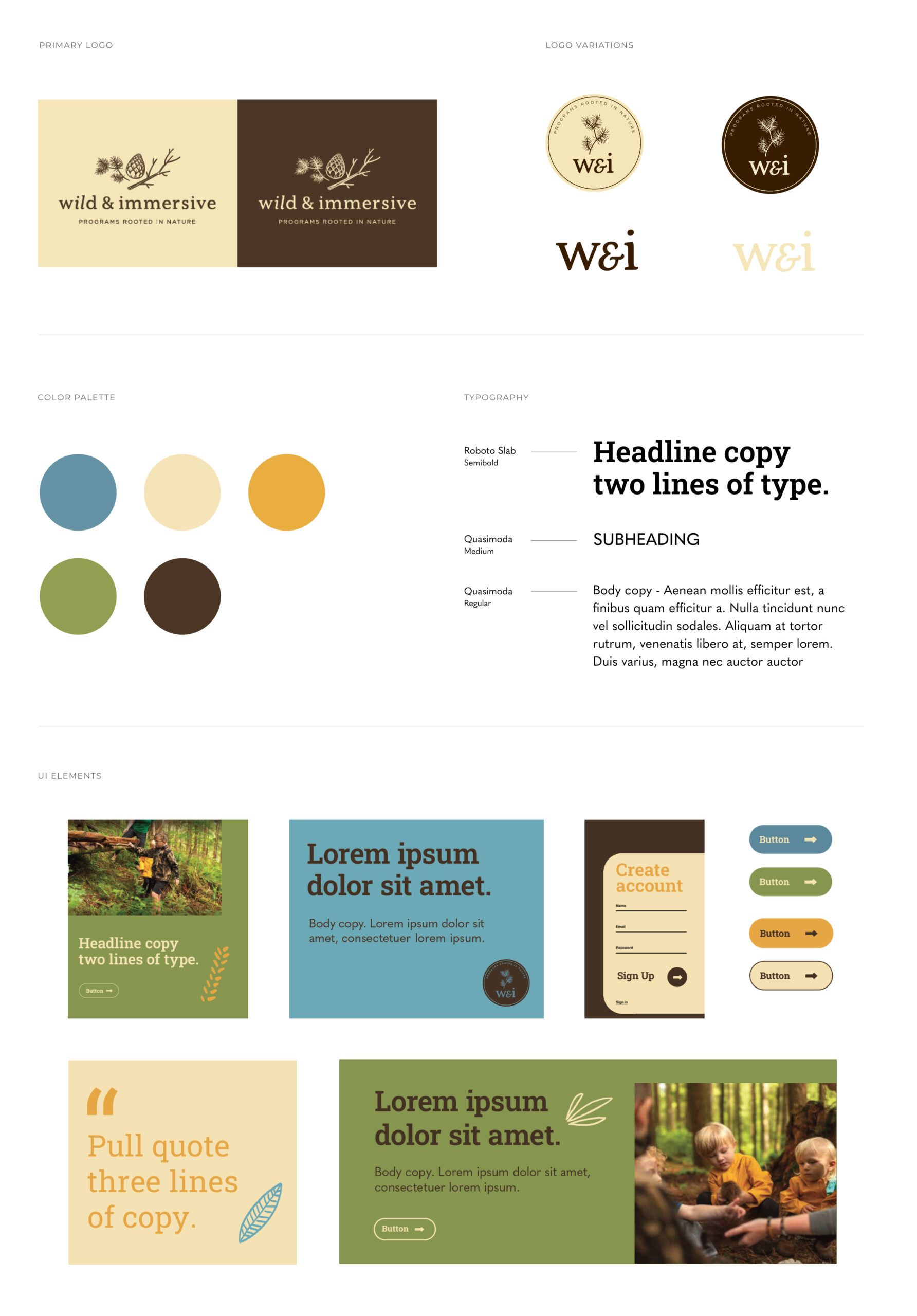
Our team took Wild & Immersive’s strong branding to new heights with a digital brand refresh. This included a more vibrant colour palette, modern typography, natural illustrations used for iconography and additional texture, friendly UI styling, and rounded image containers.
The site’s imagery was also elevated to a more professional level. Our design team created a look and feel for photos, then gave UBC directions and a shot list. They, in turn, provided amazing imagery that elevates the site’s design, giving the brand credibility and an authentic look. With an elevated and digital-friendly style, the renewal speaks to Wild & Immersive’s core audiences of parents, teachers and leaders.
This brand refresh reflects Wild & Immersive’s modern and forward-thinking approach to learning, team-building and special event experiences for key users.
Site Architecture
Groundwork for growth.
Knowing that Wild & Immersive has grown so much since its inception in 2019 and will continue to grow, we needed to build site architecture that adapts easily to changes in audiences, types of programming, and locations.
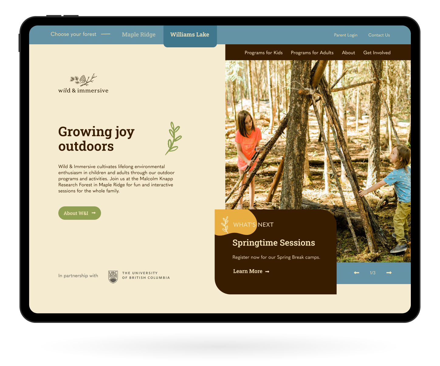
The sitemap was built to house two identical sites – one for their Maple Ridge location and one for the recently added Williams Lake satellite location – and the distinct programming and locations for each. Having two mirrored sites that populate based on the user’s geolocation is key so that people can get all the information they need that is specific to their region. These two sites also have distinct imagery and content to reflect their local geography, history, flora, and fauna.
The new navigation also lets users easily discern between programming for children and adults. Parents can easily find programs and activities best suited to their child’s age group, as well as a portal with resources. Adults can discover information on group retreats and special events held throughout the year.
Content Building
Organically structured.
There was a great base of content to work with, but it needed clearer organization, a stronger voice, and some added playfulness that better reflected the brand. We edited and rewrote the content, highlighting the benefits of outdoor learning and giving parents solid information on what they can expect from their children who attend the programs.
We ensured brevity for readability and maintained the brand’s inspired tone. We also added emphasis on what makes each forest region special. Wild & Immersive’s ethos is to inspire and cultivate lifelong environmental enthusiasm in children and adults. We believe our crafted copy will help draw in more apathetic audiences and reinforce those who have already bought into the love of the natural world.
User Interface Design
Moved by design.
When designing the Wild & Immersive site, we wanted to reflect the brand’s friendly and curious tone by adding movement and playfulness. This is demonstrated in the thoughtful, dynamic movement as users move through the pages of W&I’s website, keeping them engaged and exploring. Text and imagery appear as if telling a story, adding to the whimsy without going overboard.
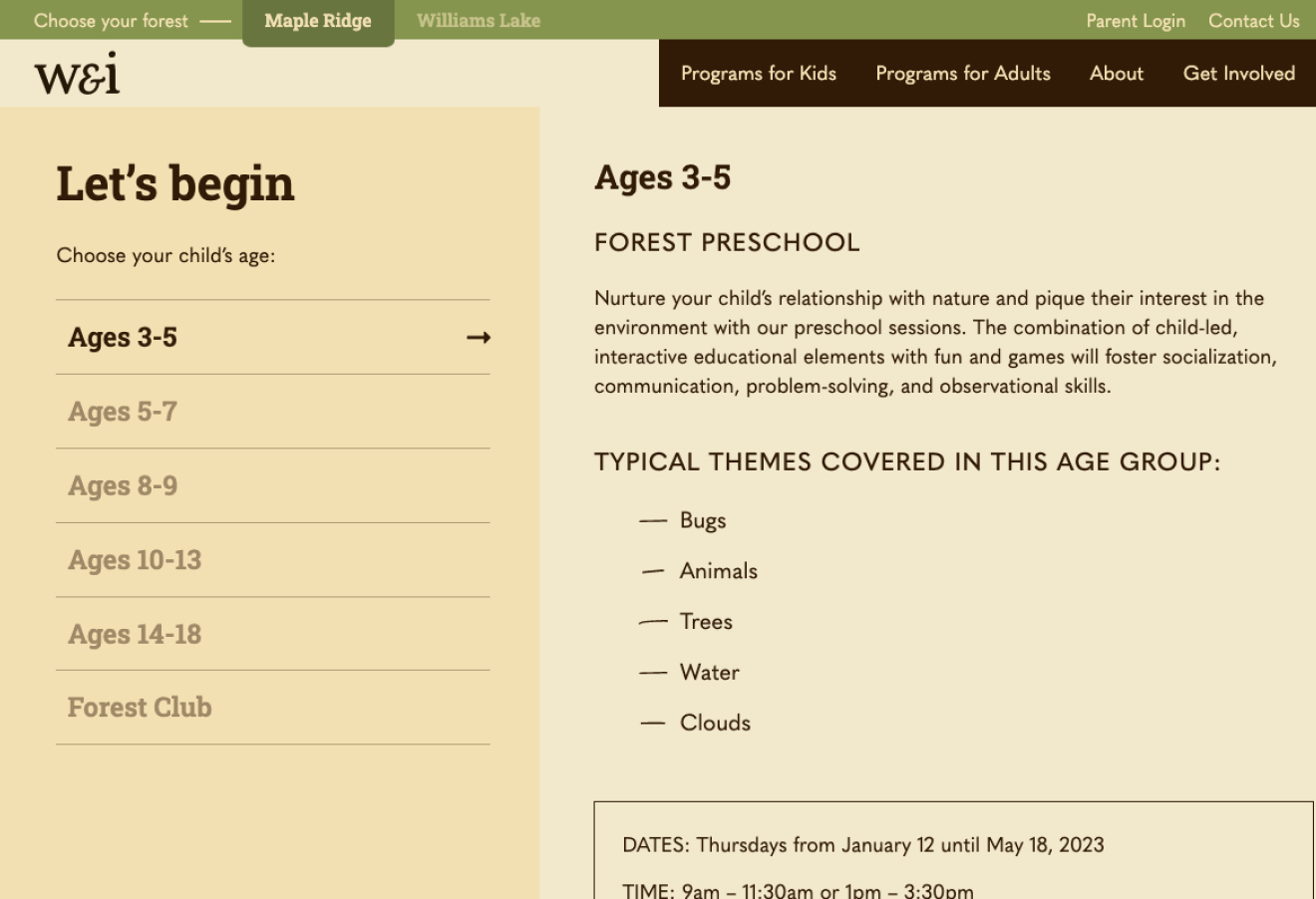
We also built out creative interactive interfaces. The new Forest School page makes browsing through different programs based on a child’s age easy. This creates a great user experience and a clean visual appearance without overwhelming users.
Great team to work with. They designed a new website for us and it is exactly what we were hoping for and more. They made the process very easy and listened to all of our feedback, wants and needs! Couldn’t recommend them more!
Liz Smith, Business Improvement Coordinator, UBC
Final Thoughts
Inspiring future naturalists.
When speaking with the team behind Wild & Immersive, we could tell a lot of passion and heart went into creating and continuing their outdoor learning programs. The finished product reflects that passion – a refreshed site that communicates to and inspires the next generation of nature enthusiasts. With a modern design, thoughtful features to augment the user’s experience, and clear and concise content, parents and participants can now find the information they need quickly and easily.
