Here’s the reality: some associations have brands that no longer work well online. Outdated colours, typography, and a lack of modern graphic elements can lead to an antiquated digital presence. In some cases, these brands no longer meet accessibility guidelines.
As an association, you want your organization to be positioned as an innovative leader for your industry. Living with a dated digital brand experience can seriously affect this positioning and your members’ perception. The good news is that there’s a refreshing solution that doesn’t need to involve reinventing your entire brand.
In this article, we’ll discuss the differences between a digital identity refresh and a rebrand, how to build a responsive brand, and why it matters for associations looking to create a modern, professional, and leading digital experience.
A refresh isn’t a total redo.
Many associations have invested years into building up their brand equity and membership base. So the thought of touching the brand can seem daunting – it doesn’t have to be. Sure, there are times when a brand has become wildly out of date and needs an overhaul. But in many cases, a simple digital refresh with a new style guide is the practical solution to get your identity up to speed and ready for the digital world.
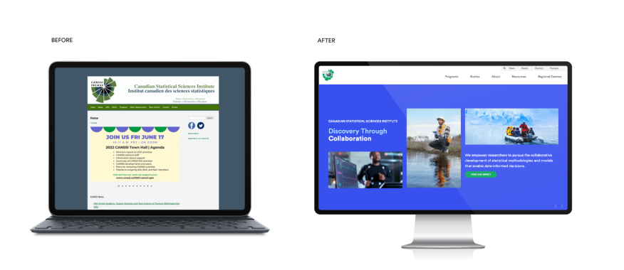
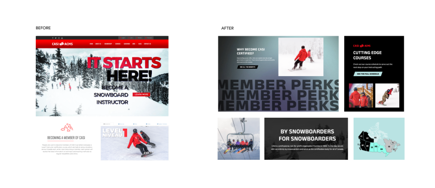
Take for example, these two digital refreshes that we completed for member-based organizations.


Sometimes, a rebrand does make sense.
When a brand no longer appeals to the desired audience, creates confusion, and/or does more damage than good for the association’s reputation, a refresh may not suffice, and a full rebrand is likely needed. In many cases, this will be obvious to those in the organization. It’s essential for associations who want to convey a progressive spirit of innovation to ensure their brand reflects this value. This was the case for BRAED Alberta.

Signs your identity needs a digital update.
Are you ready to revise? Here are five telltale signs that your identity is not fit for digital and needs a refresh:
- Your identity and/or website has not been updated in 4+ years.
- You have a logo but no supporting typography system, colour palette or graphic assets.
- Your identity no longer captures the spirit and personality of where your association is going.
- Your association is looking to reposition itself to your members.
- Your team is less than enthused about sharing the brand with others.
Responsive logos and why you need one.
Just like you expect your website to be adaptable to various screen sizes, your identity should be responsive as well. Simply shrinking the logo is a no-go. As you scale down your screen, your logo must be ideally suited to the application. Consider the mobile navigation, favicon or social profiles compared to a widescreen desktop. It’s not a one-size-fits-all situation.
As you can see in the examples below, different versions of the same logo are created for various application sizes by removing details. The smaller the application, the fewer details the logo has. This approach provides your association with a flexible logo for the scenario.
Our approach to digital identities.
Our team starts by getting to know your organization better and familiarizing ourselves with your existing brand elements. We’ll review your similar organizations and gather insights to empathize with your users and deliver a brand experience that will resonate with them.
We believe the best brand experiences have distinctive elements that fit seamlessly within a cohesive system. Our design team is adept at creating hierarchy and differentiation within brands. This can include graphic and UI elements to set your digital presence apart within your industry. And, of course, we’ll ensure that any new elements we create meet web accessibility requirements.
Our deliverable is a Digital Style Guide. It includes web-friendly fonts, accessible colour combinations, graphics, iconography and/or patterns, type hierarchy, button styles, and online application samples. This gives your team a chance to review how the design will interact with imagery and content on your website before we begin development.
Plan the brand before the build.
Getting a new website is no doubt an exciting game-changer for your association. Before jumping into deep-end design, consider the enormous impact a digital-ready brand can have on the final website. Just like the parts that make up a perfect sandwich, what you get from your website design is only as good as what goes into it. Your digital identity is a key ingredient that can’t be ignored.
Whether it’s time for a simple refresh or a redo, let’s chat about the elements your brand needs to be successful online.
