
All about accessibility.
Creating an inclusive web is not just a best practice for web developers; it has legal and moral implications for enterprises. While it is often discussed in the context of design decisions such as colour contrast, readability, and navigation for specific physical disabilities, accessible websites provide a better and more enjoyable experience for all users.
97.4% – The percentage of U.S-based web pages that aren’t accessible to the disabled community.
Web Accessibility Annual Report, 2021
Read along to learn why you should ensure more access for a wider range of people regarding your site and the top 10 best practices for designing a website that prioritizes inclusivity and accessibility.
Accessible UX vs inclusive UX.
So, what’s the difference between accessibility and inclusivity when it comes to user experience? Accessible UX aims to provide all people with an equivalent experience when they encounter a service or product. Inclusive UX, on the other hand, takes into account the complete spectrum of human variety, including ability, language, culture, gender, age, and other aspects of individual variation.
Usually, when we think of accessibility, we think of a certain type of permanent disability, such as deafness or blindness. But there are other kinds of disabilities we need to take into account.
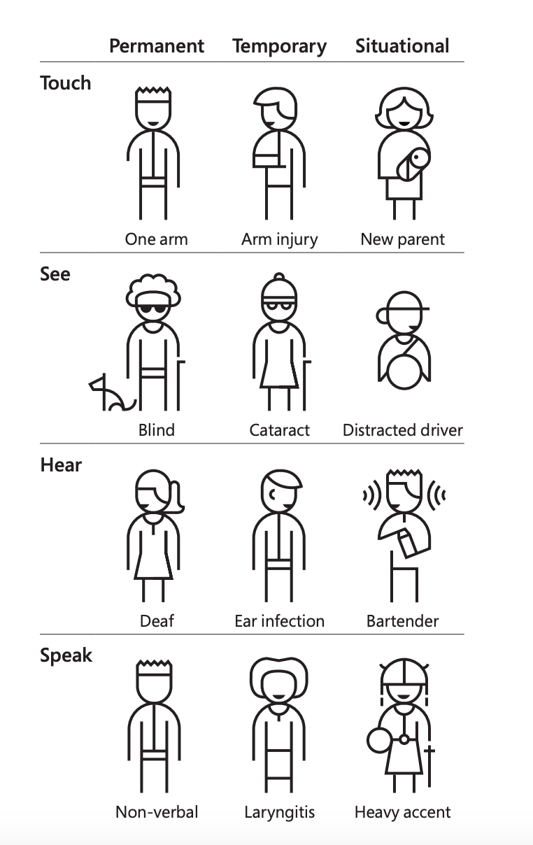
When designing, you should consider people who fit into all three categories—permanent, temporary, and situational. This broader focus includes those with permanent disabilities, such as deafness or blindness, but also disabilities that may seem unconventional, such as an ESL student or maybe even someone under heavy stress who might struggle to follow a convoluted checkout process.
By thinking about an inclusive user experience, we create digital spaces for everyone to participate in. And by doing so, we better the experience for everyone by making information quicker and easier to understand and interact with.
Gimme a P, gimme an O, gimme a…
To create guidelines for what makes an accessible website, the World Wide Web Consortium (W3C) created four accessibility principles to follow: Perceivable, Operable, Understood, and Robust. Within each of these, there are three levels you can choose from:
Level A: This is the easiest level to achieve without making much of an impact on your site’s design or structure. If you can’t make your website meet this standard, you should probably address its accessibility barriers.
Level AA: Higher than A, this is usually considered the best balance of accessibility and design for website accessibility standards. The WCAG 2.0 AA is recognized by countries like Canada, Japan, Germany, the United Kingdom, Australia, and India as a legal standard.
Level AAA: This level has a stricter set of standards to achieve on your site and should be strived for if accessibility is at the top of your must-have list. For some, this isn’t possible since some of their content can’t satisfy the requirements. I.e., animations.
Break it down.
Now, let’s dive into what each principle means and how your site can be built to meet the guidelines.
Perceivable
Information and user interface components need to be easy to understand.
All your content must be presented in a way that can be:
| A | AA | AAA |
|---|---|---|
| accessed by the majority of users, including those with visual, auditory, or other disabilities. | perceived by a wider range of users, including those with color blindness or impaired vision. | perceived by the widest range of users, including those with more severe disabilities. For example, sign language interpretation should be provided for all audio content. |
Tips for success:
- Text alternatives: Give text alternatives for any non-text content, such as ALT text on images, so that it can be interpreted by users in various ways, such as large print, braille, text-to-speech or screen readers, symbols, or more straightforward language.
- Time-based media: Provide alternatives for time-based media such as sliders, videos, and audio. For example, you could have a video running and the transcript available below.
- Adaptable: Create content that can be presented differently (for example, a simpler layout) without losing information or structure.
- Distinguishable: Make it easier for people to see and hear content, including separating foreground from background.
Operable
User interface components and navigation must be usable by users with a variety of abilities.
All content must be presented in a way that can be:
| A | AA | AAA |
|---|---|---|
| operated by the majority of users, including those with visual, auditory, or other types of disabilities. | operated by a wider range of users, including those with visual or cognitive disabilities. | operated by the widest range of users, including those with more severe disabilities. |
Tips for success:
- Keyboard accessible: Make all functionality available from a keyboard. This is one of the most important web accessibility principles as it works across disability types and technologies.
- Enough time: Provide users enough time to read and use content.
- Seizures: Do not design content in a way that is known to cause seizures.
- Navigable: Provide ways to help users navigate, find content, and determine where they are.
Understandable
Both the content and the user interface’s functionality need to be clear.
All content must be presented in a way that can be:
| A | AA | AAA |
|---|---|---|
| understood by the majority of users, including those with cognitive disabilities. For example, instructions should be clear and concise. | understood by a wider range of users, including those with limited literacy or who speak languages other than the primary language of delivery. For example, abbreviations and acronyms should be defined. | understood by the widest range of users, including those with more severe cognitive disabilities. |
Tips for success:
- Readable: Make text content readable and understandable to the reading and cognitive level of a sixth grader.
- Predictable: Make website pages appear and operate in predictable ways.
- Input assistance: Help users avoid and correct mistakes.
Robust
Content must be robust enough to be interpreted by various user agents, including assistive technologies.
All content must be presented in a way that is compatible with:
| A | AA | AAA |
|---|---|---|
| the majority of users, including assistive technologies. For example, all HTML code should be well-formed and valid. | a wider range of users, including assistive technologies. For example, all content should be accessible without relying on any specific technology. | the widest range of users, including assistive technologies. For example, all content should be accessible using a wide variety of technologies and devices. |
Tips for success:
- Maximize compatibility: Ensure user agents, including assistive technologies, are compatible with present and future browsers.
Crafting a digital experience for all.
So, now that you know the different levels of accessibility, how do you incorporate it into your design? Here are a few ways your site can be built to be more accessible and inclusive. These are not the whole list, but they’re the ones we’ve found to make the most difference when creating a more digestible and explorable site.
1. Create a clear order of information
Regardless of how you interact with a product or service, you must know the intended order in which things should be experienced. While there is plenty of room for creativity, sometimes that might create an unclear path for people to interact with your content structure, and information won’t come across as intended. This can lead to confusion and frustration for users who use assistive technologies.
Twirling tips:
- Use a linear & logical layout
- Use headings (h1, h2, h3, etc.) to create a logical hierarchy for your content
- Use consistent text alignments and layouts
2. Make sure your content is squeaky clear
Using language that’s easy to read and understand is a benefit for users with cognitive disabilities and those who may not be fluent in the language.
Twirling tips:
- Ensure your content is easy to digest, both in wording and design.
- Unless otherwise required (e.g. the science or tech-heavy text for a specific audience), use plain language and break content into manageable sections with headings and subheadings for easy readability.
3. Up the colour contrast
Colour contrast impacts the readability and legibility of your content, making it difficult for some of your users, particularly low-vision or colour-blind users, to interact with your site. To meet the standard for accessibility, make sure you’re thinking about the colours that best suit the brand you’re working with and the scale in which they’re being used.
Twirling tips:
- Make sure you test your product’s colour palette for contrast issues.
- When using text on images, make sure the text is legible. Check if there is enough contrast between the background and the text (pro tip: add an overlay layer in between) and add text as a separate asset rather than as part of an image.
- Avoid using pure white on pure black and vice versa. These intense light levels lead to screen fatigue by overstimulating the eyes.
- Ditto for using overly bright and saturated colours.
4. Add cues to your visuals
Using only one of our senses to transmit info can lead to users missing important information. For example, if a form’s fields are unlabelled, you might fill the whole thing out only to realize you’ve done it wrong but can’t remember which field held which data. This leads to unintentional mistakes, user frustration, and a loss of customers.
Twirling tips:
- Use a combination of icons, colours and descriptive tests for feedback statuses.
- Add labels to your input fields and forms.
- Add another visual indicator, such as different fill options or shape weights, to differentiate active vs. inactive input fields.
- Underline your links.
- Add colour + patterns or icons in your graphs, charts, and additional quantitative data.
- Use a progress bar for large flows that include multiple steps.
5. A picture is worth a thousand words
Well, you might not get that many to work with, but alt text does serve as a textual alternative for images and is crucial for visually impaired users and others using screen readers as aids. It conveys the image’s purpose and content for easy content digestibility.
Twirling tips:
- All images on your website should include descriptive alt text.
- Keep alt text concise but descriptive.
6. They’re not calls to ambiguousness
For CTAs, we know less is usually more when creating text for buttons. “Learn More” and “Read More” have been the go-to for websites for long. Then came the witty and pithy one-worders that don’t make sense without context. Both can lead to confusion and frustration for your users using screen readers or other options.
Twirling tips:
- Avoid ambiguous CTAs or unlabeled buttons, such as emojis, on their own.
- Make sure to do a usability test to check your site’s accessibility.
- Work with writers and content designers to optimize the text on your site.
7. Make sure you give buttons enough space
Touch targets, or actionable items like buttons, are screen areas that respond to user input. If they’re too small or close to one another, you’ll frustrate people or cause them to trigger interactions they don’t intend to.
Twirling tips:
- Create a minimum touch target area based on the platform you’re designing for.
- Ensure your small actionable items have enough area around them, at least 8px.
8. Put your people in the driver’s seat
Your users should always know the next step when moving through your app or site. No surprises like updating or refreshing the page unless necessary. Unexpected behaviours, like accidentally submitting a form, audio playing automatically, or buying something early, can cause stress or confusion while trying to complete a task. Giving users control over their interaction leads to easier navigation and a positive experience.
Twirling tips:
- Try to avoid time-dependent features. If you can’t, ensure the remaining time is visible. Provide an option to extend.
- Don’t change a screen’s context without user confirmation.
- Don’t automatically update content. If needed, give your users an option to pause or stop.
- Don’t play autoplay audio; give users control over volume and sound.
- Don’t trap your users in a flow without an explicit closing action.
9. Avoid too much flash
This is probably obvious, but for accessibility reasons, it’s important to avoid using extra dynamic and/or flashing animations. At worst, these elements can cause migraines, seizures, or other visual-based problems for people with photosensitive or sensory issues and disorders. At the very least, they can distract your users trying to complete tasks on your site.
Twirling tips:
- If you can, opt for static content or minimal animations.
- For flashing elements, the flash rate is 3 times per second or less. These elements should cover no more than 5% of the screen.
- Always have a photosensitivity warning for users in advance.
10. For all people, on all devices
Responsive design ensures your website is usable on various devices, from desktop computers to smartphones and tablets. A well-designed responsive layout helps users with motor and visual impairments interact with your content effectively, as it adapts to different screen sizes and orientations.
Twirling tips:
- Ensure your site’s design is tested to ensure it’s usable on various devices.
- If necessary, create secondary imagery to be used on smaller screens.
Be a team player.
Everyone should be on the same page regarding building sites, apps, and other products with accessible design in mind. You need to ensure you’re aligned with your team on how accessible you want the site to be. To ensure the design is implemented properly, things such as the full scope of content, technical considerations, and testing in different environments must be considered.
Don’t just meet the baseline requirements.
Designing an accessible website is more than just meeting legal requirements. It’s about establishing a welcoming, all-inclusive digital environment. You can ensure that your website is accessible to all visitors, regardless of their ability, by implementing these ten best practices. Prioritizing web accessibility results in a more user-friendly and inclusive online community, ultimately benefiting everyone. This is not merely the correct thing to do.