Guidance for exceptional digital content.
Captivating content breathes life into websites. It’s why users are coming to your site – to find the information that will help them take a desired action. Whether or not they’re successful depends on how well that content is presented. Is it easy to understand, simple to digest and delivered in a way that’s actually worth reading?
Our job as UX writers is to ensure that digital content hits all the marks for style and substance, while being optimized for web. That means it has to be concise, straightforward and accessible but it also has to be compelling, even if the subject matter itself isn’t.
To guide our content team and yours, we’ve come up with five essential rules for digital copywriting, with a simple nautical acronym: BOATS. Together these rules create a rising tide for content that helps to deliver an exceptional digital experience.
First, what it means to write visually.
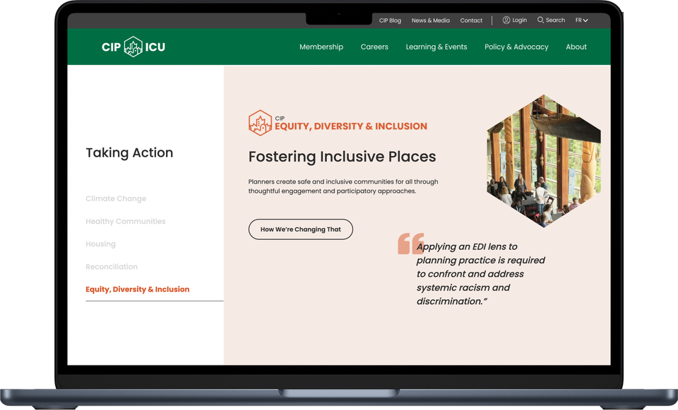
Writing visually takes into account the design, layout, interfaces and overall appearance. To set UX/UI designers up for success, we need to provide them with streamlined copy that elevates (and doesn’t break) the design. That’s why we write content for key pages directly into Figma wireframes. This ensures content will closely fit the layout and aligns with the streamlined user journey we’ve outlined in our strategy and planning phase.
Is the content allowing space for images, graphics and other supporting visual elements? Or is it dominating pages with bulky paragraphs of text? There’s no question that visually appealing content with ample whitespace is more likely to be read by users as it allows them to compartmentalize content into manageable chunks. This is key for accessibility and maintaining users’ focus, especially for neurodivergent users such as those with ADHD.
Our five golden rules for web writing.
To create a stellar experience for users, it’s vital to ensure website content is brief, original and accessible, with a tone that’s on brand, and clear structure for digital success. Let’s dig into what that means.
B is for Brevity.
Visitors are arriving on your website with a limited amount of time and your site’s content needs to be respectful of this. Online, where distractions are at an alltime high, we must strive to communicate as succinctly as possible. Of course, we also have to make sure that all the organization’s key messages are covered. In our attempts to consolidate, cut and refine, nothing important can get lost.
Our clients’ key messages have to be loud and clear. And sure, there are instances such as standards or policy pages where lengthy text is unavoidable but it certainly shouldn’t be the norm. Web content should guide and inform, not overwhelm.
“Brevity has more to do with cutting fat, bloat, and things that indulge the writer and don’t respect the reader’s time. Keep it tight.”
Ann Handley (Everybody Writes)
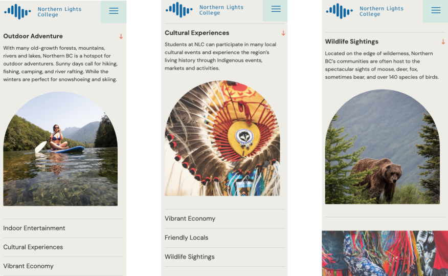
The importance of brevity becomes especially apparent for mobile users, who likely make up a large proportion of your user base. Copy that looks somewhat long on desktop will appear extra daunting on mobile screens. So we always advocate for reviewing copy on a mobile device to get a well-rounded view of its digestibility.
O is for Originality.
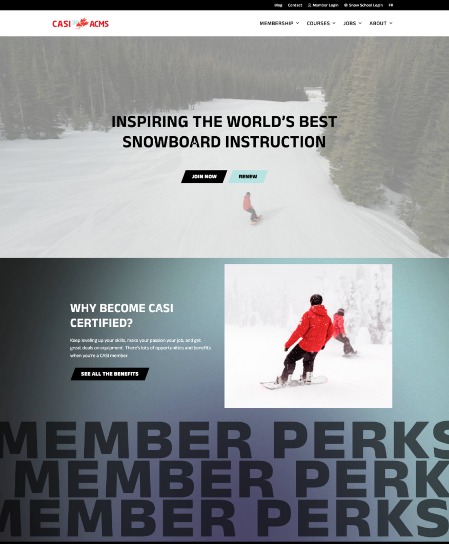
Whether your organization is an association with no direct competitors or enterprise with many, it’s imperative to have language that helps to set you apart. Just as your colours, typefaces, graphics and imagery help to define your brand, language is another tool in the kit. So what happens when the language you’re using is similar to everyone else in your industry? Your brand starts to become indistinguishable from similar organizations, and from an SEO standpoint, that’s far from ideal.
This is where a review of the industry landscape comes in handy. Taking the time to survey the digital landscape for common themes in messaging provides the due diligence to ensure your organization’s content is distinct. That means avoiding unnecessary clichés and jargon and adding a unique spin to make it ownable and memorable. In other words, make it yours. Surely your organization has a unique perspective on your industry, now’s the time to make sure that’s clearly articulated.
A is for Accessibility.
The website’s content plays a huge role in meeting accessibility compliance, specifically when it comes to readability. The Web Content Accessibility Guidelines (WCAG) state:
“When text requires reading ability more advanced than the lower secondary education level after removal of proper names and titles, supplemental content, or a version that does not require reading ability more advanced than the lower secondary education level, is available.”
The takeaway here is to simplify content as much as possible without losing its intended meaning or tone (which we’ll get into next). There are several tools and methods available to analyze your content’s reading level. Two of the more popular ones are the Flesch-Kincaid test, which is available on many word processors and some SEO plug-ins, and the Hemingway Editor.
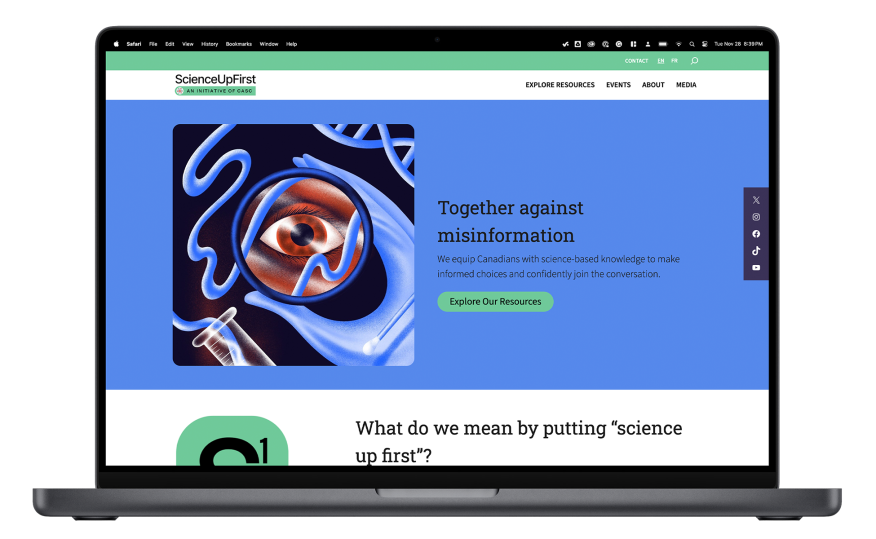
Another key consideration is the language used in calls to action. “Learn more” is no more, as vague language within links and buttons does not provide users with a clear direction on where they’ll end up. To solve this, clear and direct CTAs are the way to effectively guide your users in the most accessible way.
T is for Tone.
Writing across your website should seek to bring out your organization’s authentic voice, ensuring it’s true to your brand ethos and above all, feels human. This is increasingly important to consider with the growing popularity of AI. While we can prompt ChatGPT with notes on tone such as “make it sound friendly”, the results it returns often fall short when it comes to authenticity, expertise and empathy. But AI is a whole other can of worms – for more on that topic, check out our post about creating expert-level content in the age of AI.
Creating a cohesive personality online starts with a clear brief that dives into the various audiences that will be using the website and defines a tone of voice that will resonate with them. This approach ensures that your content connects with your users, while reflecting your organization’s values and mission. Ideally your organization has a writing style guide or at the very least, a glossary of language to embrace and avoid.
A seemingly small but mightily important consideration is the style of capitalization in a website’s headlines and subheadings. Choose your case wisely as this can have an instant impact on how your brand is perceived. Sentence case comes across as more down-to-earth and conversational. Whereas title case tends to lend itself more to more formal and traditional corporate applications. Although, even many official government websites have discovered the user-friendly benefits of making the switch to sentence-case.
S is for Structure.
Thoughtful structure allows content to stand out and command authority. It simultaneously creates consistency and variety throughout the website’s user experience. While we would love to think that users are going to read every word we’ve written, that’s simply not the case. Research shows that users only read up to 28% of the words on a webpage, preferring to scan content instead. There’s a simple solution for this: let’s make content more easily scannable!
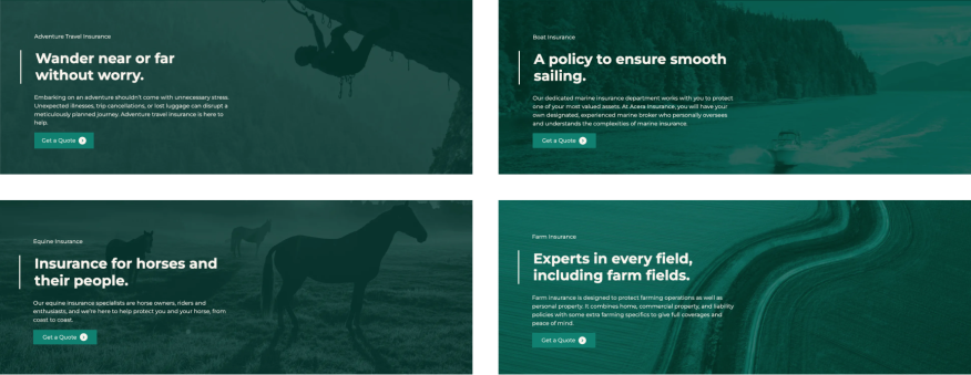
It’s best to think of structuring a page’s content in terms of blocks. That’s where WordPress’ built-in block editor, Gutenberg, has a host of benefits for content creation. Content is much easier to comprehend when it’s split up into bite-sized sections (or blocks). Break free from a repetitive headline/paragraph structure and introduce alternate blocks like bulleted lists, quotes, stats, videos, accordions and more.
Consider your website’s “About Us” page. These types of pages have a tendency to be text-heavy and structure-less – a dumping ground for a barrage of paragraphs that deliver a longwinded backstory. To put it bluntly, most About pages aren’t great but they can be. This is an opportunity to showcase what your organization stands for. By creating an appealing content structure, it can become one of the most compelling pages on your site – one that helps to convince your members or clients to choose you. It doesn’t stop there, this same thinking can be applied to many other pages throughout your website.
Smooth sailing across the site’s content.
All too often a website’s content is treated like an afterthought – a necessity to fill the pages. Instead it should be the driving force for the user experience. By keeping these five golden rules in the forefront of our minds, we can ensure that content not only attracts users to your site, but keeps them engaged along their journey.
