Web design
Web design for organizations with a mission.
We plan, design, build, and launch websites for associations, regulators, and non-profits through a collaborative process, so the finished website works for your audiences, your content, and your team.
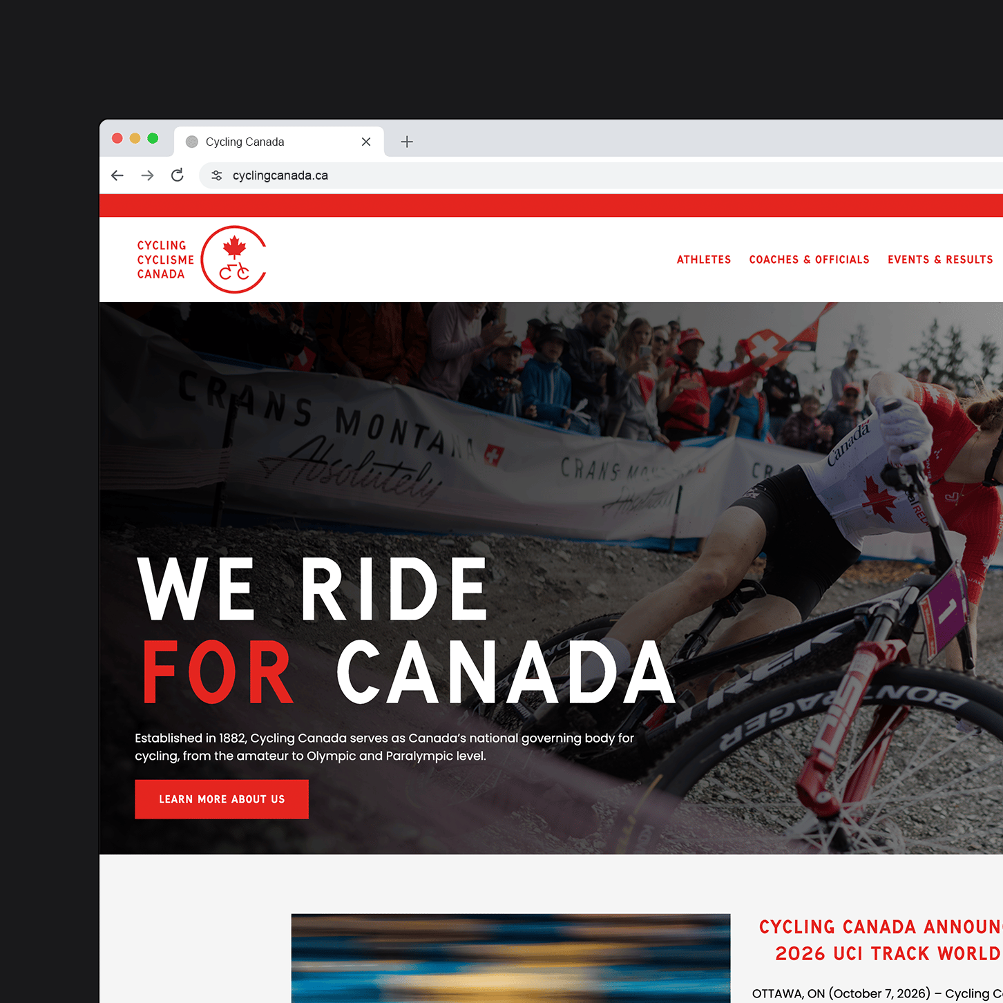
Web design
Designed for your visitors,
built for your team.
Your website serves members, applicants, donors, staff, and the public, often on the same page. We start with what each of them came to do, then design and build every page around those tasks. Visitors find what they need and take the next step easily, and your team gets a website that’s simple to update and stays on brand from the home page to the smallest form.
The work
From first conversation to first login.
Behind every page is a plan, a structure, a design system, and the content and connections that make it useful. We create all of it, then hand your team a website that works the way they do.
- Discovery
-
A plan for the whole project. Stakeholder input, an analytics review, and a content inventory, brought together in a website development plan.
- Site architecture
-
A sitemap built around your audiences. How your content is grouped, labelled, and navigated, the foundation for every page that follows.
- Wireframes
-
Layouts before styling. Key page types, content hierarchy, and user pathways, so feedback stays on structure and flow.
- Digital style guide
-
Your brand, translated for the web. Typography, colour, spacing, imagery, and components like buttons, menus, cards, and forms.
- Design prototypes
-
Your website, before it’s built. High-fidelity designs of key pages on desktop and mobile, reviewed against WCAG 2.2 AA.
- Development
-
A custom WordPress block theme. Reusable blocks, patterns, and templates in the native block editor, so new pages stay on brand.
- Integrations
-
Connected to the tools you already use. Registration, forms, fundraising, newsletters, and analytics, through each platform’s supported methods.
- Content migration
-
Your content, moved and organized. Key pages laid out individually, recurring content imported, and redirects from every changed address.
- Testing and launch
-
Checked from end to end. Functional, device, accessibility, and performance testing, then a coordinated launch with a rollback plan.
- Training
-
Ready to run it yourselves. Hands-on training, plain-language documentation, and a three-month warranty.
Process
Six phases, one senior team.
Design takes shape across the first three phases, so by the time we build, every page has been planned, styled, and tried. Every phase includes two rounds of revisions and ends with your approval, a dedicated project manager keeps you updated throughout, and every website we build includes a three-month warranty.
Discovery
Workshops and research into your goals, audiences, current website, and systems.
Deliverables- Website Development Plan
Experience Design
Wireframes for priority pages, and the accessible type, colour, and components of your brand online.
Deliverables- Wireframes
- Digital style guide
Prototyping
High-fidelity designs of key pages, joined into a prototype you can click through.
Deliverables- Interactive prototype
Development
A custom block theme, blocks, and integrations, built in version control and tested at every step.
Deliverables- Working website
- Test environment
Content
Fresh copy for high-impact pages, with existing content migrated and reorganized to fit.
Deliverables- Launch-ready content
- Redirects
Launch & Training
Training for your team, a final review, the domain cutover, and monitoring after go-live.
Deliverables- Live website
- Team training
Audiences
Websites designed for the people you serve.
Every organization we work with serves several audiences at once, each with its own reason to visit. We map each audience’s journey, then give each one a clear path to what they need.
Members want to renew, register, and get on with their day.
Members come back to do something specific: renew, register for an event, or find a resource that comes with belonging. When they sign in, the website should already know who they are and put their next step first.
- Renewal finds them. A notice at sign-in, weeks before the deadline, so no one lapses by accident.
- Their own shortcuts. Courses, registrations, and the member directory, one click from their home page.
- One sign-in. Member content, events, and learning share one account, whether member records live in WordPress or your AMS.
Applicants want a clear path into practice.
Applying to practise is high stakes, and the route depends on where and when someone trained. Each route needs its own clear path, so applicants know what is required before they begin.
- Routes, not rules. Each route says who it is for and what it involves, in plain language.
- Requirements up front. Documents, fees, and timelines listed before the form, not discovered halfway through.
- Progress they can see. Where their application stands, without calling the office.
Registrants want to know exactly what is left to do.
Renewal and practice requirements come with deadlines and real consequences. Registrants need to see where they stand, pick up where they left off, and finish without calling the office.
- Every step in view. What is done, what is next, and the deadline, before they start.
- Save and come back. Long forms keep their place, so no one starts over.
- Requirements explained. Practice hours, competence, and declarations explained where they are asked for.
The public wants a straight answer they can trust.
People checking whether a professional is registered, or looking for help, do not know how your organization is structured, and should not need to. They need the answer first, in words they understand.
- The answer up front. Status, conditions, and history on the result itself, not three clicks away.
- Search that forgives. Partial names, misspellings, and plain terms still find the right result.
- Accessible to everyone. Built to WCAG 2.2 AA, so the public can use it with any device or assistive technology.
Employers want to verify, understand, and act.
Employers come to verify a professional’s standing, understand the standards their staff must meet, or raise a concern. Each is a task with a beginning and an end, and the website should treat it that way.
- Their own front door. A page for employers built around what they come to do.
- Verification that scales. Checking one person or a whole team without repeating the search.
- Concerns explained. What happens after a report, in plain language, before they decide to file.
Students want to see the path into the profession.
Students are deciding whether and how to enter a field. Show them the whole path, where they are on it, and the help available at each step, and they arrive as members and registrants who already know you.
- The whole path in view. From program to practice, one step at a time.
- Help at each step. Exam preparation, mentoring, and student pricing where they matter.
- A welcome, not a wall. Content written for people new to the field, without insider language.
Professionals want the right course and a clear view of their credits.
Professionals keep learning throughout their careers, often with requirements to meet. They need courses that count, and a clear view of where they stand before the cycle ends.
- Progress at a glance. Credits earned, credits needed, and the deadline in one place.
- Courses that are easy to narrow down. Filters for topic, format, and credits, so the right course turns up first.
- Proof on hand. Completed courses and certificates, ready to download when they need to show them.
Donors want to trust where their money goes.
A donor is deciding in a moment whether your organization is worth their money. Show what a gift does, make giving monthly as easy as giving once, and answer the trust questions before they are asked.
- What a gift does. Each amount tied to a real outcome, so giving feels concrete.
- Monthly made easy. Recurring giving as the first choice, with a short form and nothing asked twice.
- Trust on the form. Charity status, receipts, and privacy answered where people decide.
Volunteers want to know what it takes before they say yes.
Non-profits and associations run on volunteers, and most people will help when they know what it involves. Clear roles, honest time commitments, and an easy way to sign up turn interest into action.
- Time, up front. Each role says how much time it takes, so people know what they are signing up for.
- Every open role in one place. Events, programs, and committees listed together, with what is still open.
- A simple sign-up. A short form that reaches the right staff person, not a general inbox.
Selected work
Design work we are proud of.
 Nurses and Nurse Practitioners of BCA member hub connecting nurses and nurse practitioners with resources, jobs, and events.
 Canadian Society of Nutrition ManagementA scalable website that showcases member value and keeps content manageable.
 College of Occupational Therapists of OntarioAn accessible website that guides registrants, applicants, employers, and the public.
 Acera InsuranceAn enterprise platform that consolidates legacy websites into one online identity.
 Canadian Institute of PlannersAn accessible, bilingual website with member resources and a job board.
Questions
Fair questions about design.
Yes. Most projects extend an existing brand into a digital style guide. If your brand needs a refresh, we can help with that as part of the project.
Yes. You review wireframes, a style guide, and a clickable prototype, and development starts only once you approve them.
Two rounds of revisions at every phase. Most projects find that is plenty, because each phase builds on decisions you have already approved.
Yes. We design a system of reusable components and build them as blocks, so new pages match the design without a designer.
Next step
Let’s talk about your website design.
Tell us about your organization and what you would like to improve. Whether you are planning a redesign or refreshing a few key journeys, we would be happy to talk through your needs.
