Directing traffic to local business.


Small Business BC
The place to focus on local.
The provincial and federal governments support the BC Marketplace initiative from Small Business BC, which provides an inspiring online space for finding small businesses in BC communities.
The previous platform was experiencing various issues related to usability and performance. We recommended and implemented a series of UX improvements to make the site more appealing for businesses and useful for visitors.
Reach
- Thousands of small businesses.
Services
- Information Architecture
- UX & UI Design
- Copywriting
- Development
Year
- 2022
Technology
- WordPress
- Custom Development
- Performance Optimization
USER EXPERIENCE
Better UX leads to greater value.
After reviewing the previous marketplace platform in great detail, we applied best practices to improve the user experience and strengthen their value proposition. We focused on the interface updates to the navigation, homepage and regional pages.
The previous slide-out menu didn’t provide any context for how the website is organized and was lacking in the desktop experience. We recommend a new menu organization that allows quick access to explore each region.
INFORMATION ARCHITECTURE
Making search more useful.
The search tool is one of the most important features of the marketplace directory. We prioritized this feature and incorporated WordPress’ upgraded search tool, Jetpack. By relocating the search to be front and center, the new site aligns with the approach of platforms like Airbnb, where search is vital to the experience.
But the search feature can’t do all the heavy lifting. We highlight key categories throughout the homepage to make the experience more explorable. These include featured industries, businesses, and stories about the entrepreneurs behind the scenes.
Design & Content
A new balanced design.
The new content approach balances the need to highlight various business types and regions without playing favourites. Practical filters and categorization guide users through the directory. We also improved the presentation of the benefits and features for listing businesses.
A big selling feature of the Marketplace is the focus on small local businesses. The revamped design structure puts these businesses at the forefront. By showcasing owners, local gift guides and timely featured content, we excited the platform’s value.
CUSTOM FUNCTIONALITY
Rethinking the registration process.
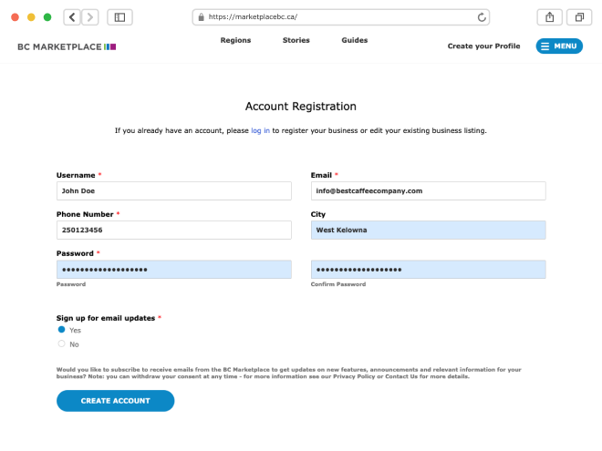
We aimed to make the process for business listings more intuitive and less daunting. To capture more business faster, we recommended breaking out key information into a multi-step process. We simplified the form fields and presented the Marketplace’s main benefits at the beginning of the registration flow.
Once a business completes its listing, we prompt it to input additional info such as business hours and featured offers. This encourages businesses to return more often to update their profiles.


PERFORMANCE OPTIMIZATION
Speedy and mobile-friendly.
We focused on improving speed and mobile usability with a new look, better-organized content, and a streamlined registration process. We got to work fixing various usability issues and functional flaws. We improved the SEO by addressing broken links, redirects, outdated themes and unused plug-ins.
We also properly configured Google Analytics to create accurate time series reporting on clicks, page views, impressions, and searches.
Final Thoughts
Expertise in the world of UX.
As an experience design agency, we objectively view existing websites to recommend actionable changes that have an immediate impact. This was the case for BC Marketplace, where the user experience degraded the platform’s overall value and appeal. Without reinventing the digital wheel, we improved the site dramatically. We’d love to do the same for your site!
